Architeture
This section explores elements from different projects I have worked on professional. I have focused on diagrams and design elements but I also have problem solving skills from my more technical experience in construction.
Photoshop
Grasshopper
Rhino
Rhino
3D Modelling
Sketchup
Enscape
1.
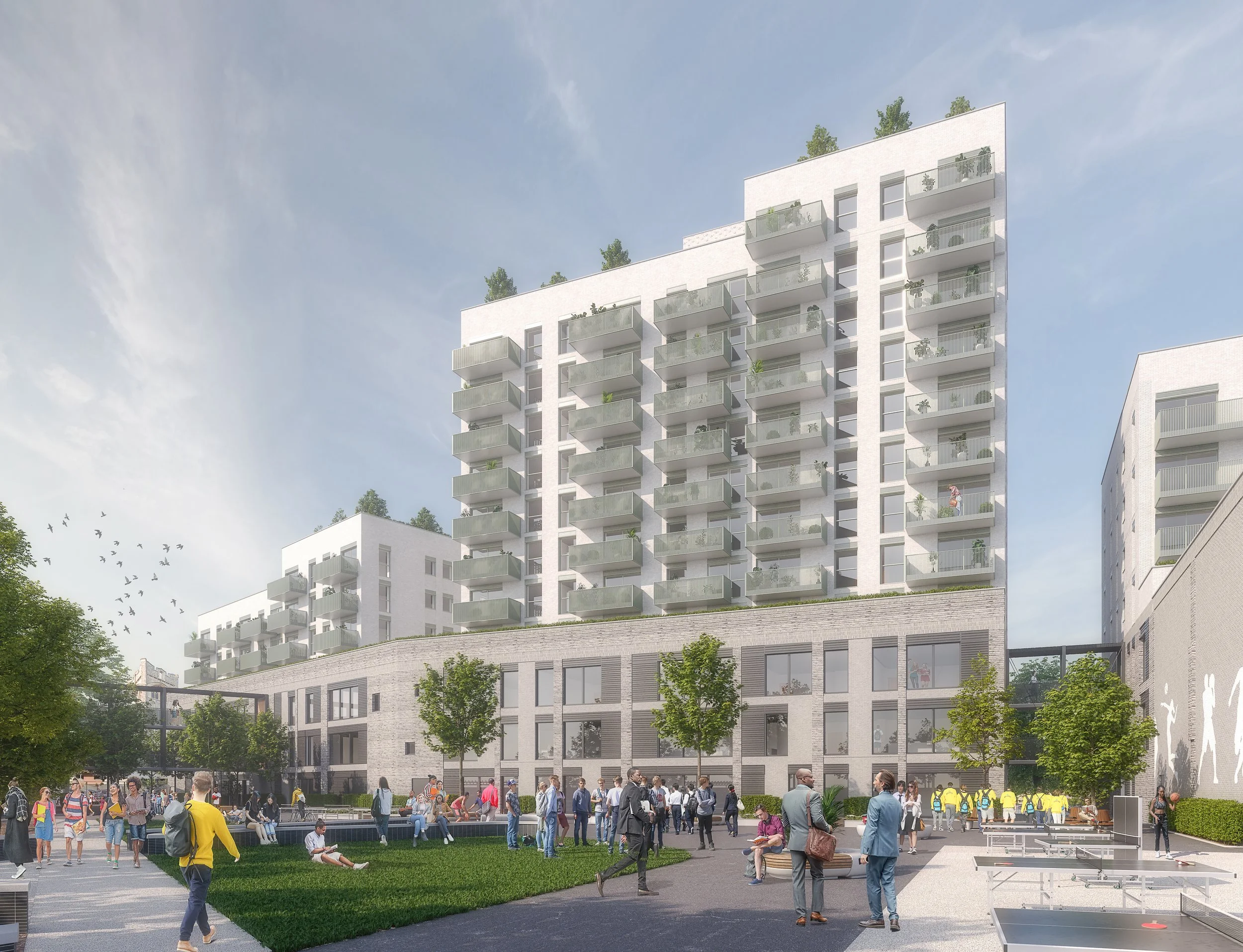
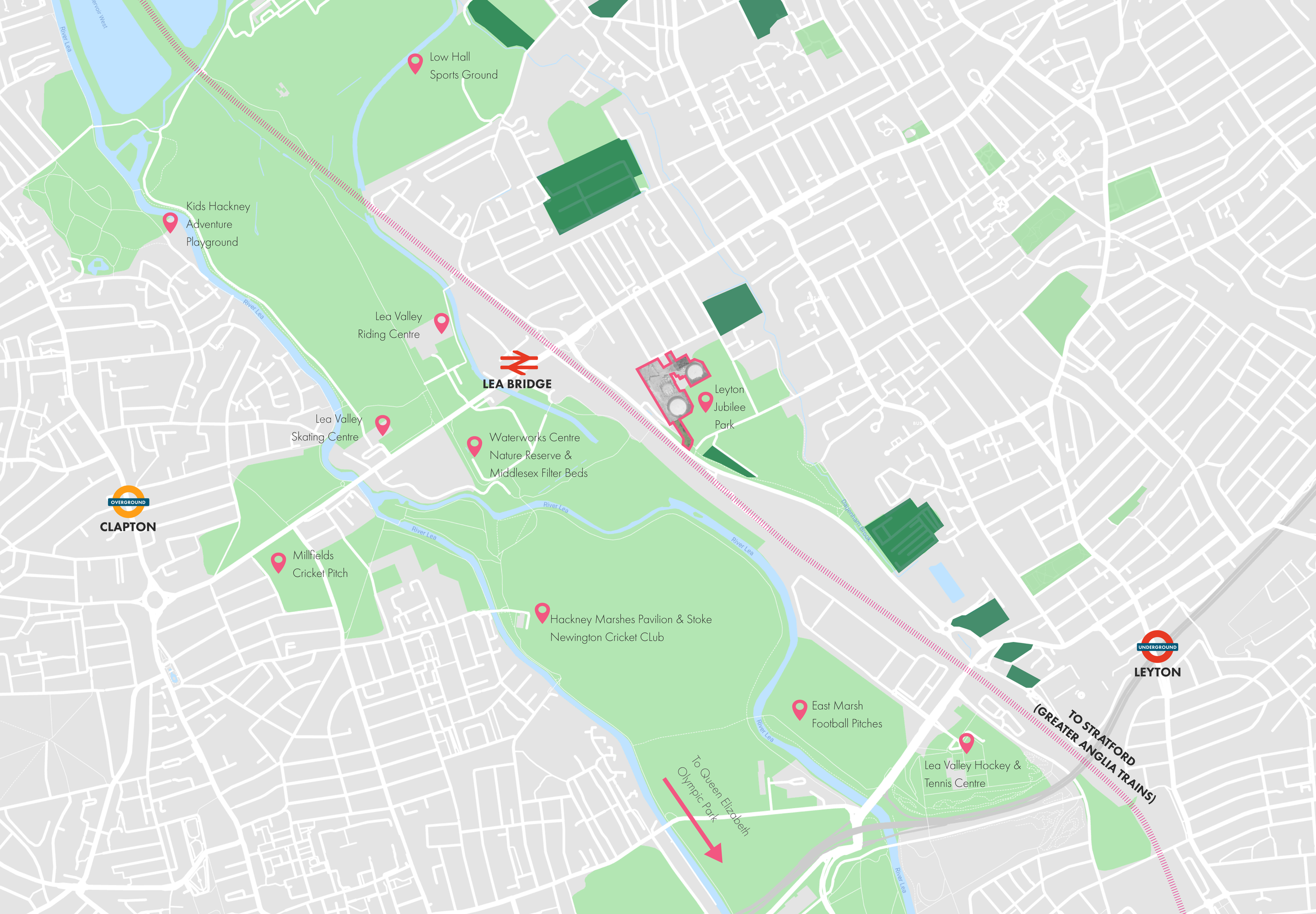
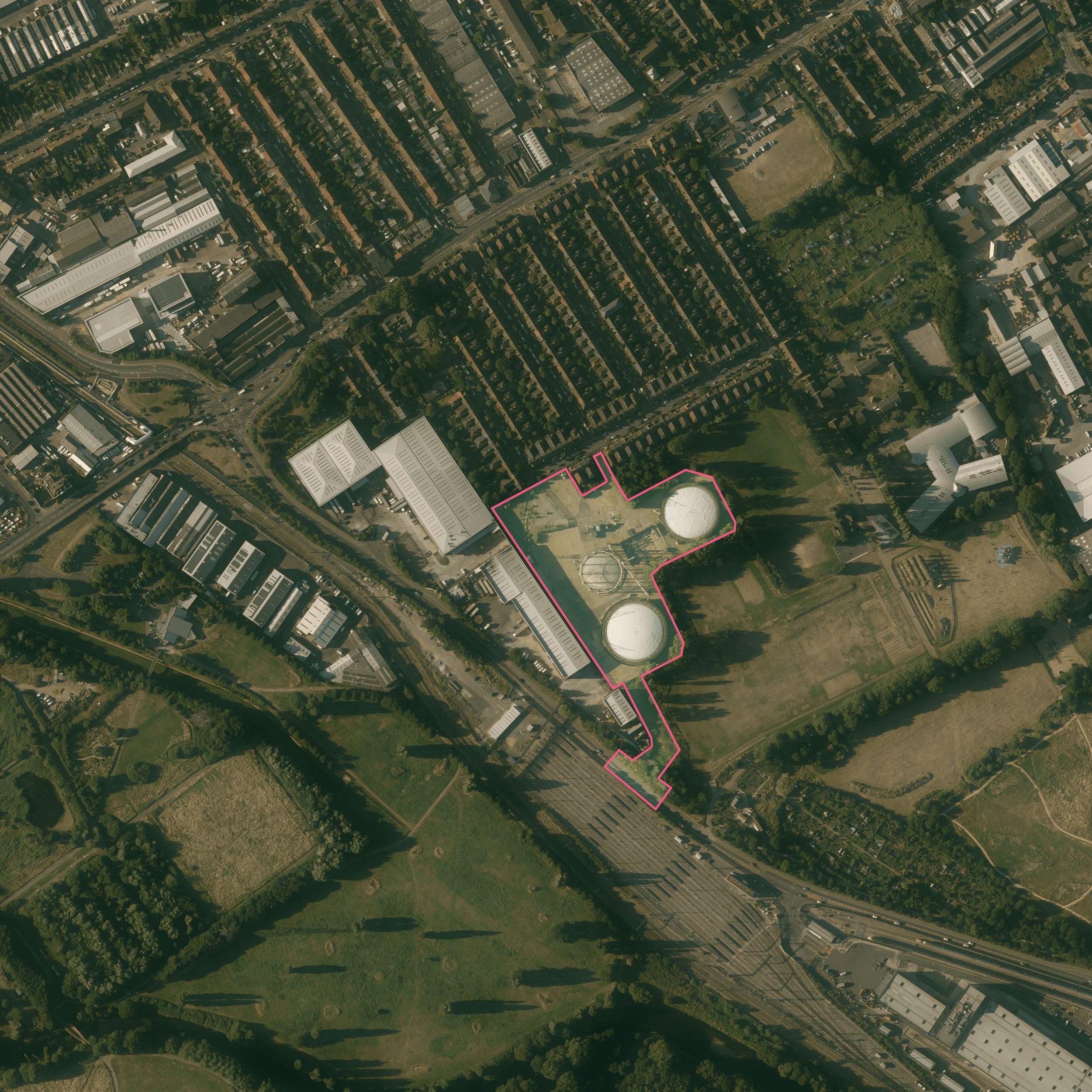
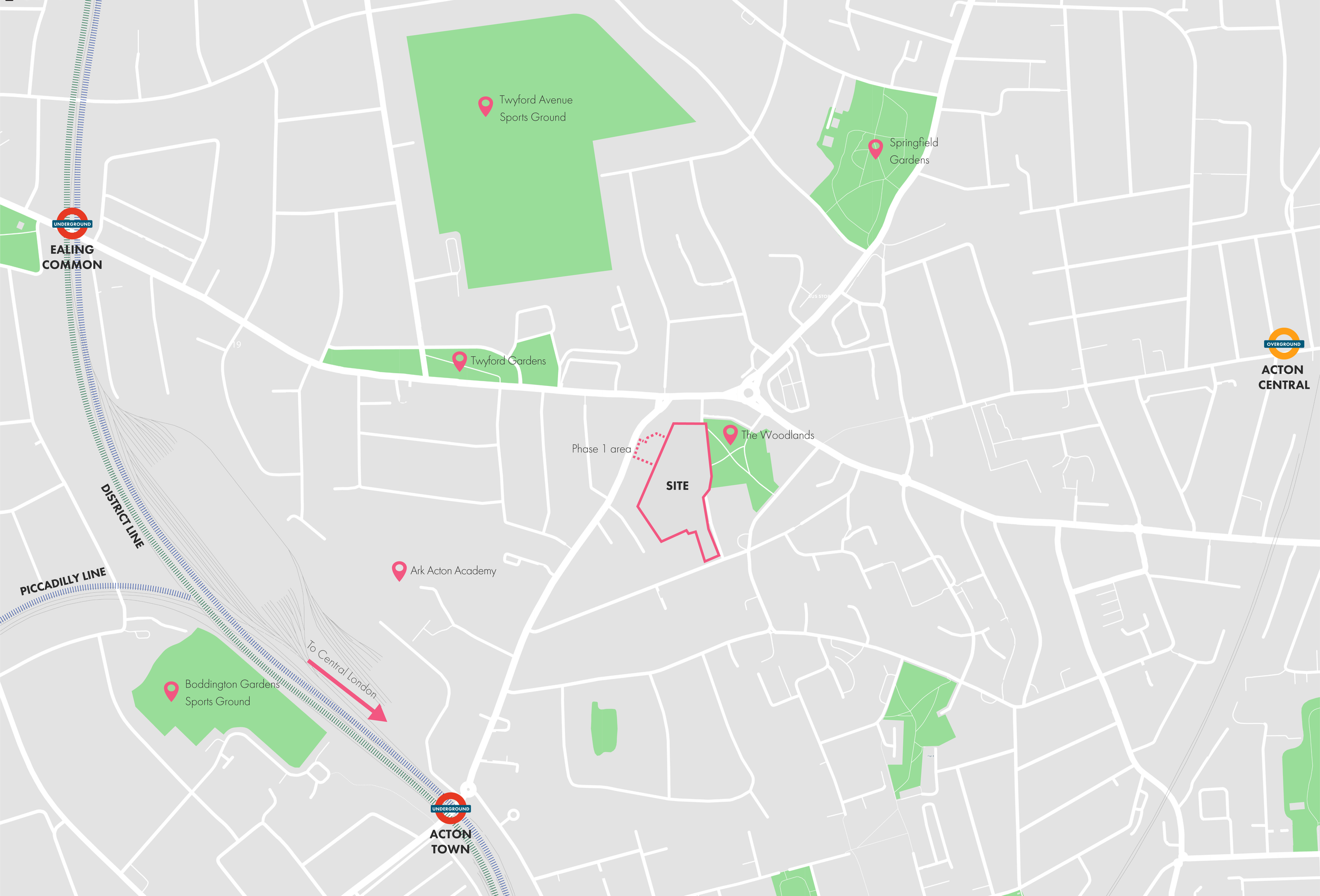
Lea Bridge Gasworks
This development proposes 500+ homes on a former gasworks site with provision for a gym and nursery. Sitting adjacent to a park and terrace-style flats, the local council and developer wanted a higher density scheme that would respect the local area.
2.
Ark Soane
This project was the redesign and delivery of a existing proposal for new academy with houses above. In the aftermath of grenfell, the developer felt the existing design, using a panelling based system, would be too risky to continue with. The school already had a set opening date and, as such, required a quick redesign process.
This development proposes 500+ homes on a former gasworks site with provision for a gym and nursery. Sitting adjacent to a park and terrace-style flats, the local council and developer wanted a higher density scheme that would respect the local area. To achieve this the building heights would ramp up from north to south and sit within a lush marsh-themed flood-resistant landscape. These called for different typologies as the buildings transitioned in height as well as specific design elements, like bridges, entrance canopies and screening.
I worked on the project throughout its design stage and had various roles. These include, but were not limited to:
the exploration of brick options and facade designs;
the creation of particular design elements like entrances, bridges, and screens;
the production of final drawings, diagrams and 3D renders;
and model making.
On this page, I explore the project and some of the content I produced for it. Only the final site renders were not produced by myself but by an external firm selected to work alongside us as we developed the design.
As with all projects in my professional section, the presentation style and broad design principle are heavily influenced by the firm’s philosophy and preferences, the priorities of clients, and the goal of achieving planning permission.
Lea Bridge Gasworks
Local Context
The local area is generally low-rise residential with various amenities and some light industry/warehouses. The area has seen new residential towers and higher development with the reopening of the Lea Bridge train station. The council has encouraged this and has pushed for the development of brownfield sites to be higher density, building taller structures towards the valley. This is a welcomed policy by contractors and home builders but requires careful consideration of the nearby Clementina estate.
Proposal
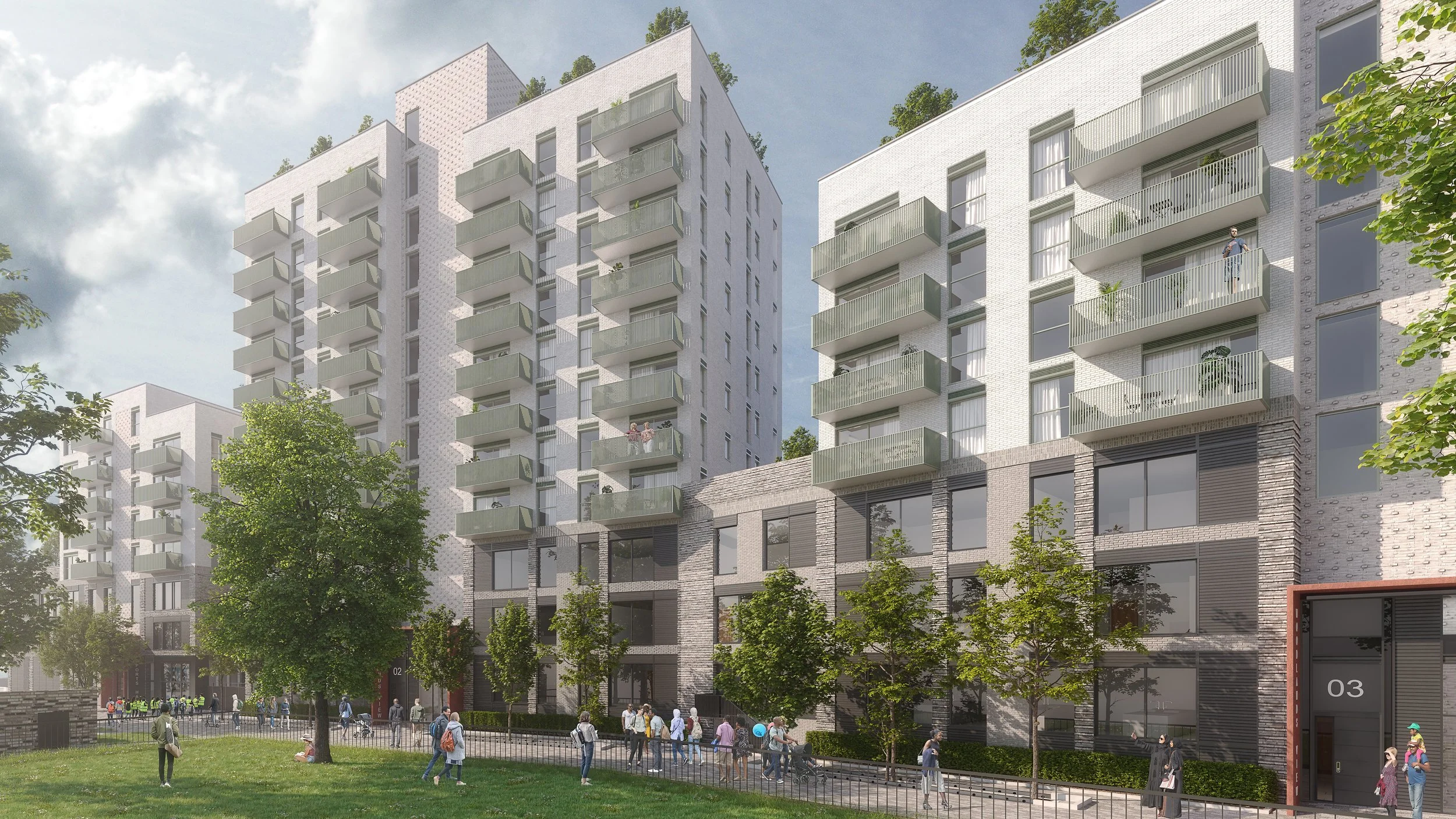
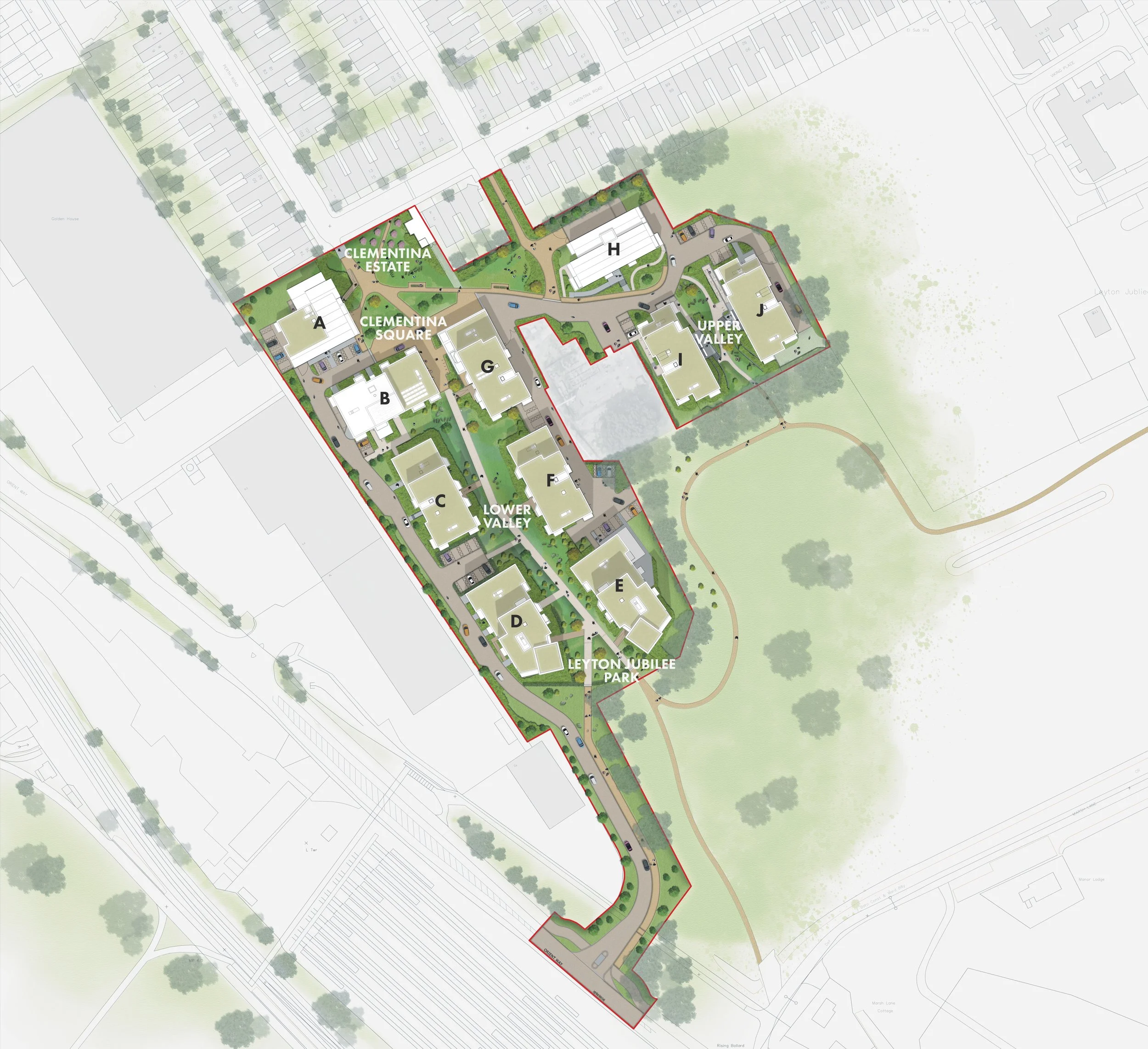
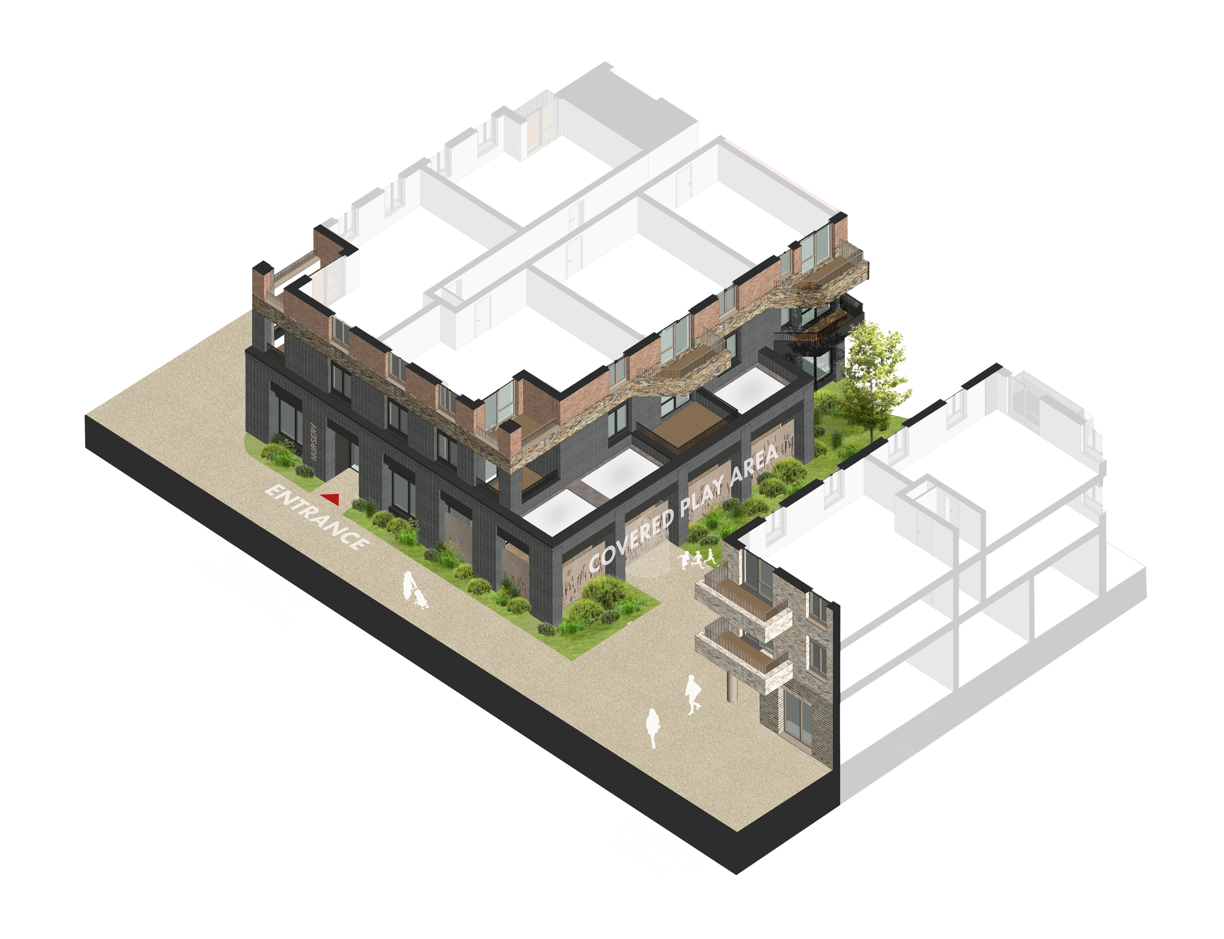
The proposal consistents of ten blocks of flats with various character areas and corresponding typologies.
The transition in height was matched with a change of styles. I helped develop these typologies from the beginning of the scheme and would produce these isometric studies as part of the planning application. As well as reflecting the change in height, the typologies also created distinct character areas, the most striking being the dark brick within the ‘lower valley’ area.
Isometric Studies
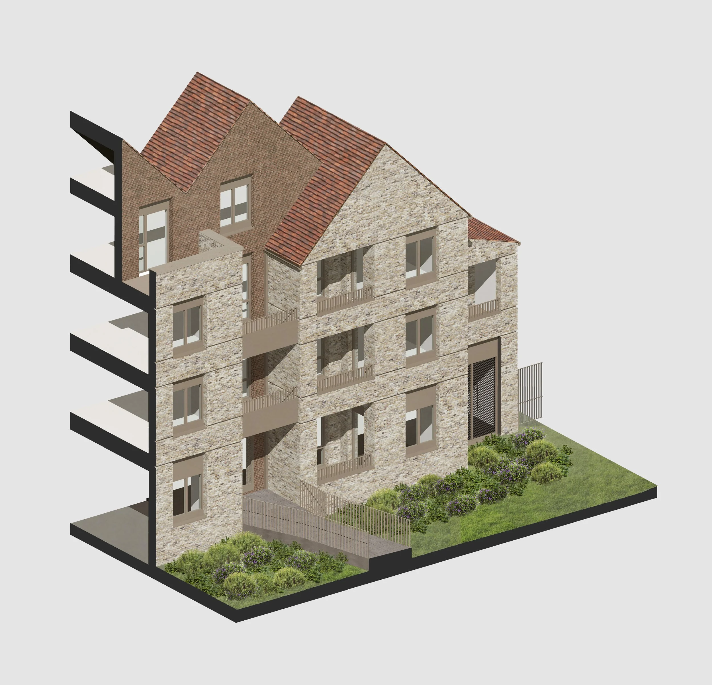
Clementina Estate Adjacent
Block A (shown here) & block H follow this typology. The buildings here are 3-4 floors and use various gabled roofs to mirror the adjacent estate’s terraces. The banding used throughout the rest of the site is introduced here with inset bricks forming the line between each band. The form of the buildings reflect the domestic scale of the terraces but are still flat blocks with private balconies.
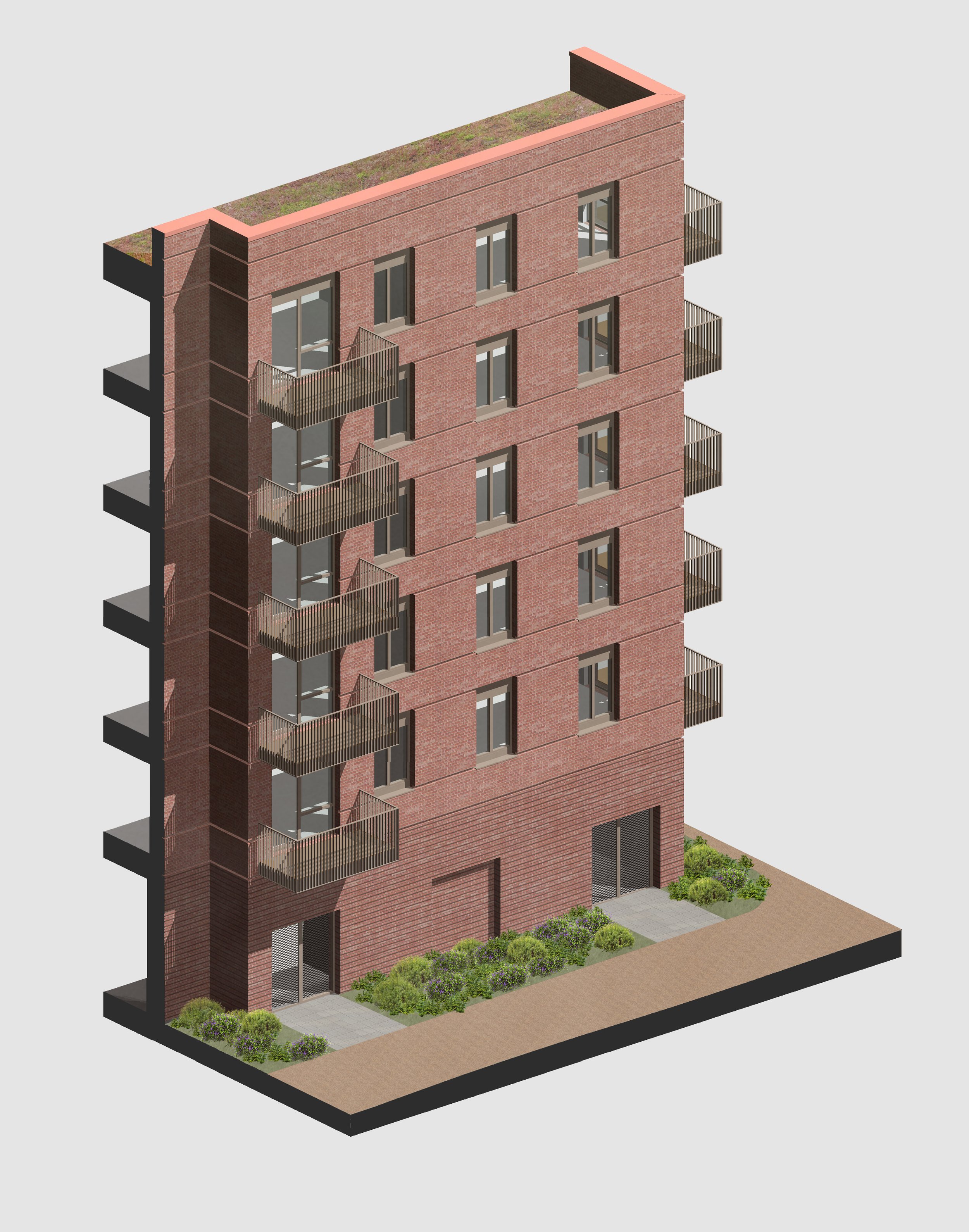
Clementina Square
Block B follows this typology. Slightly taller, this style moves to the flat roofs used throughout the rest of the site and establishes how buildings are segmented by height. Block B’s ground floor uses projections every other row of bricks adding visual weight to the bottom of the building.
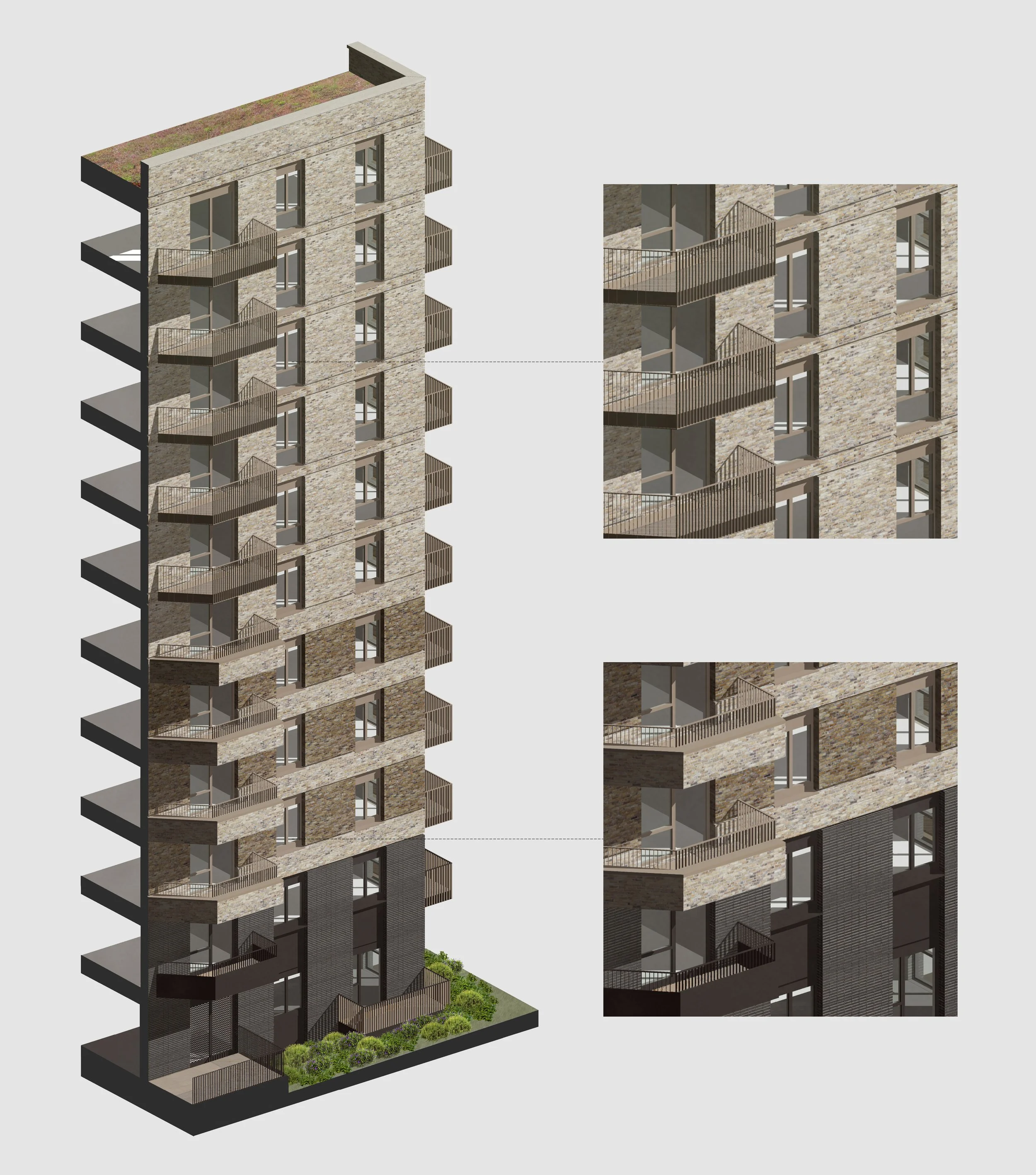
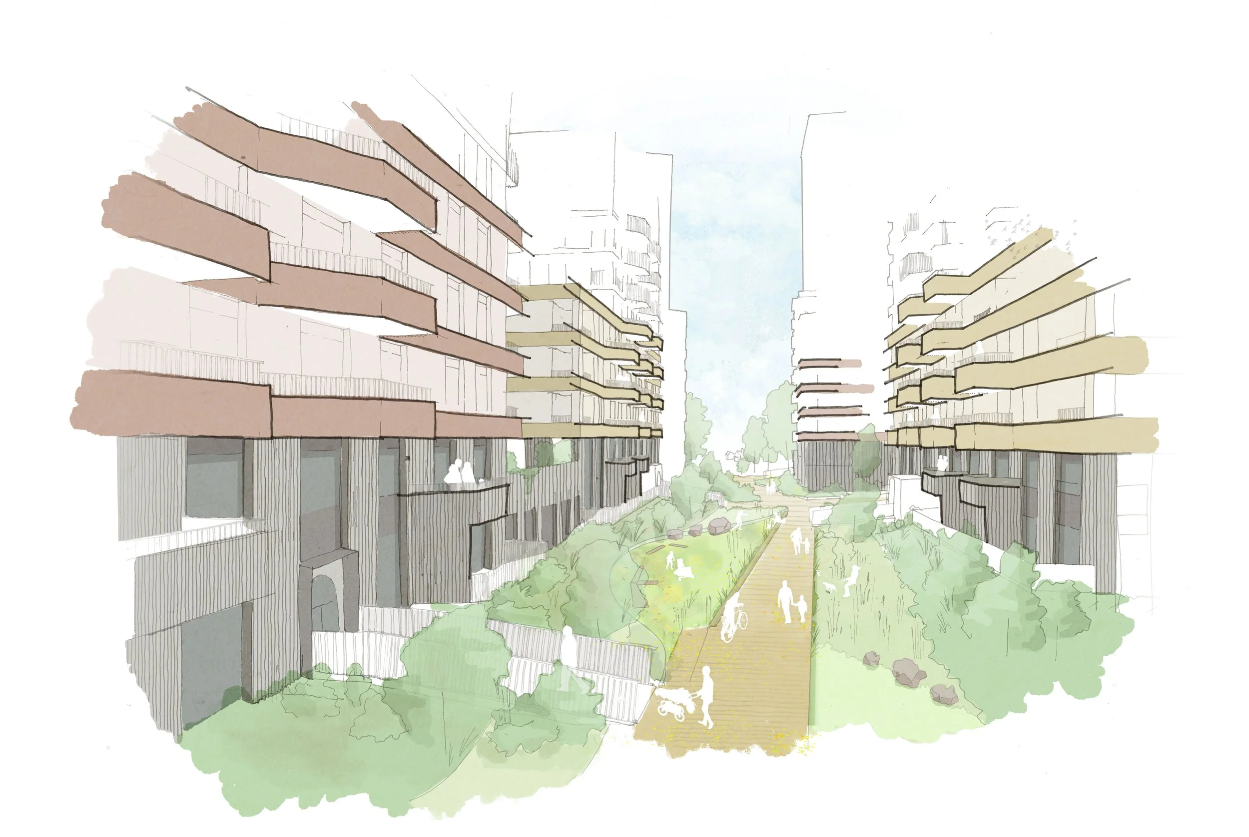
Lower Valley
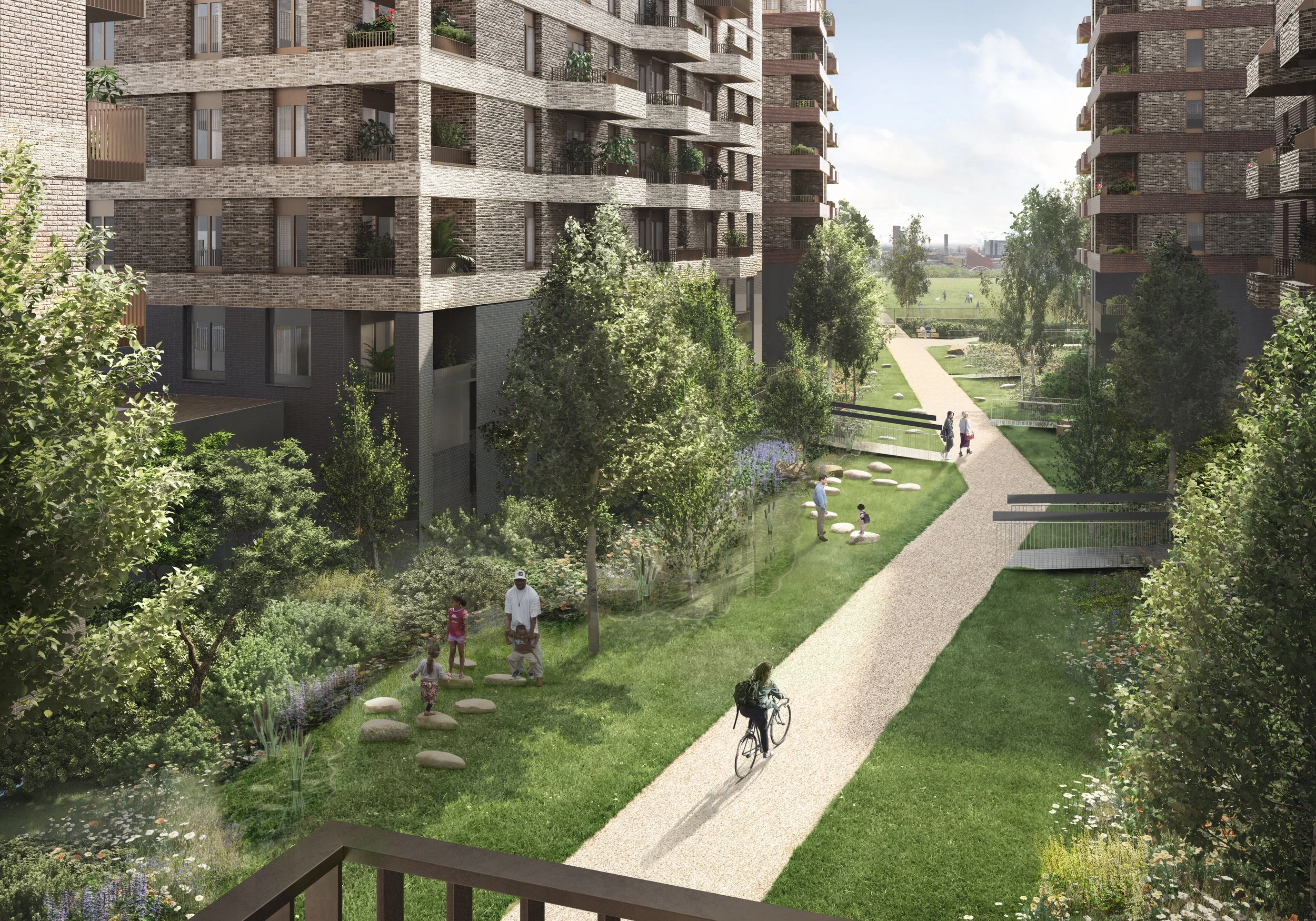
Blocks C, F & G, as well as half of blocks D & E, use this typology. It is designed carefully to work harmoniously with the lower valley, the linear park through the site with informal woodland style planting and swales to absorb water and produce a wetland appearance. The design is divided into three distant sections that being lighter as you move up.
The two bottom levels form a plinth for each block that frame the gardens with vertical banding in dark materials. The black stacked brickwork and matching black metalwork are used by all the blocks and form a consistent formal and modern backdrop to the gardens. This provides a strong visual foundation for each of the blocks.
In the next section, thick horizontal bands switch between two different bricks - each block has its own pairing. The chamfered balconies are open on their southern side, directing views down the valley towards Leyton Jubilee Park, and are formed by the bands peeling off the building. The metalwork in this section is bronze coloured to reflect the lighter brickwork.
The final section only appears on the taller section of blocks C, F & G. Here the blocks become monotone blocks of the lighter brick selection, the banding is narrowed and only visible through the insets between each band. the windows are larger and the balconies are reduced to only metal work. This section’s appearance is the lightest and also uses bronze-coloured metalwork.
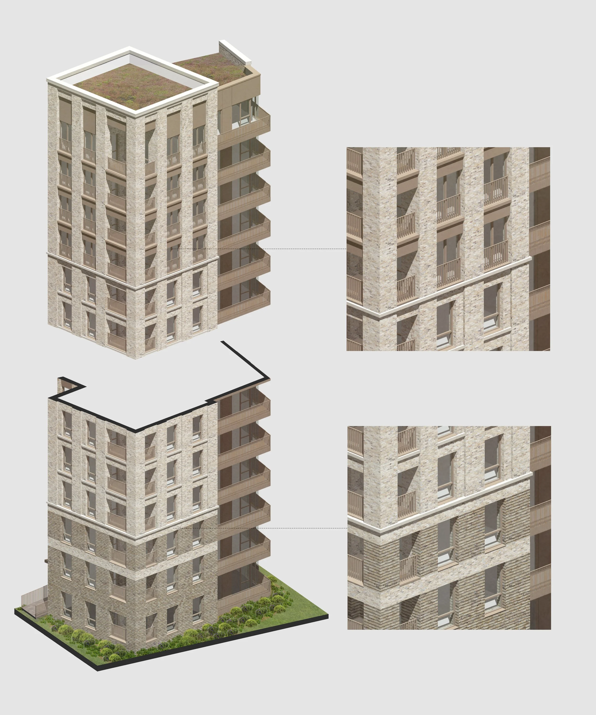
Leyton Jubilee Park
This typology is used for the sections of blocks D & E closest to Leyton Jubilee Park. Designed to face the park, the style embraces the height of the southern 2 blocks and is the furthest from the domestic scale and brick tones of Clementina estate to the north. The ‘towers‘ are split into 3 sections using a new lighter brick as well as concrete bands. The park-facing section adjacent to the towers uses metal panelling.
The base of the towers starts with every other row of bricks inset and no vertical banding and windows appear to sit in a thick solid foundation of brick. The section is capped with the first concrete banding.
The next section is the largest of the three with the vertical banding starting here. On each floor, concrete cills sit between the vertical brickwork forming an inset frame around each window. These frames contribute to the overall lighter appearance of this section. The actual windows remain the same size but the openings on each balcony get larger. This section is also capped with a concrete band
The final section is similar in form to the dark base of the lower valley typology but uses only the lightest bricks. The design drops the brickwork and concrete between levels, with metalwork instead, and the windows get wider to become juliet balconies filling the entire inset section. This leaves only the vertical and makes for a visually light crown to the tower.
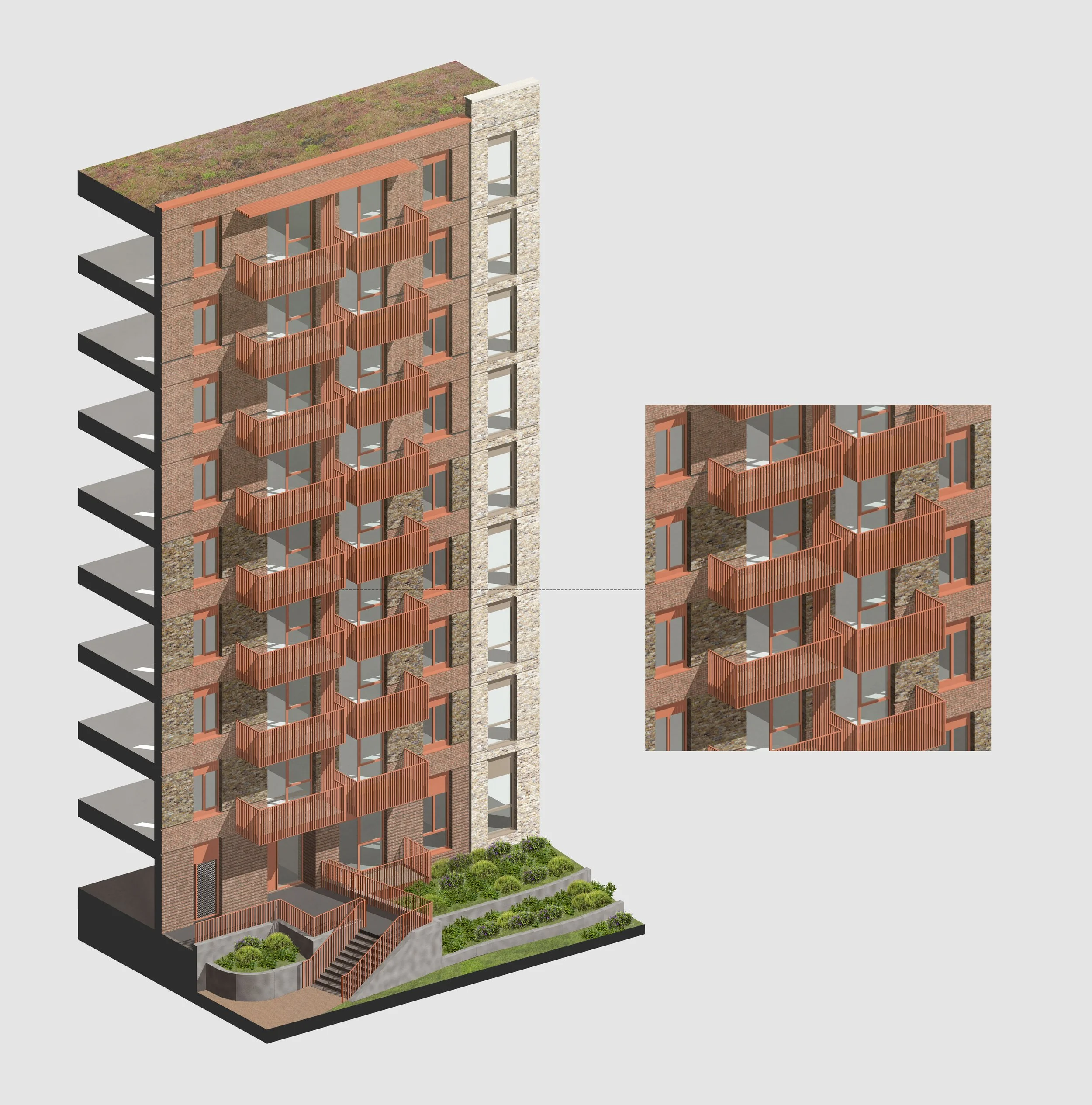
Upper Valley
This typology is a mixture of existing typologies and is used for blocks I & J. The northern half of each building uses similar banding to the lower valley, with 3 sections of banded brickwork that simplify the higher up the buildings. The northern halves also include bright red/orange metalwork and the balconies with screening to provide privacy from adjacent flats. The southern, park facing, half of each building borrows from the towers. It uses larger bronze-coloured windows, lighter bricks, and has a taller parapet.
This split design was created to transition between the Leyton Jubilee park and Clementina estate typologies over a condensed distance while providing a unique style to the upper valley.
Design Features
Bespoke design elements were considered an integral part of delivering a high-quality design. Of these design features, I worked with the team to develop the nursery garden & screening, the lower valley bridges, and the lower valley entrances. These features would be highly visible, sitting on the main route through the site, and in the case of the lower valley entrances, occur numerous times along the route.
These were concepts developed in Revit, Sketchup, Rhino and grasshopper. All the diagrams below were produced by myself as part of the planning submission.
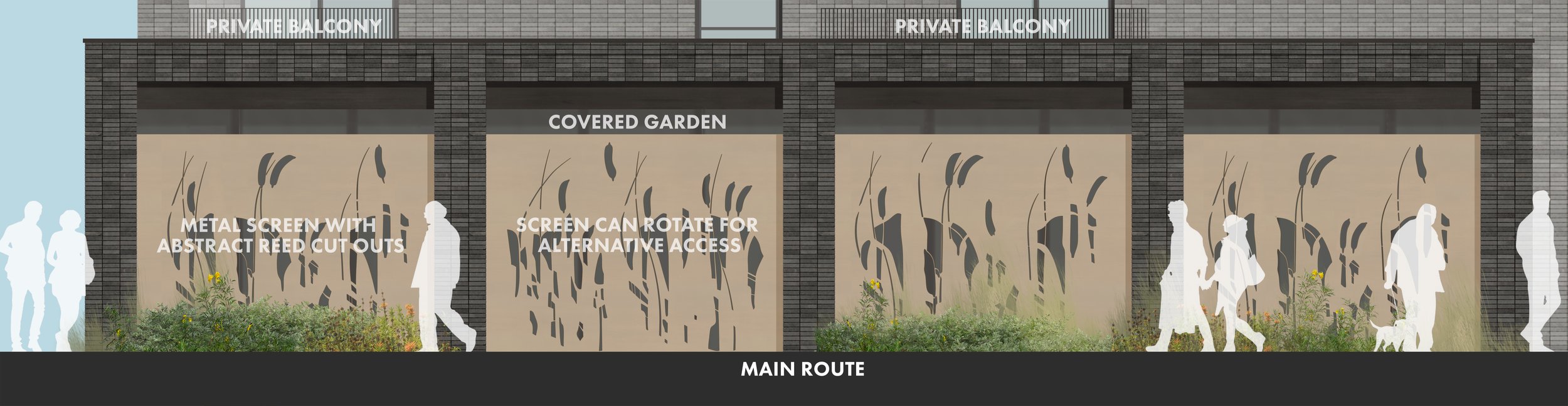
Nursery Garden
As well as developing the colonnade, I also produced the screening for the nursery. Based on the reeds used within swales, part of the water absorbing landscape, these metal screens add a bespoke design element. The design is playful, with reed elements clearly visible, while avoiding anything that might take way from the upmarket feel of the area.
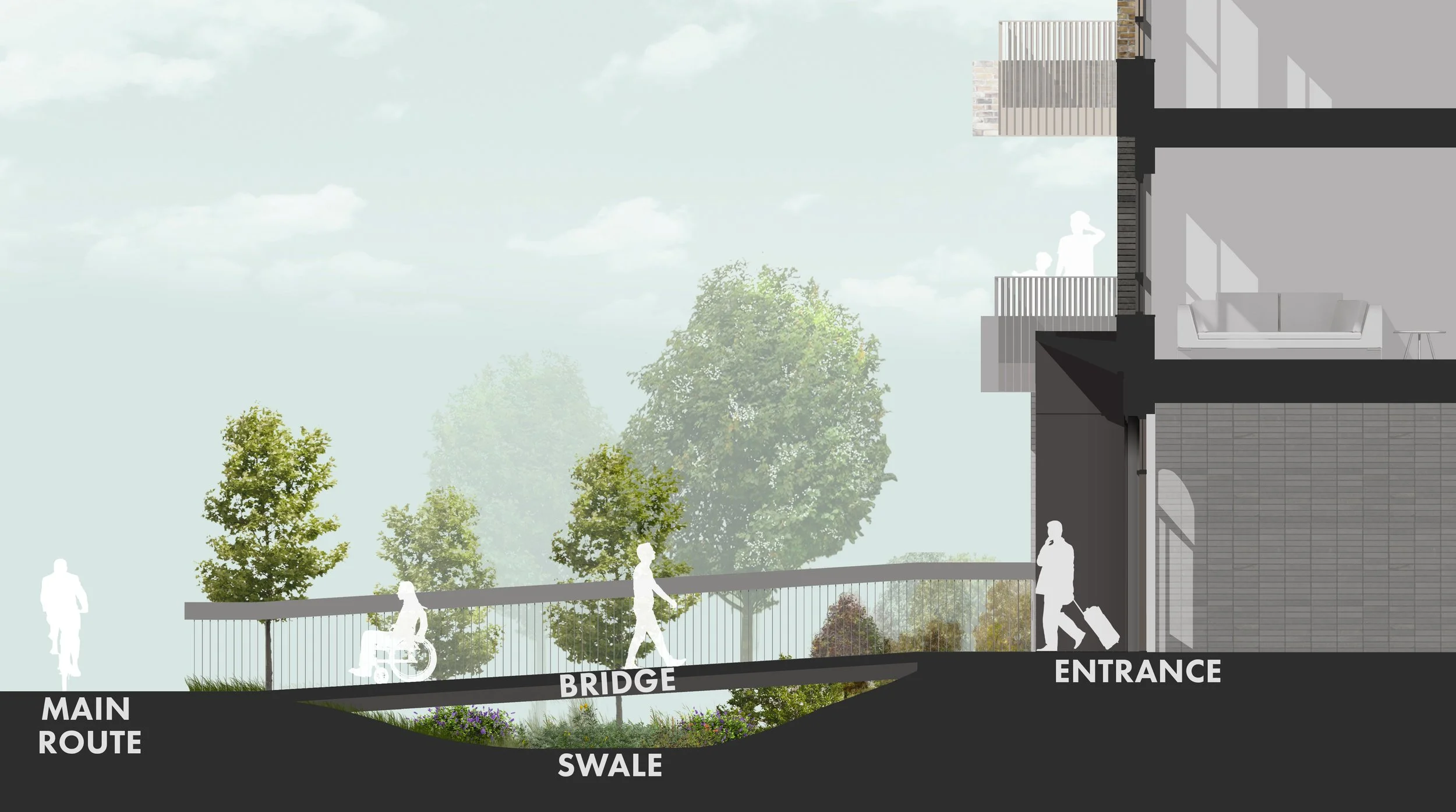
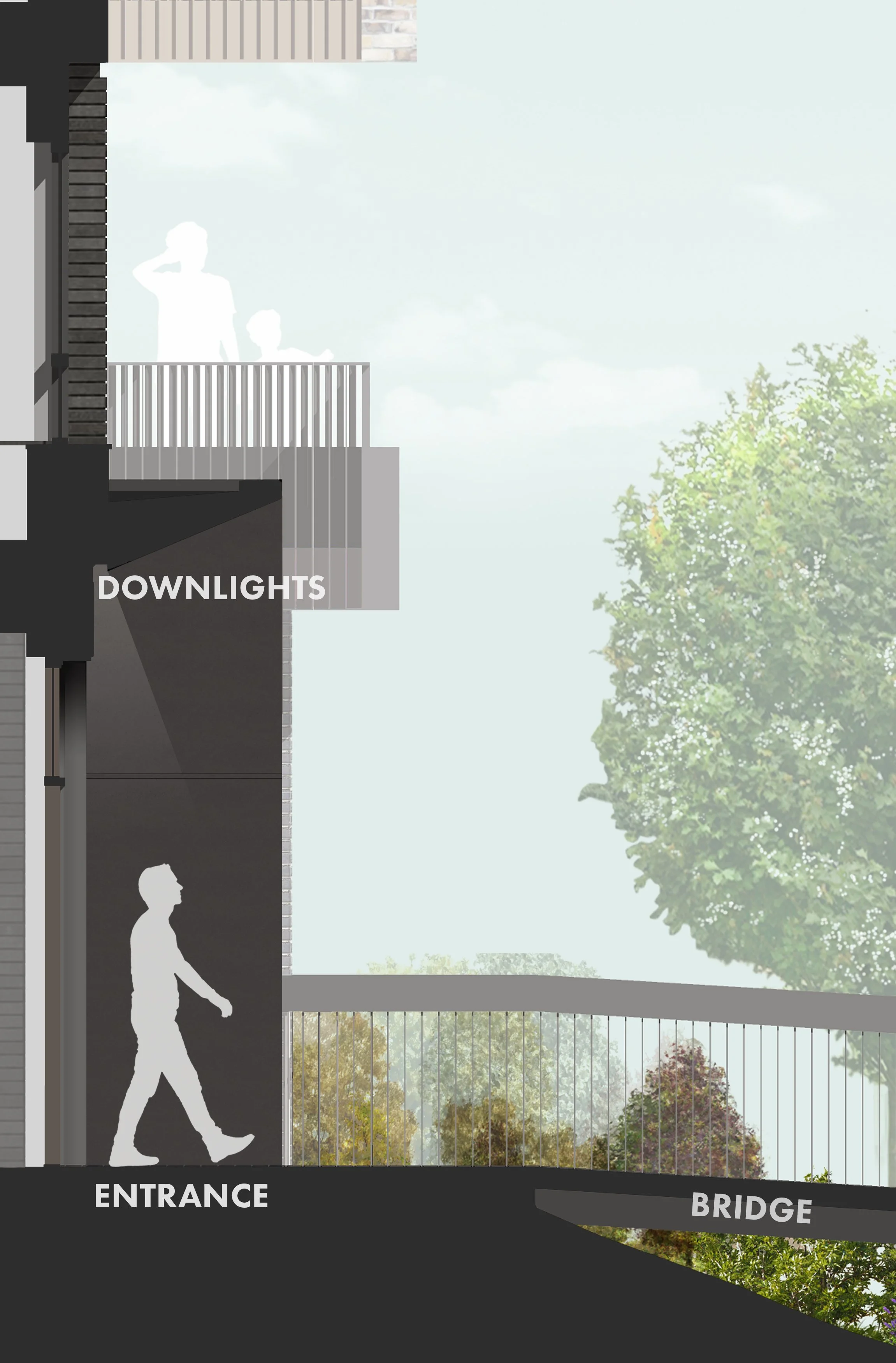
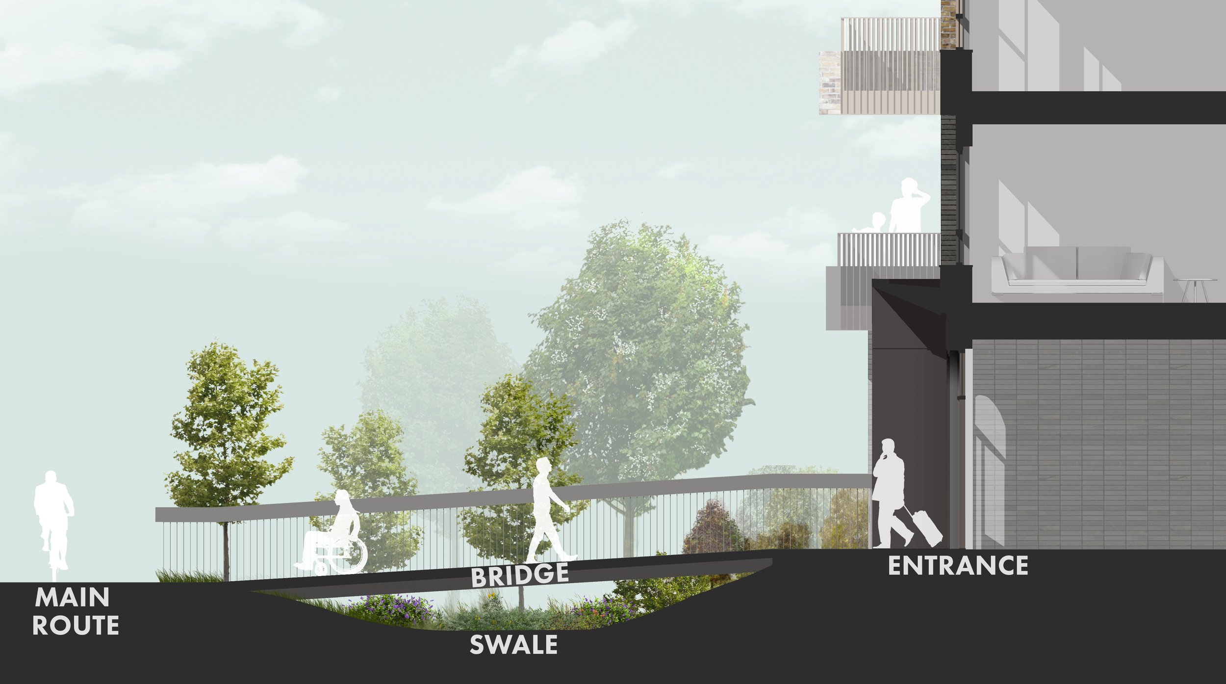
Lower Valley Bridges
The scheme’s location within the lee valley flood zone requires:
the buildings to have an elevated base above any likely flood level;
the site to incorporate sustainable landscaping.
Together, these offered an opportunity. Bridges could provide the difference in height while working in conjunction with swales. These swales would reduce water run-off, by providing trenches with water-friendly planting, and provide a buffer between private terraces and the main path. Hosting the main route through the site, plenty of green space for swales and being the largest section of the scheme, the lower valley was the ideal location to implement these bridges
Given the prominence of these bridges within the landscape, I worked on various design options that explored different railing and floorings. Sticking with darker tones and the vertical elements common in the lower valley typology, the final design uses small frequent upright supports that join a thick, offset, balustrade. This balustrade gives a stronger visual character to the bridge in comparison to the balcony railing. The floor plates would consist of horizontal elements that match up with every upright support. The railing would continue after the bridge to meet up with the entrance and any close-by cycle store entrance.
Nursery Garden
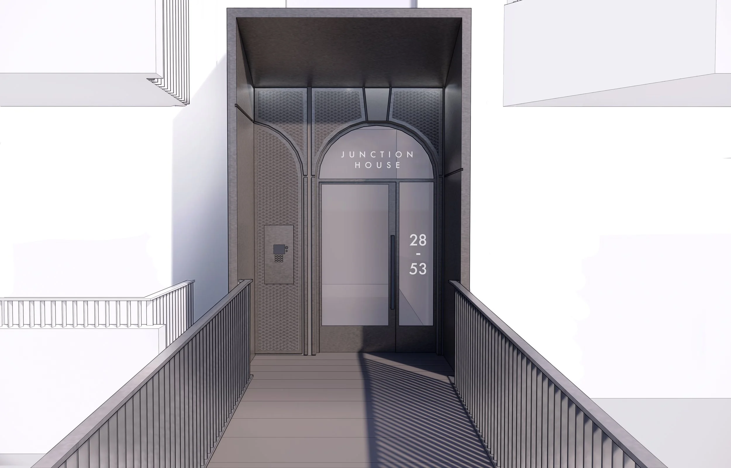
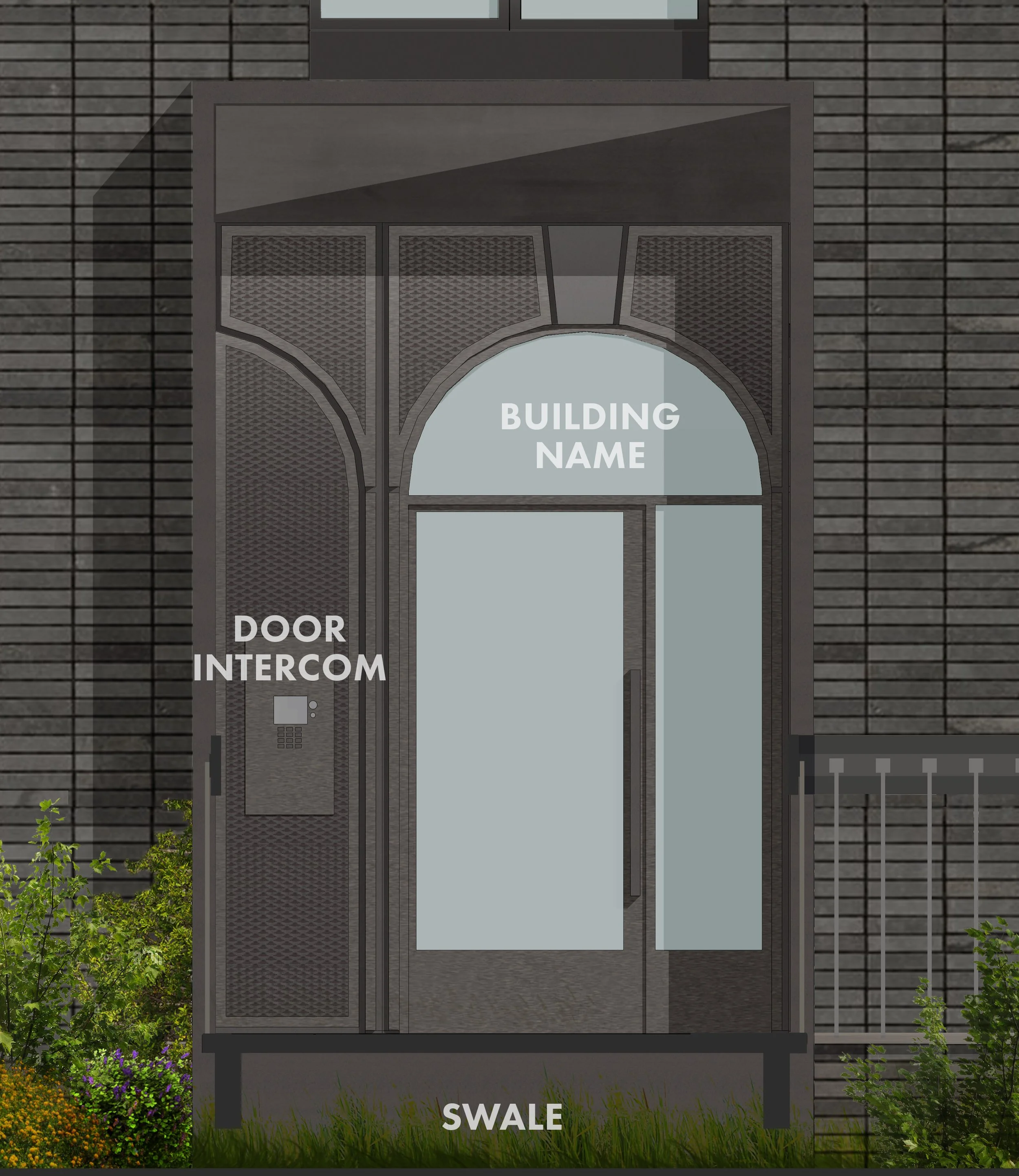
Another part of achieving high-quality design was creating attractive and identifiable entrances. As with the bridges, the lower valley offered the best location to dedicate this additional design consideration.
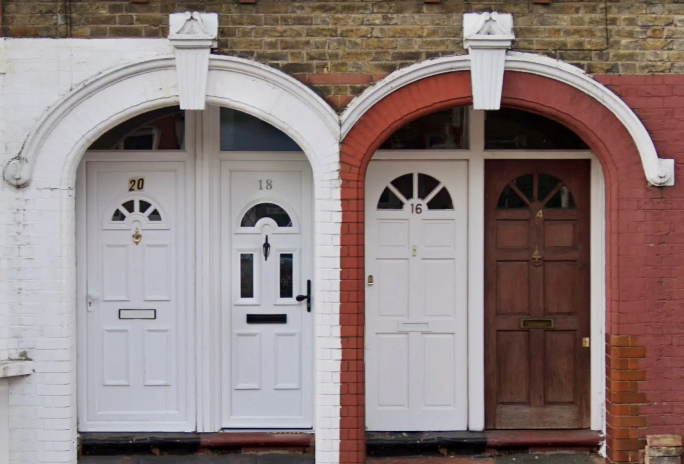
The existing Clementina estate has unique entrances. Although they appear like traditional terraces houses, the ground and first floor are separate flats with the entrances to both inset within the same arch, This arch is paired with the adjacent ‘terrace’ entrances to form a pair of arches. The final result reduces the visual clutter, keeps each pair of flats tied together, and gives the whole estate a recognisable architectural language.
I explore various ideas for the lower valley entrances, with the team deciding that this proposal, referencing the distinct architectural language set up by the estate would be best. The design mirrors the double arches by using one as an entrance for the building and another section of arch for the intercom system. The arch on the entrance provides space for signage and glass is used to let light into the internal corridor and make clear if anyone is on the other side of the door. The design also alludes to the industrial past of the site, the previous gasworks, through its metal and expanded mesh materiality. The frame around the entrance is a tall square canopy that makes it obvious from the main path - it includes additional detailing on each side to reference the arches as well as a sloped roof for drainage. Integrated into the frame is the lighting, downlights are used which highlight the arch design and expanded mesh.
As well as diagrams showing it in section and elevation, there is also a render to give the impression of how the signage and downlighting would appear.
Renders
These images show how the various elements explored above look implement in the final proposal. The typologies are visible, each reflecting their context, and all using the banding logic that carries through the whole project. The design is not atypical for a new London development but has unique elements aimed at creating a high-quality and varied space. Replacing a gasworks site that took away from the local area, the design makes for a place where pedestrians take priority, with each building facing the routes through the site and the park now just walk away from Clementina estate.
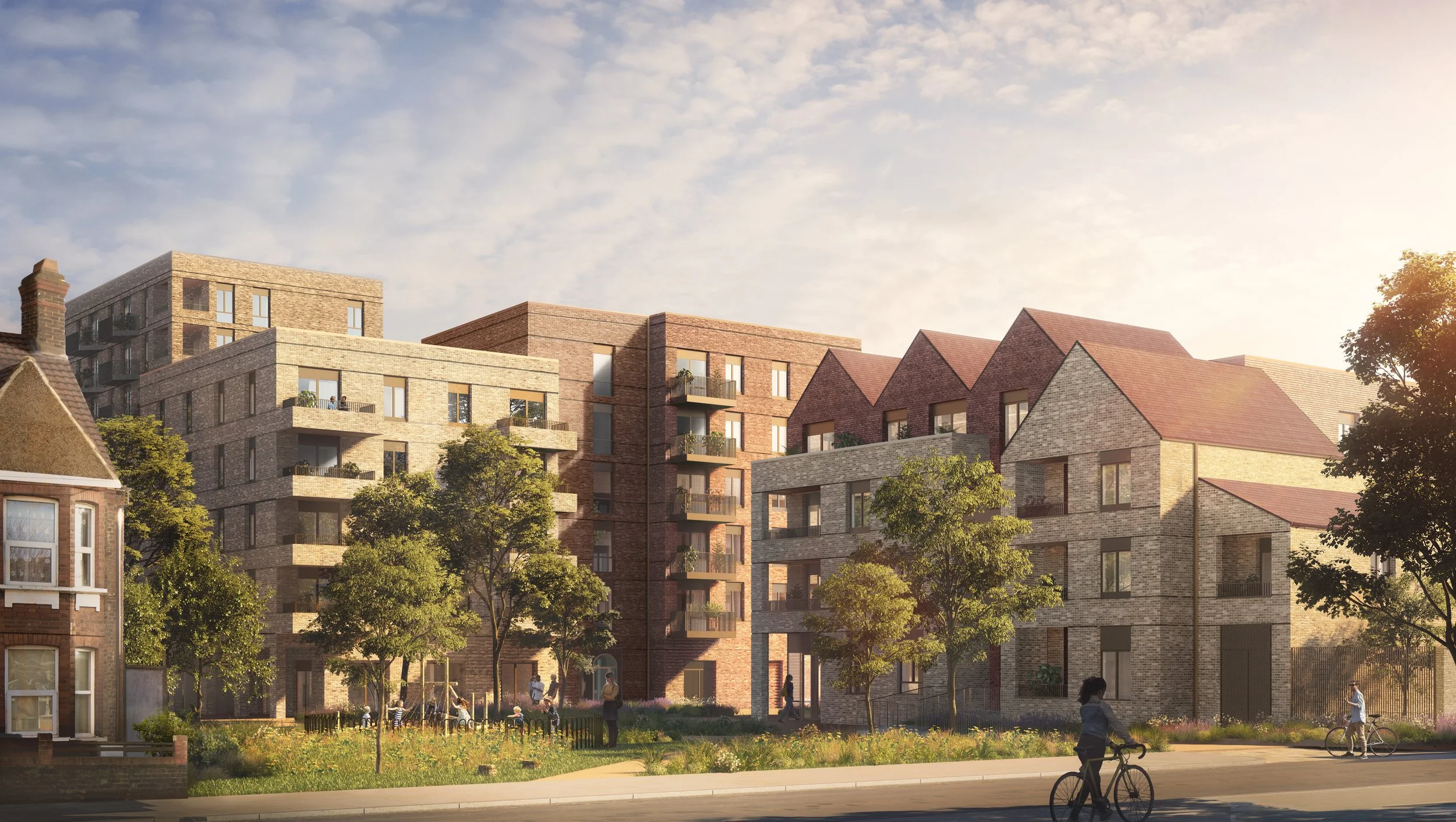
From Clementina Estate
Block A, B and some of C are visible here. It showstoppers how each slowly moves away from the scale and form of the terraces while remaining in keeping with each other.
Inside the lower valley
From a balcony on block B one can see the lower valley and the park beyond. The swales and their water-friendly planting sit against the dark plinths of each building providing privacy. The path is flanked by grass and various elements such as stones designed to encourage play. The only thing breaking through the greeny is the bridge bringing residents to their blocks by spanning the swales.
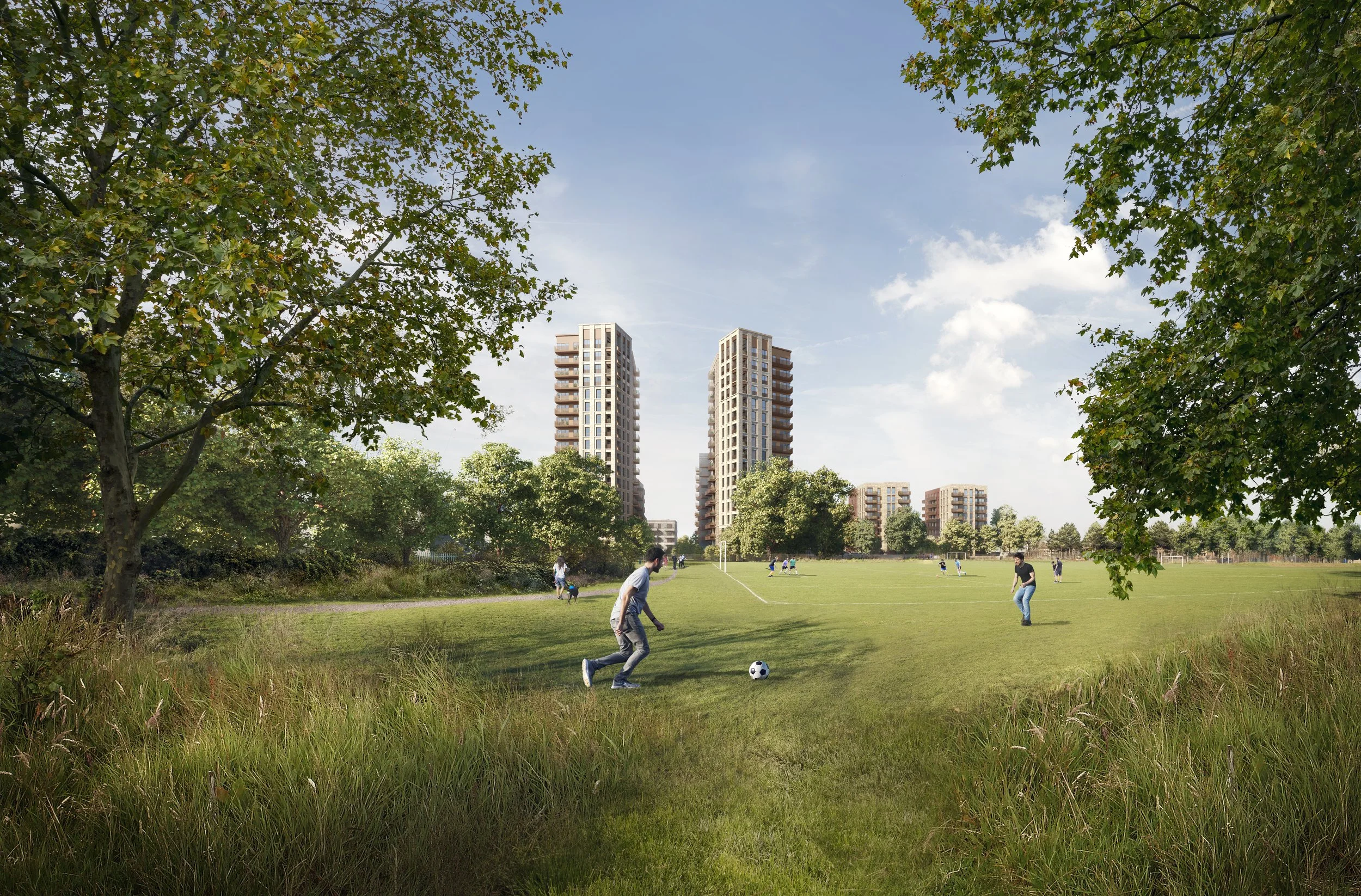
From Leyton Jubilee Park
The tower turn to open up the development to park, welcoming people into the estate. The height of the towers providing each flat views of the adjacent park and the wider development along the Lee valley. Once 3 gasometers were visible from this point, walled off and surrounded by a barren brown field site - soon these towers will replace them and will sit within a permeable and green space.
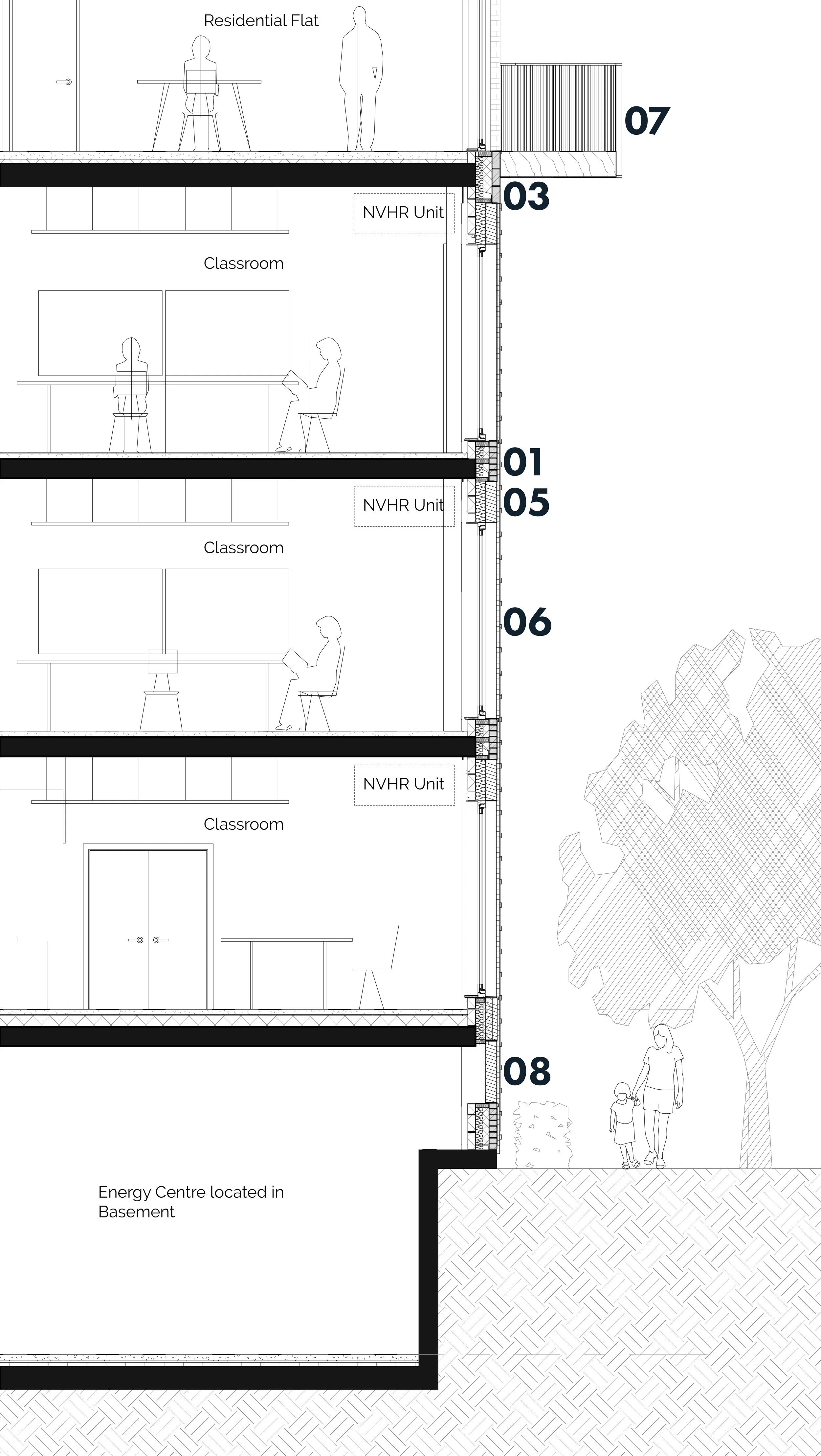
This project was the redesign and delivery of a existing proposal for new academy with houses above. In the aftermath of grenfell, the developer felt the existing design, using a panelling based system, would be too risky to continue with. The school already had a set opening date and, as such, required a quick redesign process. During the bidding, the architecture firm also committed to improving and rationalising some of the more special design elements. The project was initially with a delivery team within the firm and when the redesign started I was brought on to offer more design expertise. During the design stage, I would aid on the overall redesign of the whole scheme as well as on specific elements like the residential and gym entrances. I would also help create the highly detail 3d model that would be used for drawings and later construction. During construction I worked on details for various elements like windows and wall construction. All the diagrams here were created by myself under the requirement for quick turnaround times.
Ark Soane
Local Context
The site is among mostly low-rise buildings of 3-5 stories and set back from the major roads. The first phase provides access to one of these major roads and additional access is provided by route to east of the site that is set to be pedestrianised and renovated as part of the scheme. There is an adjacent green space as well as various sports grounds in the surrounding area. It has good public transport links with plenty of bus routes, two Underground lines and Overground line all within walking distance of site. The site is a great opportunity but is compact and the design we had to work with reflected it.
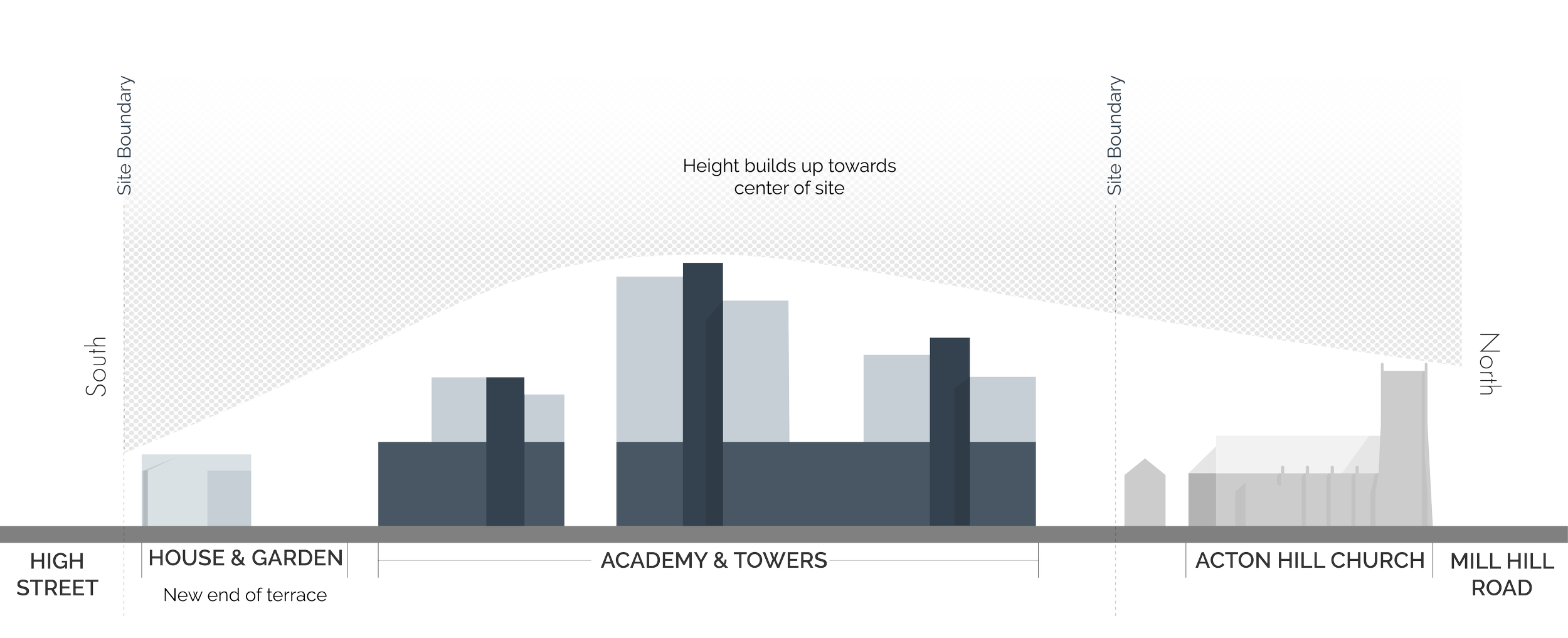
The massing of the scheme would remain the same with our new revision - a series of towers on top of a school with the height stepping up as you moved away from the existing low-rise buildings surrounding the site. The main facade of the school would be from a new pedestrianised road that links Mill Hill Road and High Street and provide access to the adjacent park.
Concept
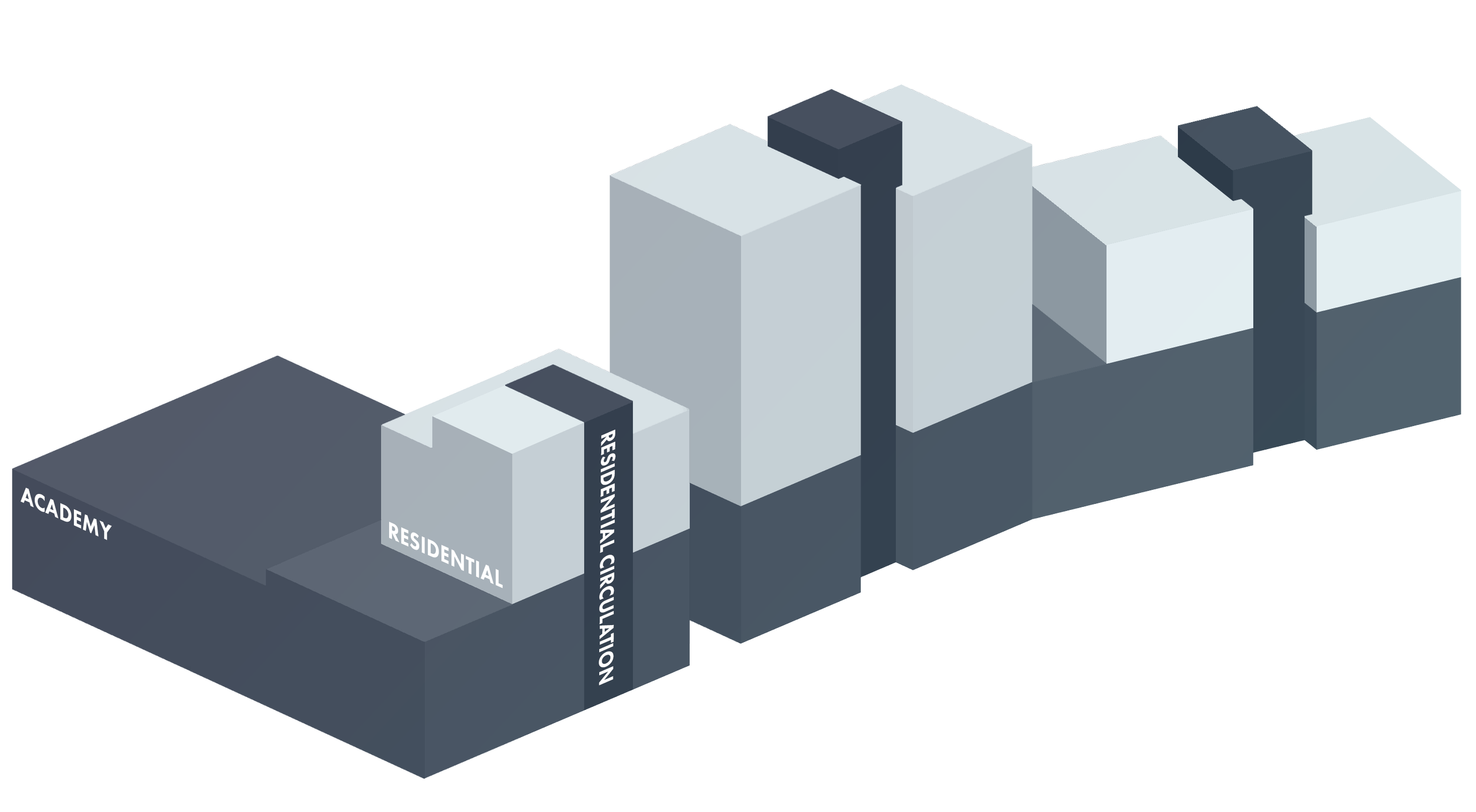
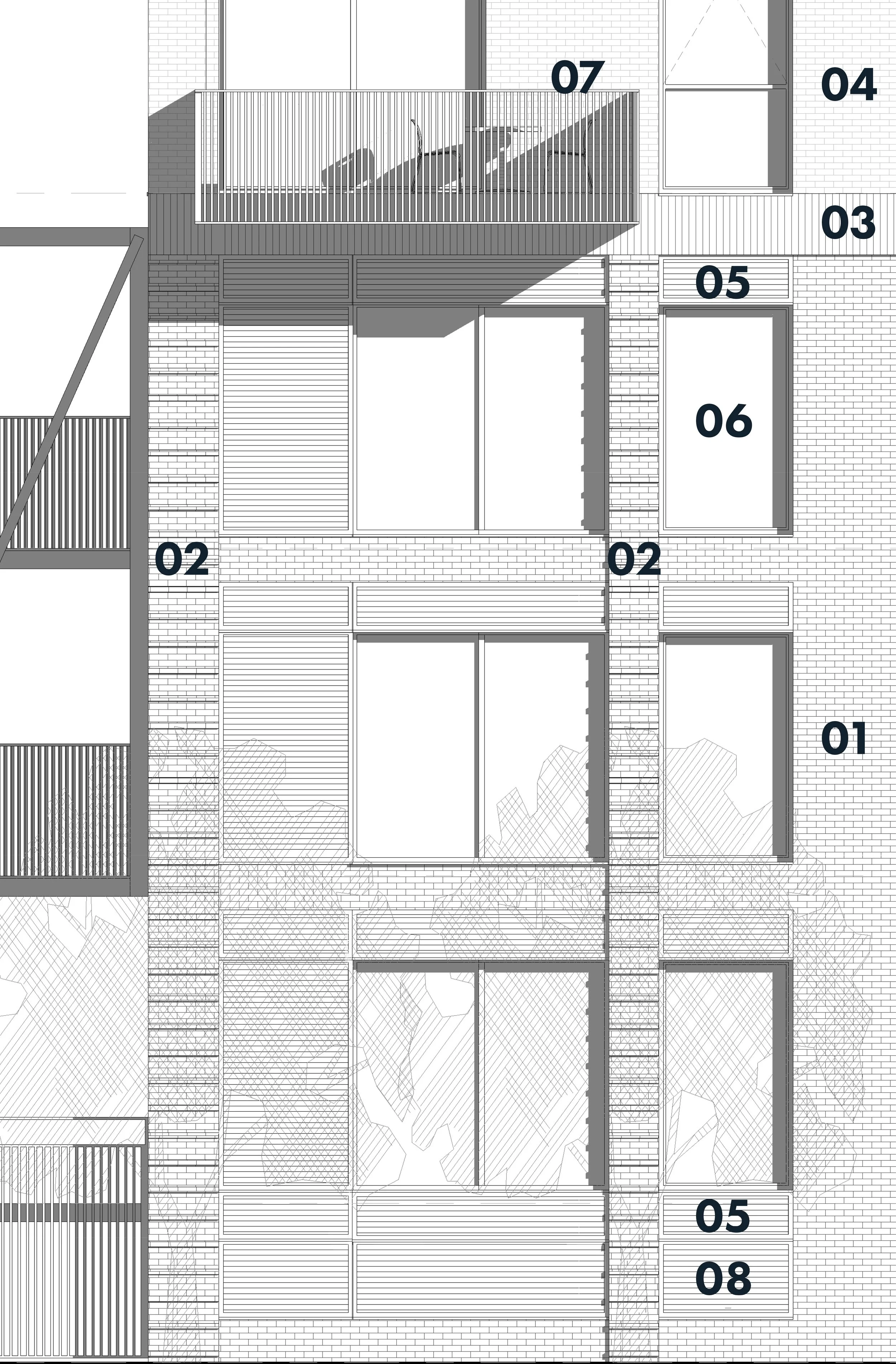
The design needed to change to reflect the new materiality and offered opportunities for expressing internal functions on the facade of the building. This would help make for a design that would better reflect local character and mixed usage of the building. This is expressed here with the decision to split brickwork into 3 distant sections - the isometric indicates how this was broken up.
Elevations
West facade
Rear façade of the building. This area is occupied by the school yard and the residential towers are set back from the school’s façade here.
East facade
The main facade of the school development as seen from the pedestrian road to the front of the building. Here, the residential and school sections of the building are in plane with each other with the change of brick, the use of a different metal colour, and articulation of the brickwork itself indicating a separation between these sections. where the cores are located the lighter brick reaches down to the residential entrances, the latter using the same metal colour as the rest of the rest.
Given the project was predicated on the move to bricks and redesign of the external envelope, one of the most important tasks was the upper and lower facade designs and the logic both would follow. The final design was a balance between elements that made clear the distinction between the academic and residential components while ensuring the whole structure retained harmony and balance
Key
Facing Brickwork - Dark Grey
Facing Brickwork - Dark Grey - Banded
Facing Brickwork - Dark Grey - Triple soldier course
Facing Brickwork - Light Grey - Textured
PPC Metal Louvres
PPC Metal Faced Composite Windows
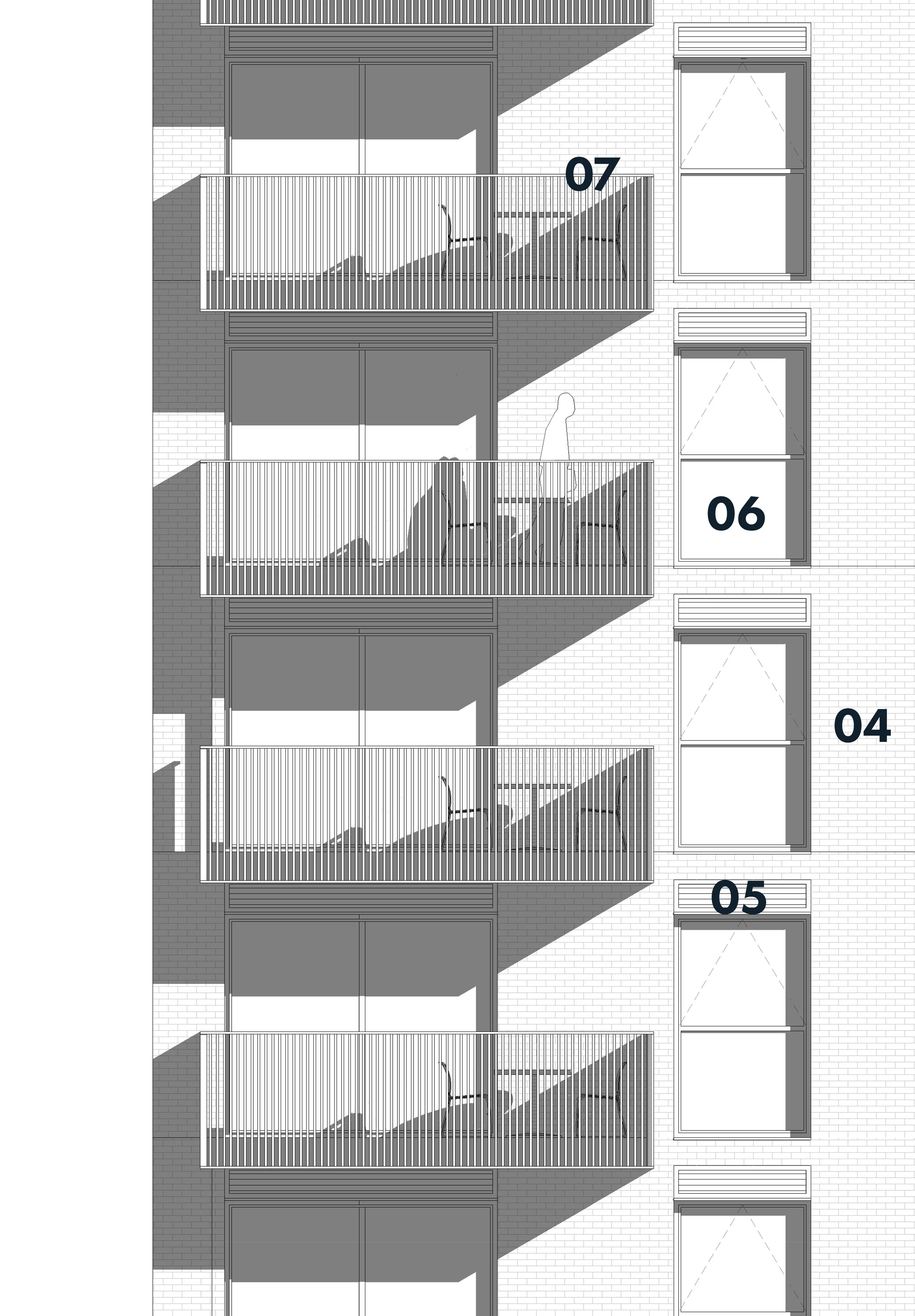
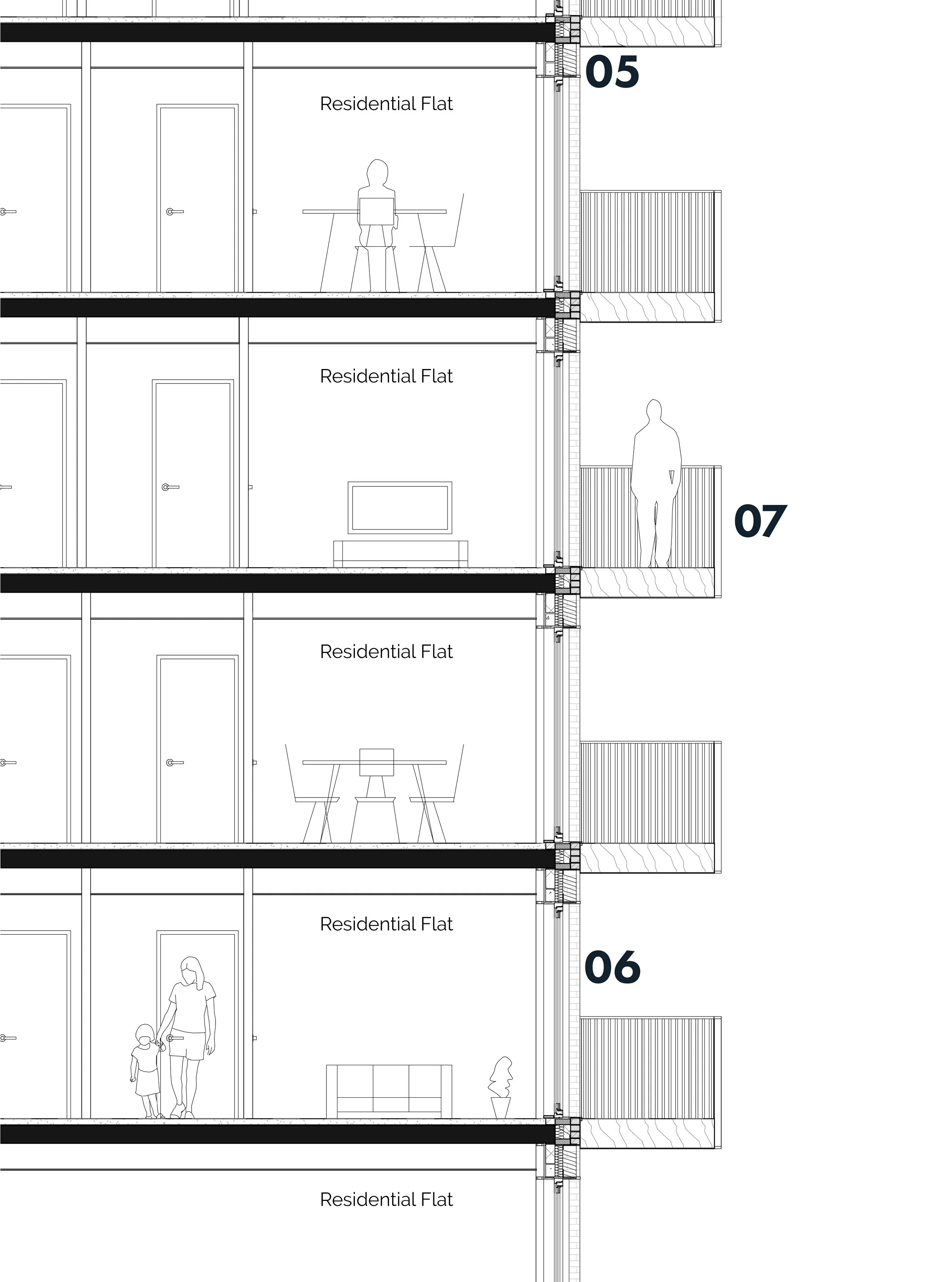
Projecting Residential Balconies
Louvre For Basement Ventilation
Facade Design
Upper Facade
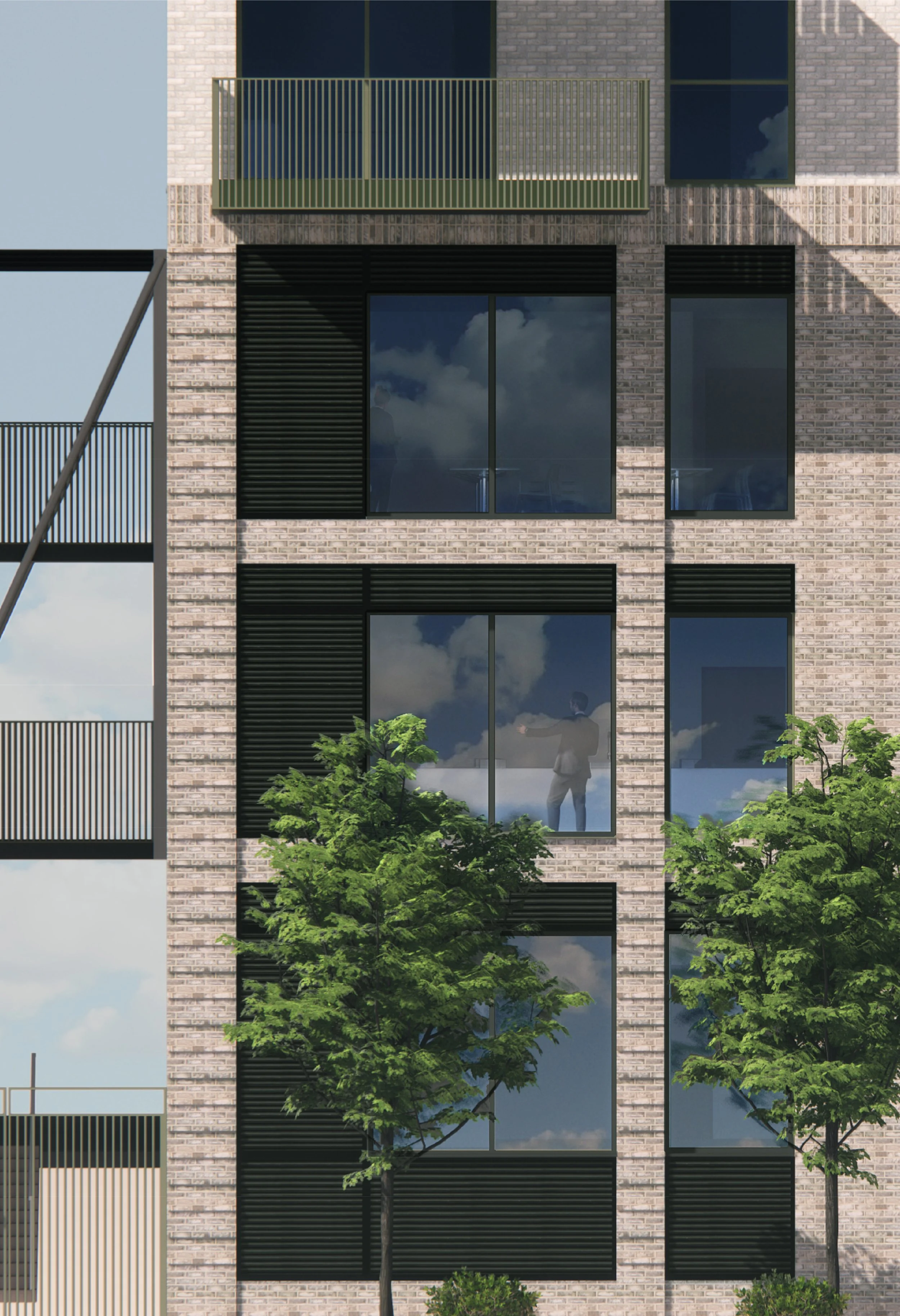
The upper facade has a simple and softer appearance. Using the same light white brick of the existing building on site, the bricks are paired with a soft grey-green colour for the metalwork of the balconies and window frames. The window positions and vents align with the school and carry up the entire structure. In comparison to the lower facade, the brickwork takes up more space and is less ornamented, creating a plainer and more domestic appearance. This suits the residential use within and reduces the visual weight of the upper sections.
Lower Facade
The lower facade is darker and more detailed. To create a colonnade the brickwork is varied, the top is a triple soldier course of bricks and the columns are shown with a projecting course every 4th course. Within the colonnade, the brickwork face is set back with the louvre panels and window frames only reaching as far as this brickwork. The result is a subtle colonnade giving a sense of order to the academy. It is carried around all the various facades of the school but is most noticeable on the front and rear. The sense of order fits the school as a public institution and provides a visually strong foundation for the housing above. Practically, it also makes sense to contain the more detailed brickwork within the base of the structure as this is where it will be most visible.
Design Elements
As part of the redesign of the façade, we had to offer new solutions to various features on the original proposal. In this process, we aimed to deliver better design elements. Coming from a design background, I often led this process on the team, with the creation of various design options that senior staff could comment on before I would create the final design.
All the renders were created by myself and all diagrams were either produced by me or in conjunction with me.
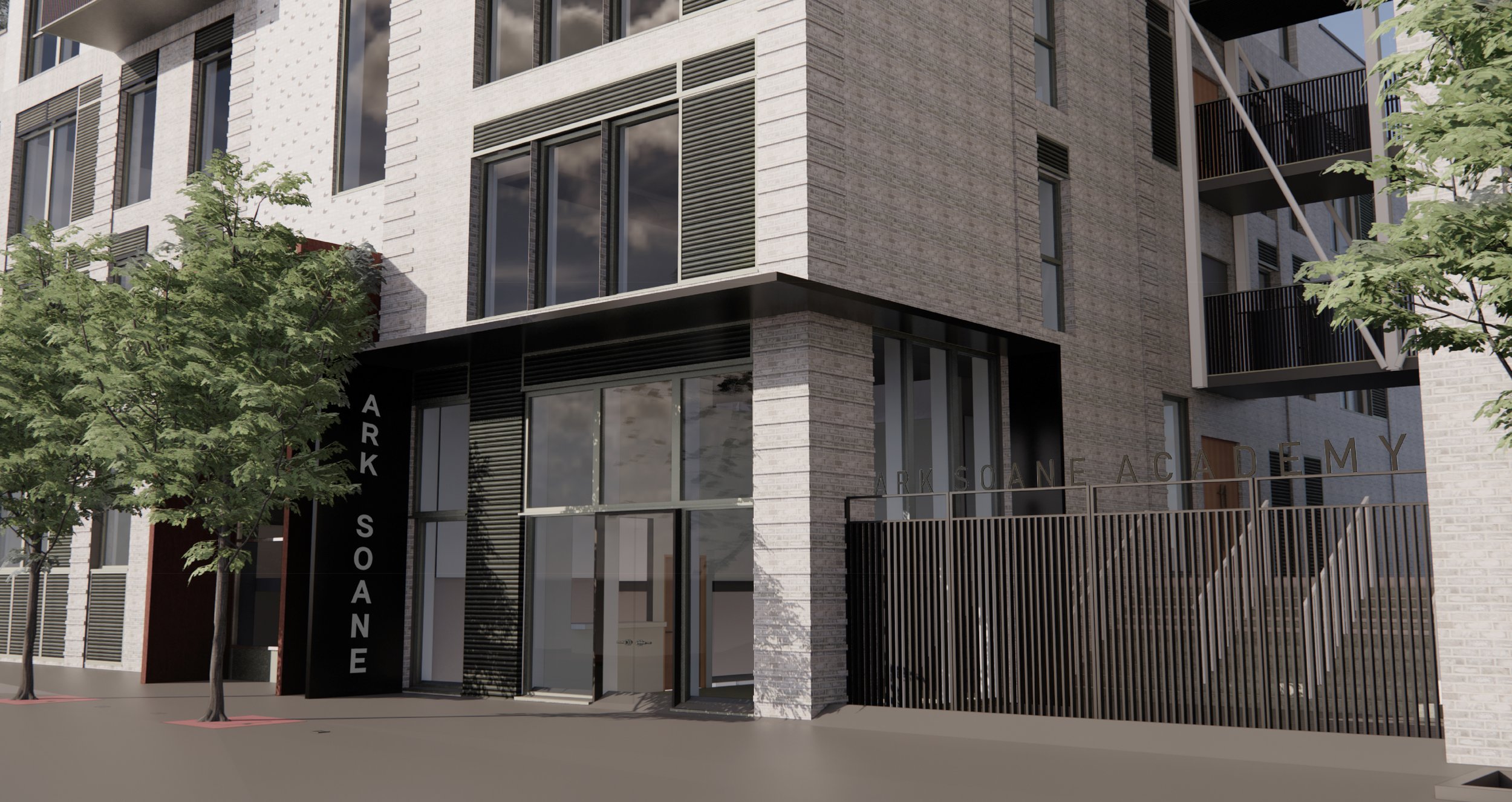
Sports Entrance
The new design wraps the canopy around the corner with glazing and metal louvres within. The school name could then be placed on both the gate and the canopy. Although I created design options and produced the final planning submissions images, the design was developed and final option selected working with senior members of the design team.
1. Facing Brickwork - Dark Grey
2. Facing Brickwork - Dark Grey - Banded
3. Facing Brickwork - Light Grey
5. PPC Metal Louvres
6. PPC Metal Faced Composite Window
7. Projecting Residential Balconies
8. School Gates to Pupil and Staff Entrance - Painted Metal Flats With Sports Graphics
9. Platform Lift
10. Reception desk / Entrance
11. Intercom
12. Entrance Canopy With Inset Lights Wrapping Around Entrance Corner
13. Push Pad for Power Assisted Door
15. External Walls of Platform Lift Clad to Match Adjacent External Building Wall
Residential Entrance
The original residential entrances were undeliverable with too little space and too little thought given to drainage and construction. The new design proposed would carry patterned brickwork into the entrance space with down lighters, This would be combined with corten steel with important elements like mail boxes and way finding highlighted in the green-grey metal work selected by the senior designers.
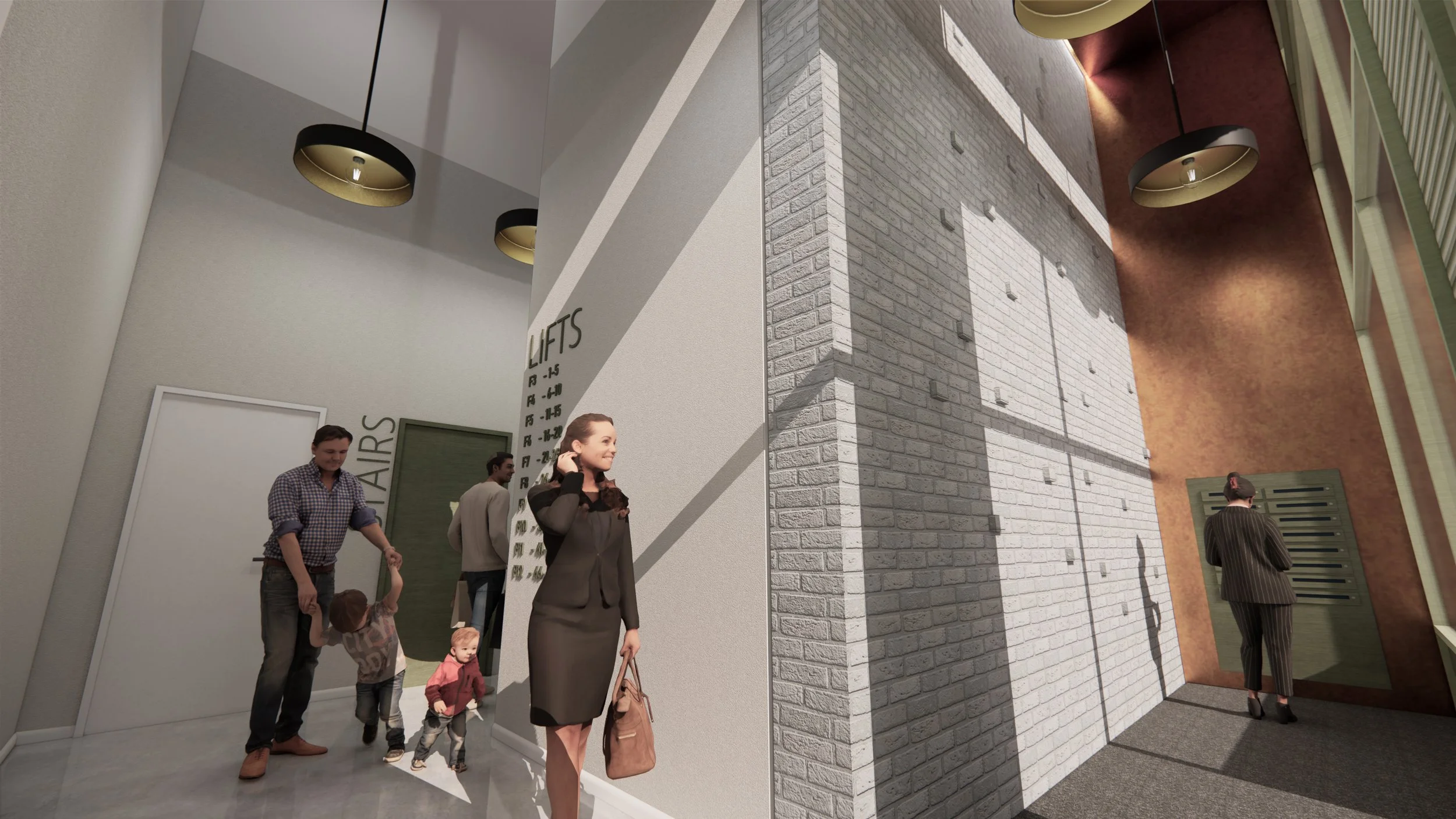
The images show nicely how the variation in the brickwork and metal work colours indicate and reflect the different uses within the building
I worked in conjunction with an outside firm that produces high-quality renders. Although photo-realistic renders are something I have done before professional and at university, working with a firm dedicated to the quick production of them made sense for the project. Management of the model provided to the firm and views selected were done by myself.
Render