Ark Soane
Following Grenfell, a proposal by another architecture firm for 100 homes on top of a school had to be redesigned with bricks instead of a panel system. Pollard Thomas Edwards, who had already been hired to deliver the previous design, won a competition to do this redesign and I was brought on to the team for my design experience and went on to aid with the new planning proposal and following delivery stages.
This was considered the second phase of the project with the development of phase 1, one smaller building for the academy, constructed primarily in a light white brick, already proceeding. This reflected the fact that the project had a strict timeline with the requirement to get revised planning and construction underway as fast as possible to fit within the academic timetable - the school would have to be constructed by the start of the next academic year.
Context
Local Context
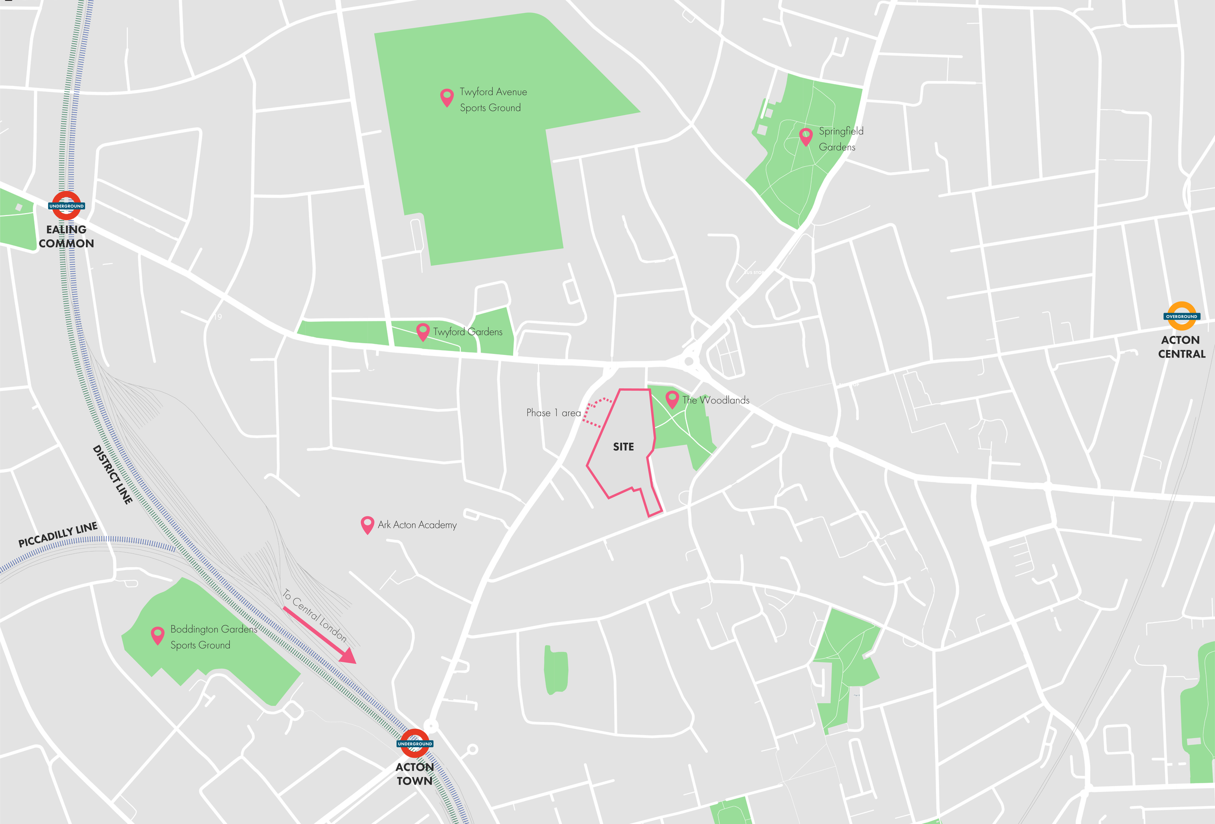
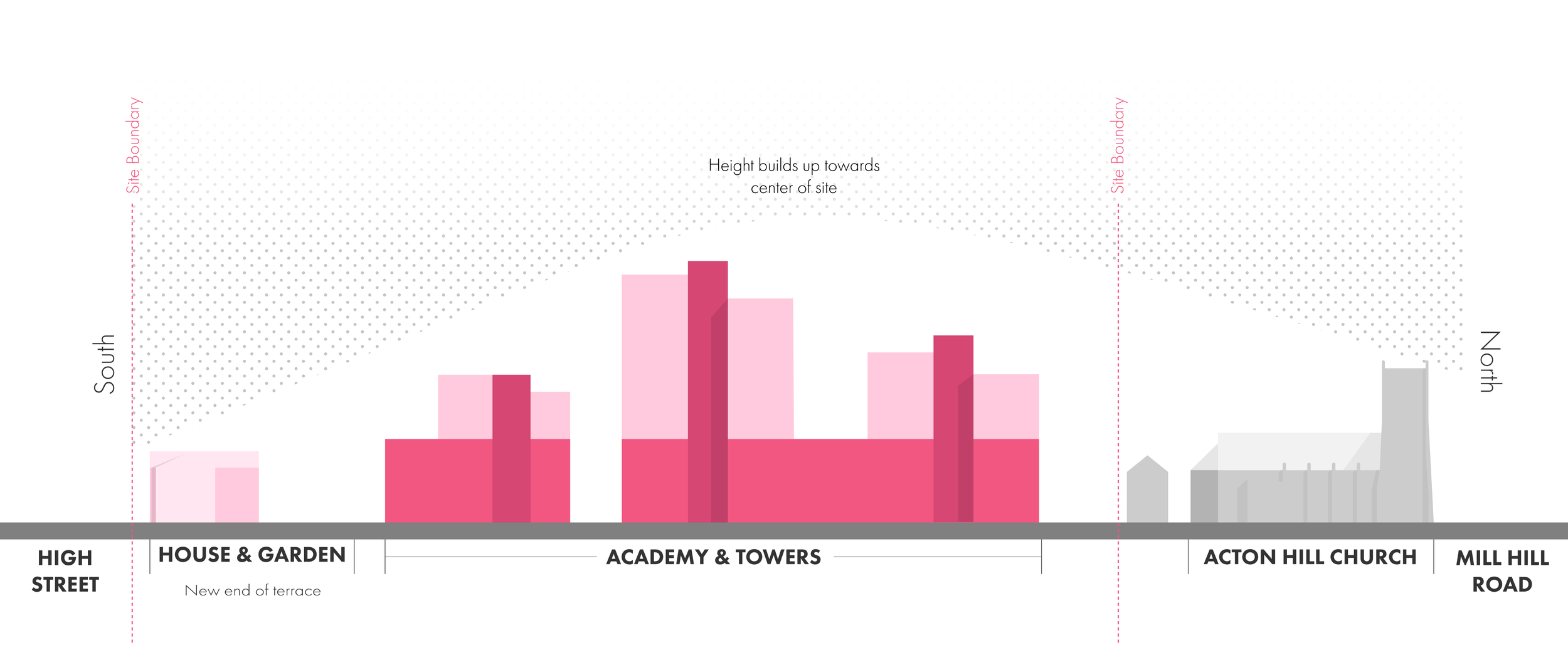
The site is among mostly low-rise buildings of 3-5 stories and set back from the major roads. The first phase provides access to one of these major roads and additional access is provided by route to east of the site that is set to be pedestrianised and renovated as part of the scheme. There is an adjacent green space as well as various sports grounds in the surrounding area. It has good public transport links with plenty of bus routes, two Underground lines and Overground line all within walking distance of site. The site is a great opportunity but is compact and the design we had to work with reflected it.
Concept
The concept behind the scheme which would remain the same with our new revision was a series of towers on top of a school with the height stepping up as you moved away from the existing low-rise buildings surrounding the site. The main perceptive of the school would be from a new pedestrianised road that links Mill Hill Road and High Street and provide access to the adjacent park.
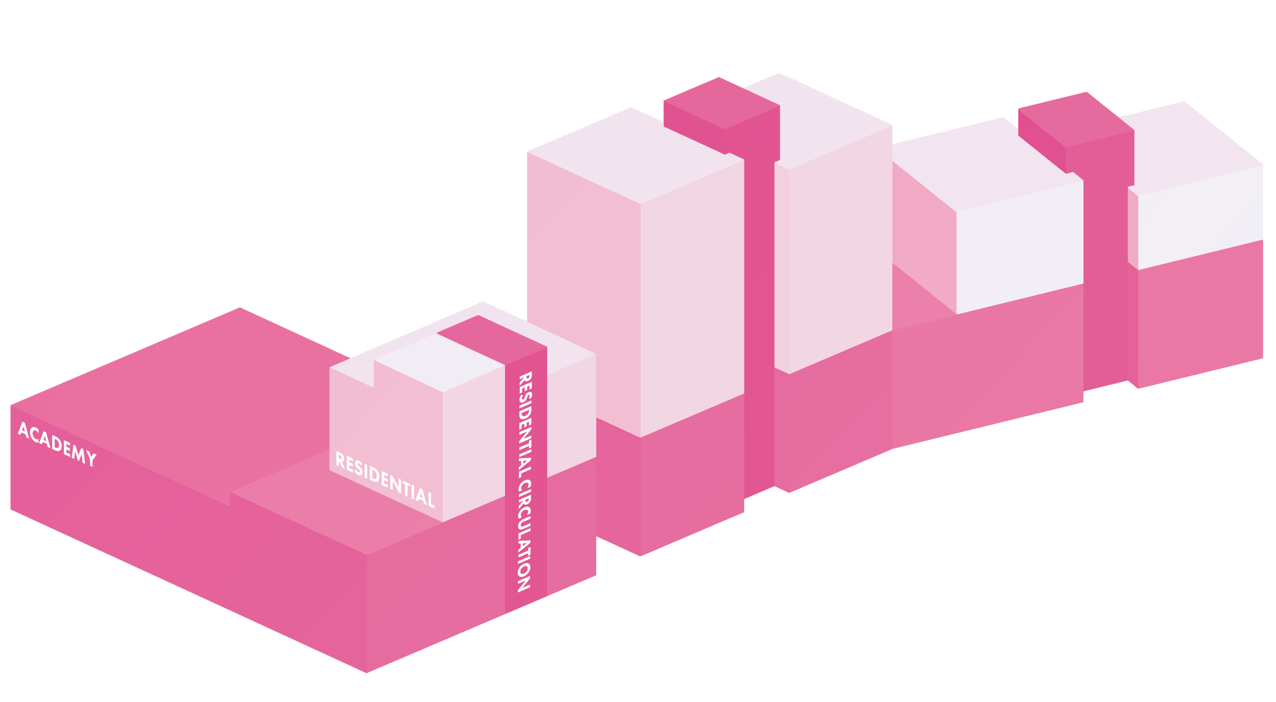
With the move to brick the design needed to change to reflect the new materiality and offered opportunities for expressing internal functions on the facade of the building. This would help make for a design that would better reflect local character and mixed usage of the building. This is expressed here with the decision to split brickwork into 3 distant sections — the below isometric indicating how it breaks up.
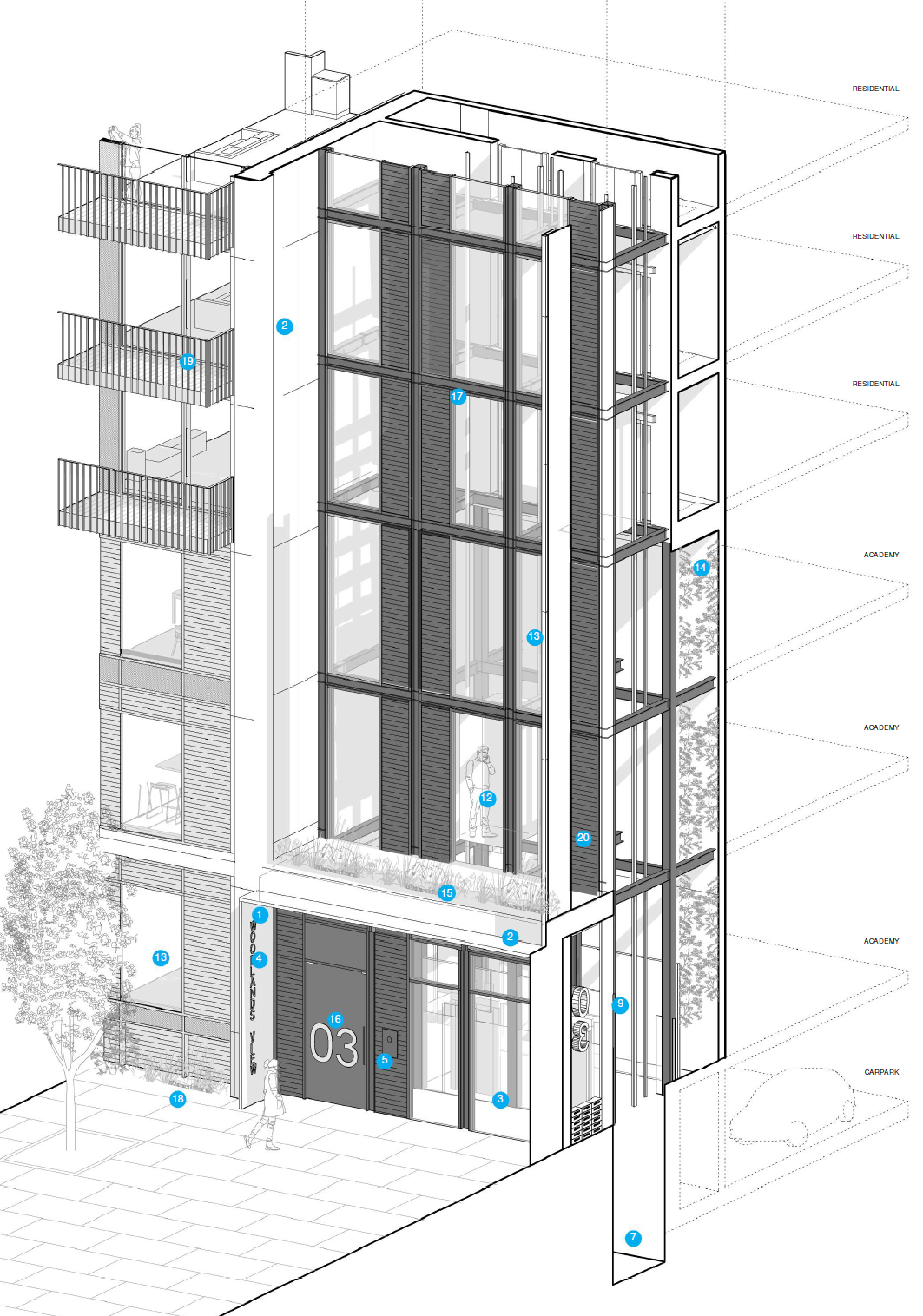
Façade Design
Given the project was predicated on the move to bricks and redesign of the external envelope, one of the most important tasks was the upper and lower facade designs and the logic both would follow. The final design was a balance between elements that made clear the distinction between the academic and residential components while ensuring the whole structure retained harmony and balance
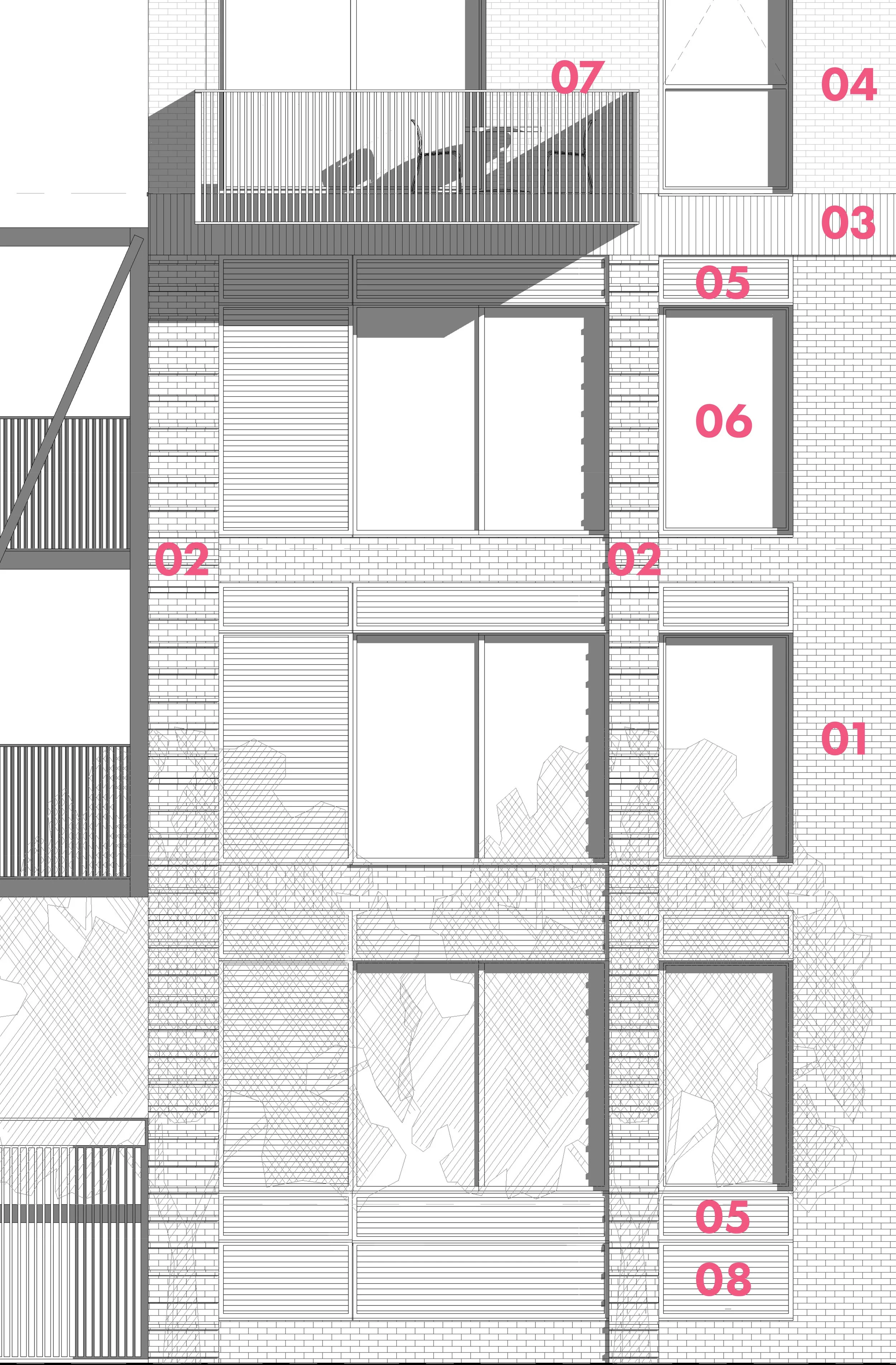
Key
Facing Brickwork - Dark Grey
Facing Brickwork - Dark Grey - Banded
Facing Brickwork - Dark Grey - Triple soldier course
Facing Brickwork - Light Grey - Textured
PPC Metal Louvres
PPC Metal Faced Composite Windows
Projecting Residential Balconies
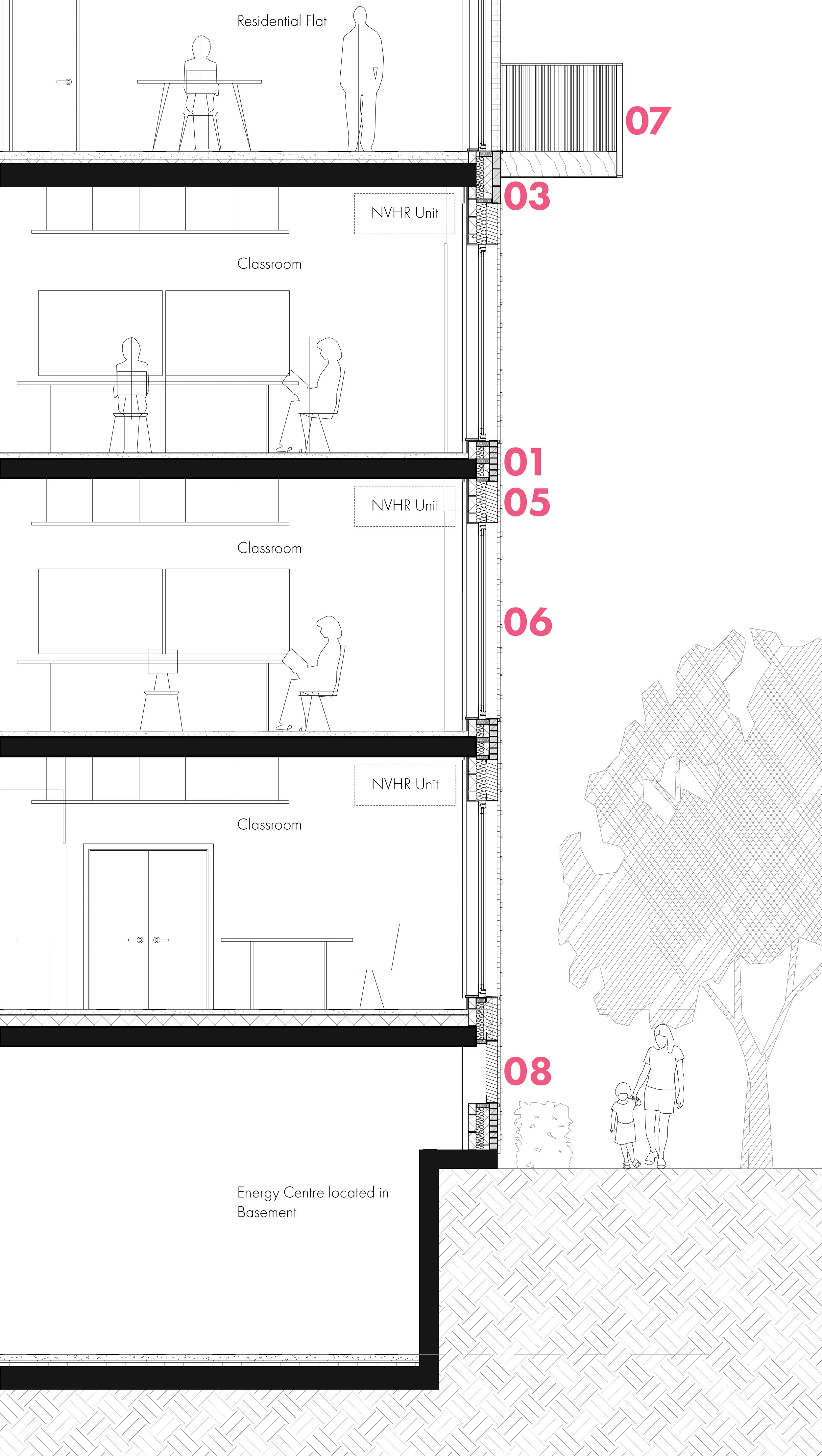
Louvre For Basement Ventilation
Upper facade design
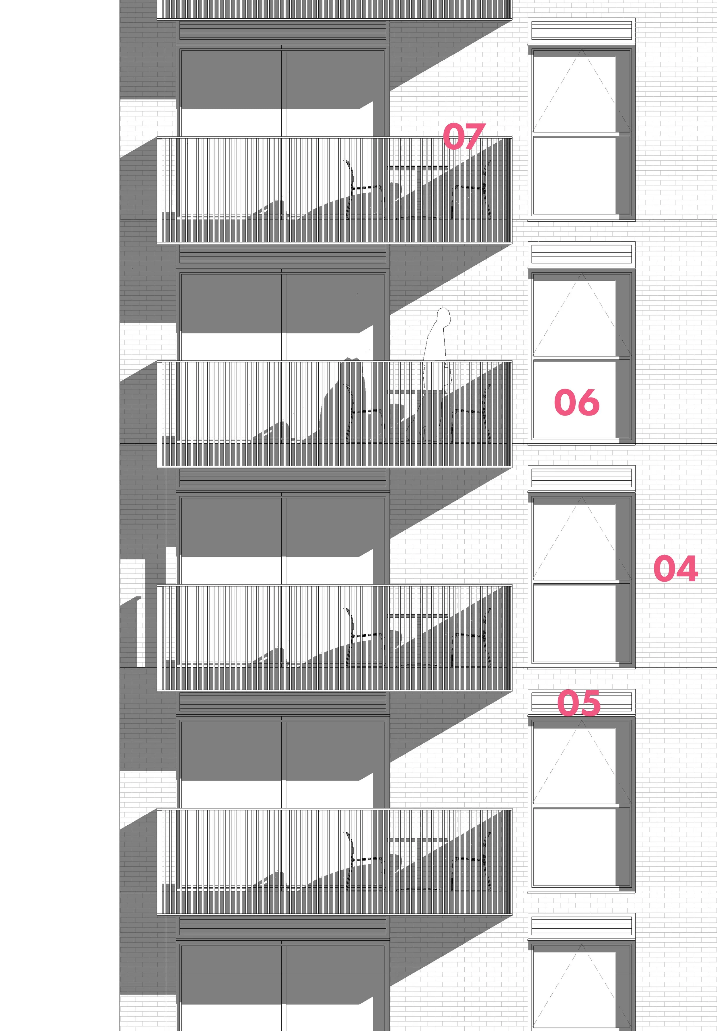
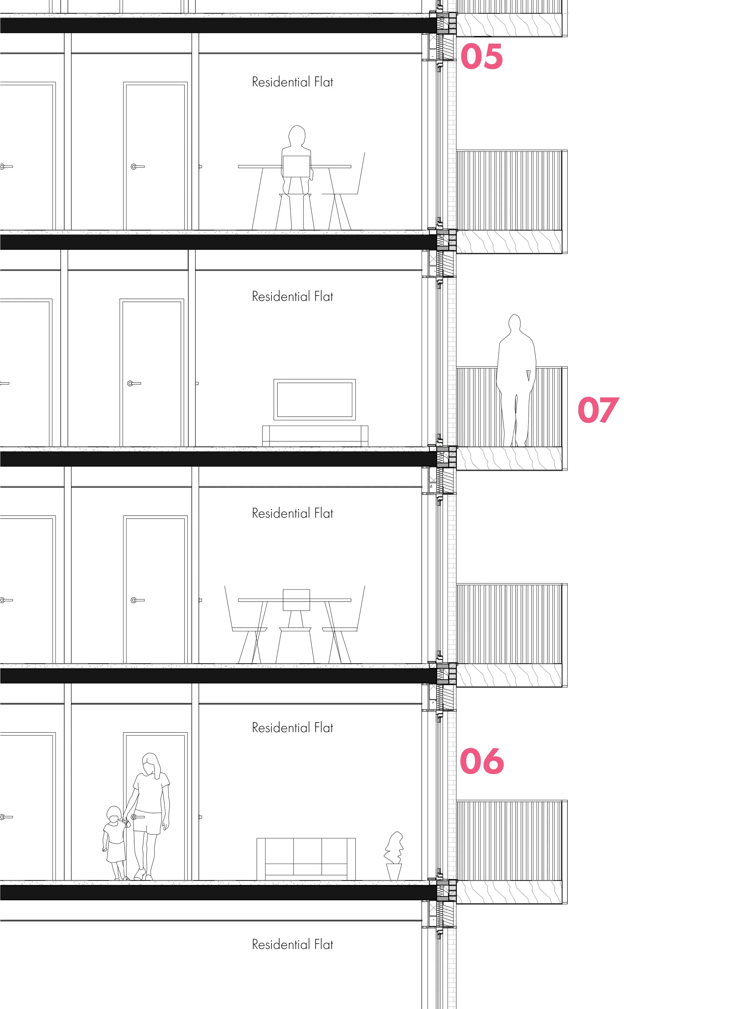
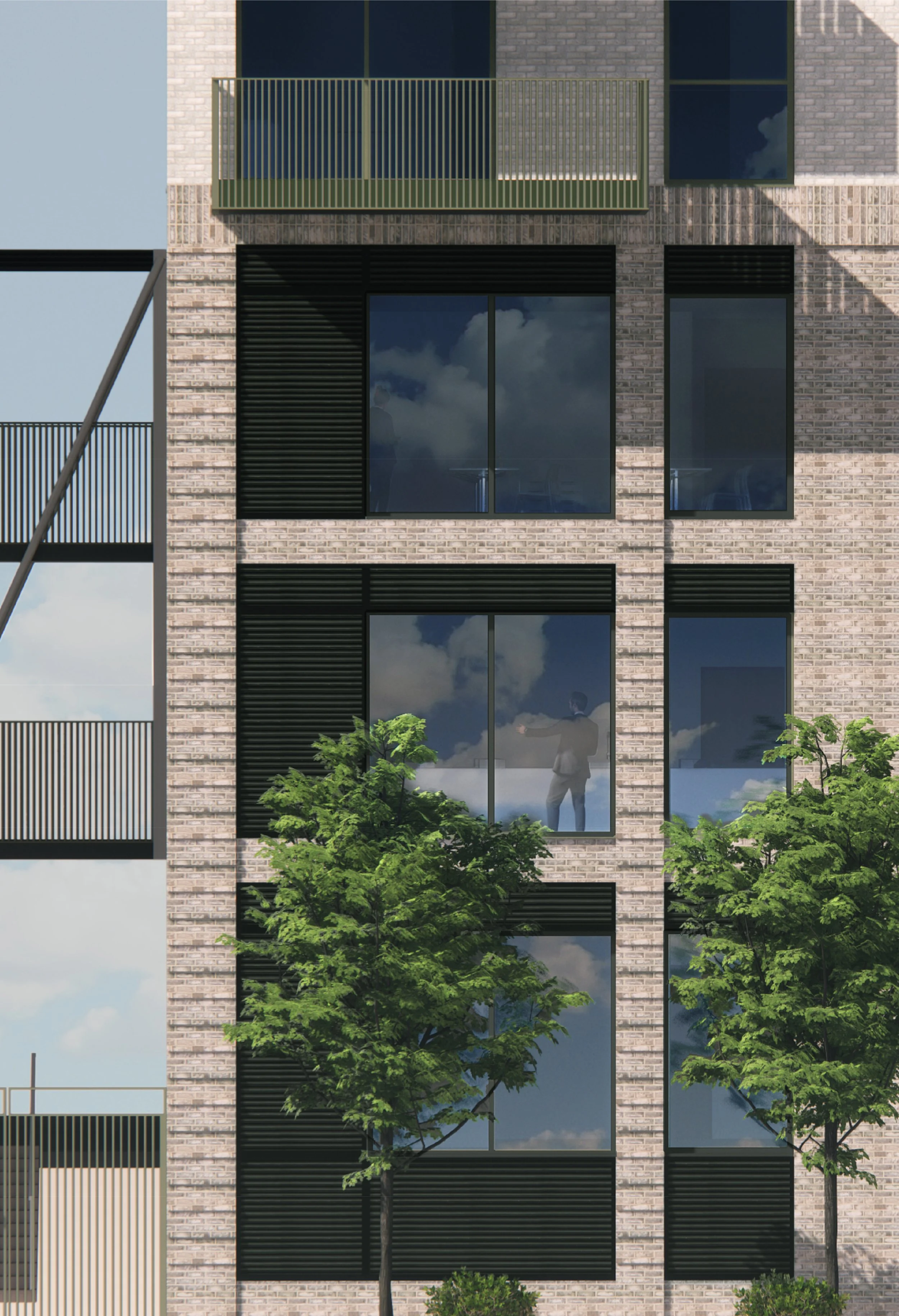
The upper facade has a simple and softer appearance. Using the same light white brick of the existing building on site, the bricks are paired with a soft grey-green colour for the metalwork of the balconies and window frames. The window positions and vents align with the school and carry up the entire structure. In comparison to the lower facade, the brickwork takes up more space and is less ornamented, creating a plainer and more domestic appearance. This suits the residential use within and reduces the visual weight of the upper sections.
Lower façade design
The lower facade is darker and more detailed. To create a colonnade the brickwork is varied, the top is a triple soldier course of bricks and the columns are shown with a projecting course every 4th course. Within the colonnade, the brickwork face is set back with the louvre panels and window frames only reaching as far as this brickwork. The result is a subtle colonnade giving a sense of order to the academy. It is carried around all the various facades of the school but is most noticeable on the front and rear. The sense of order fits the school as a public institution and provides a visually strong foundation for the housing above. Practically, it also makes sense to contain the more detailed brickwork within the base of the structure as this is where it will be most visible.
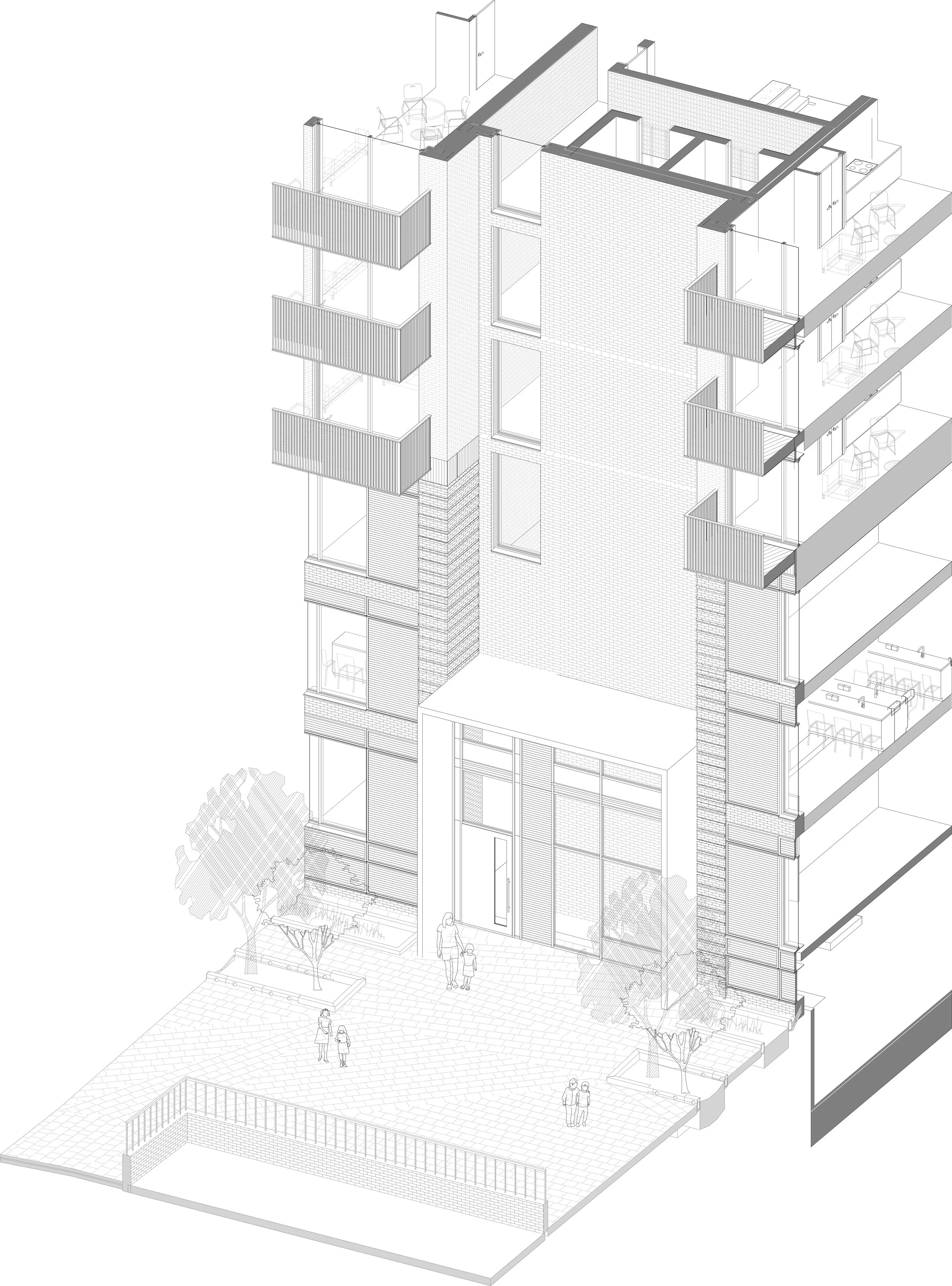
Elevations
West facade
Rear façade of the building. This area is occupied by the school yard and the residential towers are set back from the school’s façade here.
East facade
The main facade of the school development as seen from the pedestrian road to the front of the building. Here, the residential and school sections of the building are in plane with each other with the change of brick, the use of a different metal colour, and articulation of the brickwork itself indicating a separation between these sections. where the cores are located the lighter brick reaches down to the residential entrances, the latter using the same metal colour as the rest of the rest.
Design Elements
As part of the redesign of the façade, we had to offer new solutions to various features on the original proposal. In this process, we aimed to deliver better design elements. Coming from a design background, I often led this process on the team, with the creation of various design options that senior staff could comment on before I would create the final design.
All the renders were created by myself and all diagrams were either produced by me or in conjunction with me.
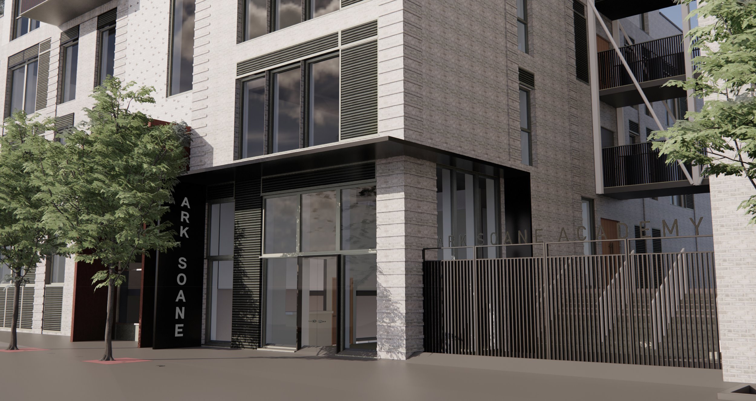
Sports centre / community entrance
In the original proposal, this entrance was articulated identically to the residential entrances. Here, the intention was to bring greater prominence to the entrance and tie it into the school more clearly. The colour distinction between the metalwork of school and residential sections helped established the difference and by carrying the canopy around the edge of the building to encompass the entire reception we create a clearly visible entrance.
Elevation
Plan
Isometric
Key
Facing Brickwork - Dark Grey
Facing Brickwork - Dark Grey - Banded
Facing Brickwork - Light Grey
Facing Brickwork - Light Grey - Textured
PPC Metal Louvres
PPC Metal Faced Composite Window
Projecting Residential Balconies
School Gates to Pupil and Staff Entrance - Painted Metal Flats With Sports Graphics
Platform Lift
Reception desk / Entrance
Intercom
Entrance Canopy With Inset Lights Wrapping Around Entrance Corner
Push Pad for Power Assisted Door
Open Air External Glazed Platform Lift (Controlled Access)
External Walls of Platform Lift Clad to Match Adjacent External Building Wall
Render
Residential entrance
This required the largest redesign of any of these design elements given the previous cores were exposed glass boxes that were unfeasible and underdeveloped. The client wanted a simpler design that still delivered a distinct and high-quality entrance
The previous design lacked several considerations and was not practical for a building of this price range. An interior plant wall, exposed lift shafts, and huge void spaces made for an excess design. It also lacked some practical design decisions. The small roof gardens on the canopy had no clear way to drain or access it and had an insufficient floor build-up to create it. The 3-floor lobby space had no high-level access required for fire safety.
The new design kept the important elements like views from each floor’s lift lobby and improved others like a taller and buildable canopy. To mark the core a pattern of extruded bricks was selected and it continues down into the lobby space.
Previous Design
New Proposal
Below is a render to indicate how the lobby space might look. The brickwork carries down into the interior space and downlights mounted in the canopy are used to highlight it. As well as this one can see how the taller canopy section makes for an impressive space without the need for the green wall and transparent lift shafts. There is also some indication of how the light green metal colour can be carried within the structure to create a clear identity.
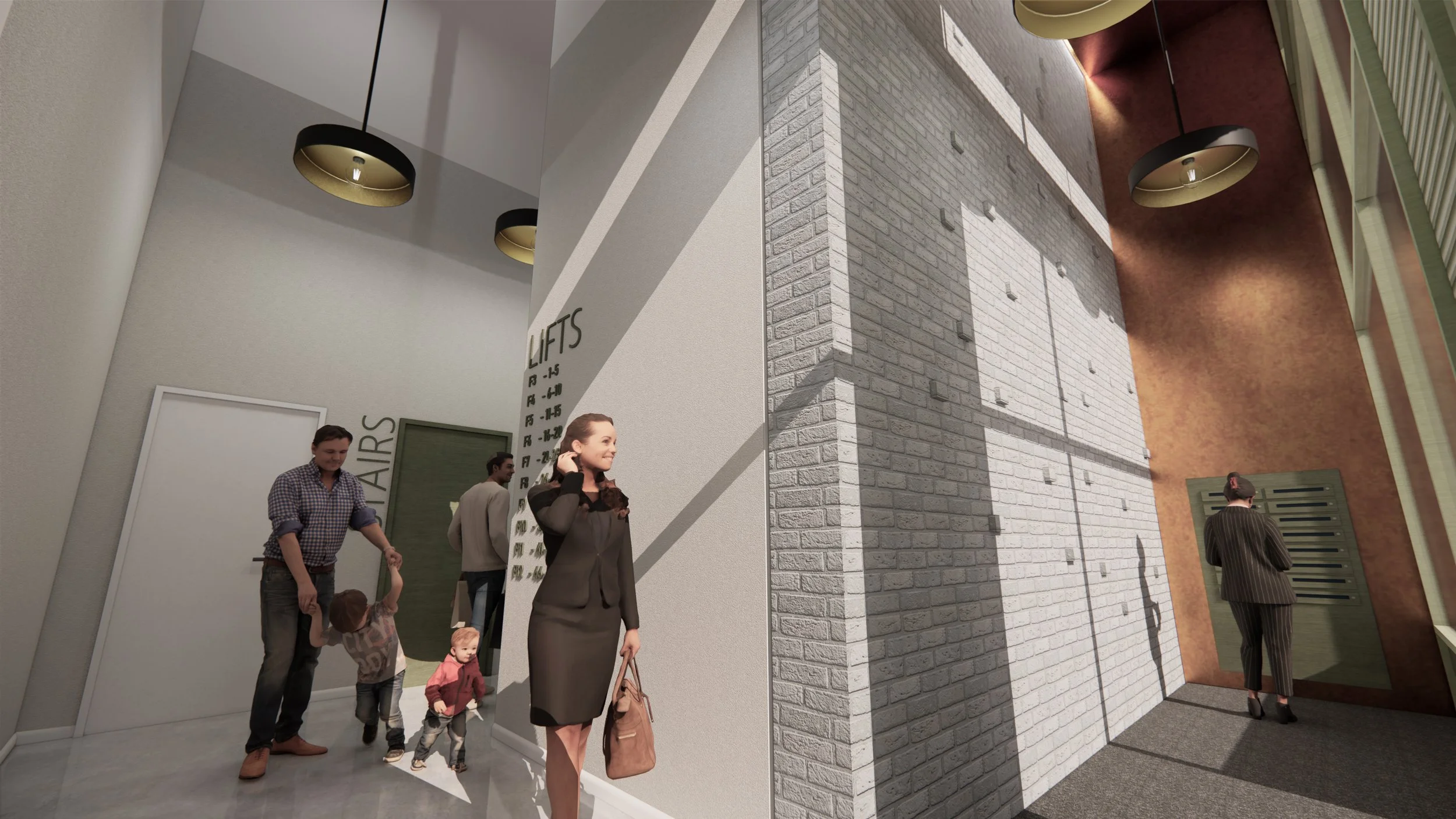
Entrance Lobby Render
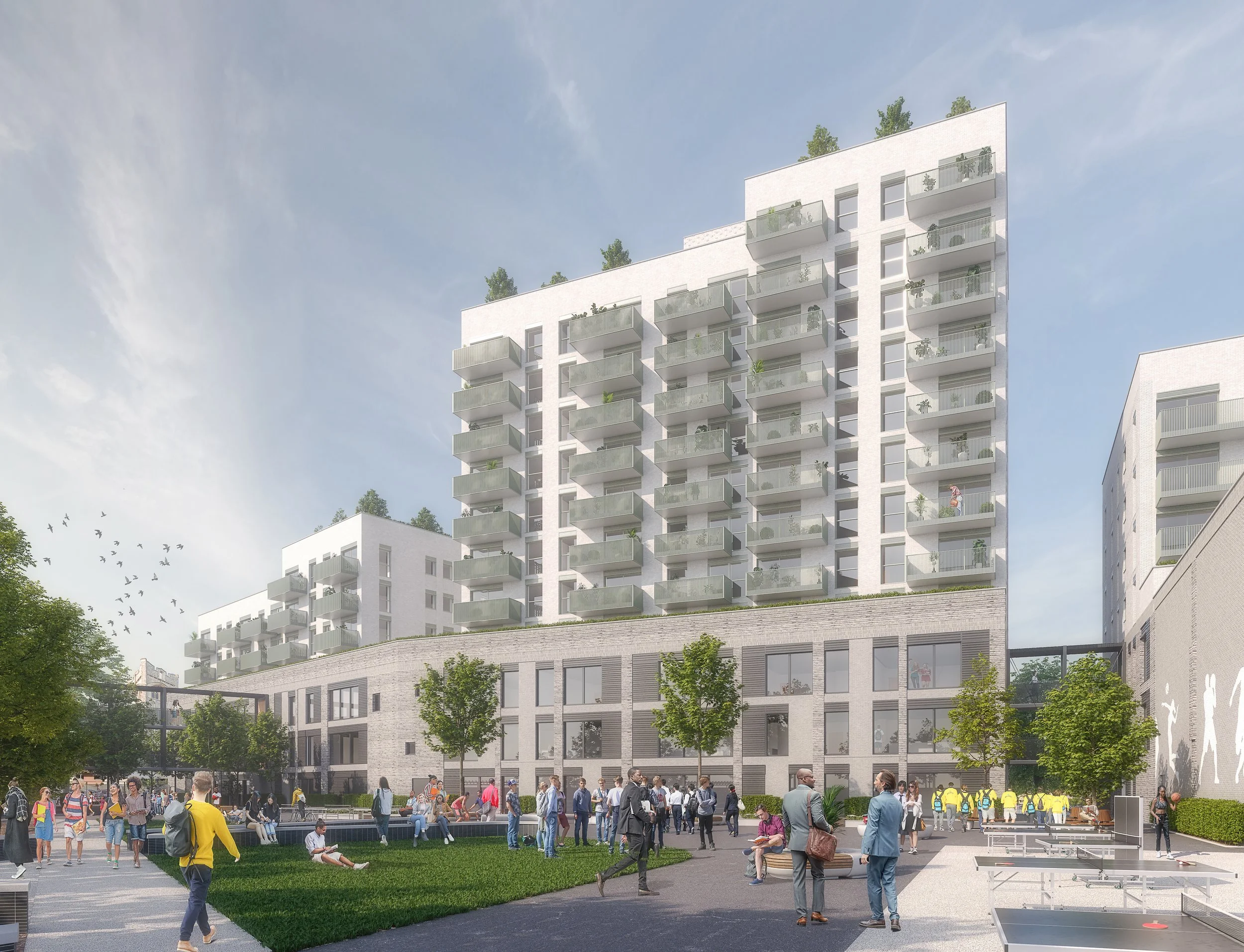
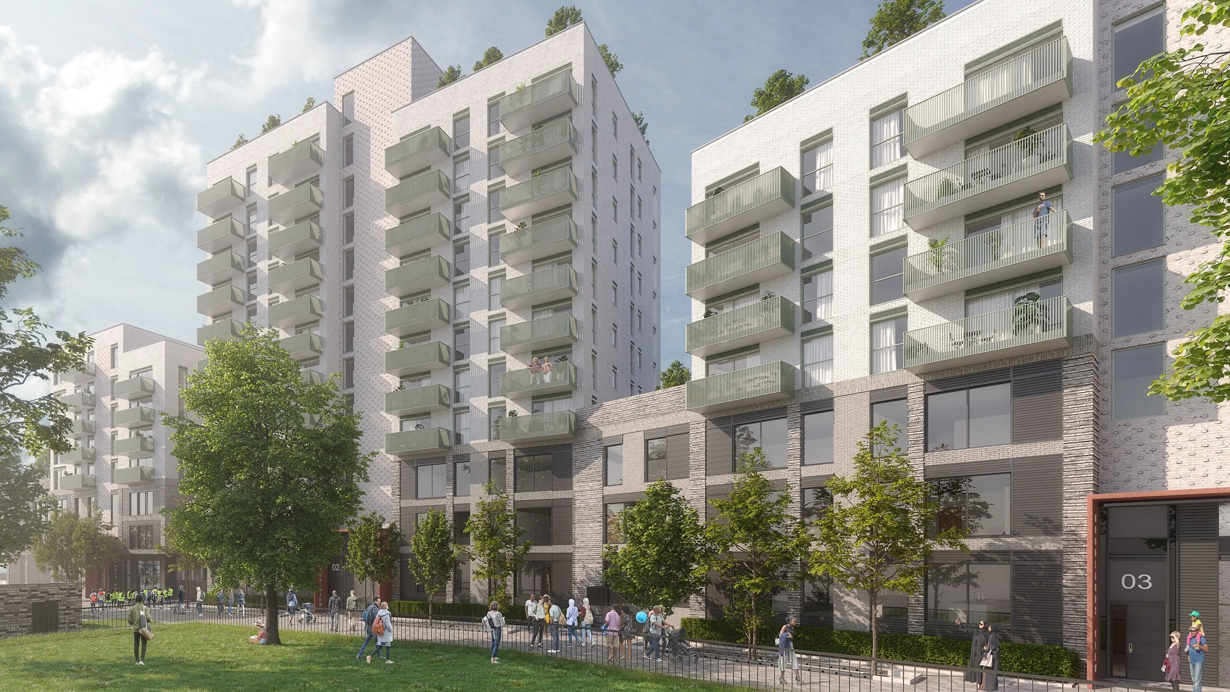
Renders
The images show nicely how the variation in the brickwork and metal work colours indicate and reflect the different uses within the building
I worked in conjunction with an outside firm that produces high-quality renders. Although photo-realistic renders are something I have done before professional and at university, working with a firm dedicated to the quick production of them made sense for the project. Management of the model provided to the firm and views selected were done by myself.