Interior Design
Showing two different renovation projects designed for clients, this explores both the design work and some of the problem-solving required to make both projects work.
Photoshop
Enscape
AfterEffects
Project Management
Sketchup
1.
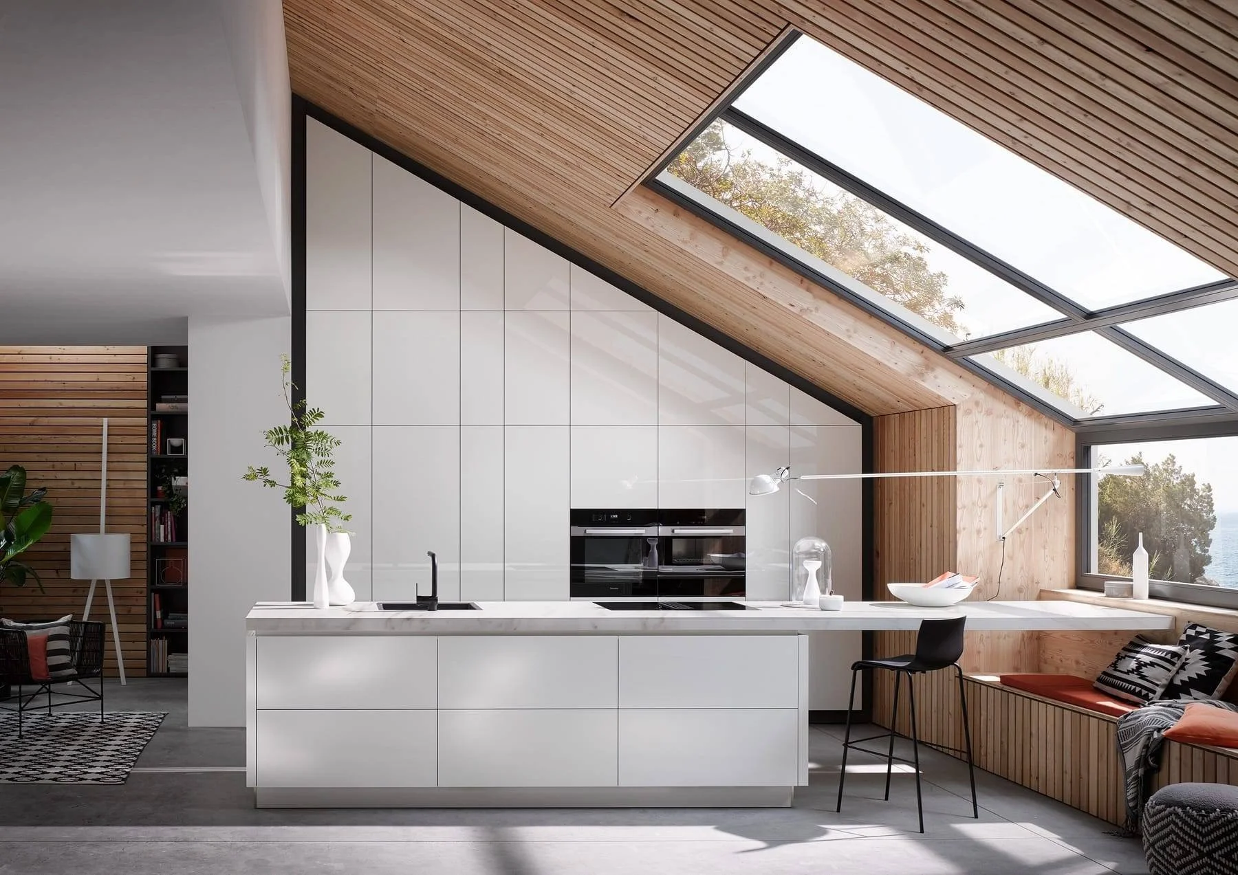
Kitchen Redesign
Working for clients that wanted a high-end appearance on a budget, the design had to allow for continuous operation of the kitchen during the renovation. The client had a strong preference for white and anything that reduced clutter and reduced clean-up.
2.
House Renovation
This is an ongoing project working with a couple that recently bought their first come. Clients were unsure how best to utilise space and what changes would enable the greatest transformation for the price. They were keen to make bolder decisions about colours.
Brief
The clients were looking for a high-end kitchen within a tight budget. The property, a category B listed 3-story Georgian townhouse in Aberdeen, had a dated second-hand kitchen installed by previous owners. Although it functioned fine, its quirks and overall appearance detracted from the property's grandeur. The clients hoped that a large high-end kitchen would help sell the property in the future and compensate for the lack of built-in storage elsewhere in the home.
The clients provided a list of desires, influenced heavily by their previous kitchens:
White units
Clean & modern appearance
Easy to clean
Real stone worktops
Pull-out larders
A large amount of storage
Glass backsplash
Retaining existing floors, lights wiring and ceiling
Minimal disruption
Minimal open storage
Rationalise the various quirks within the room
We explored various precedents together to find elements the client liked and the overall impression we wanted for the kitchen.
Kitchen Redesign
As well as these listed brief items, I also tried to explore some important elements given the focus on resale value. I suggested a boiling water tap and clients seemed enthusiastic to get a combi-oven to aid the high-end appearance of the kitchen. I encouraged the client to embrace elements that will help keep the kitchen looking modern like matt black hardware, handless doors and agreeable unsaturated blue-green tones throughout.
Precedents
Initial Kitchen
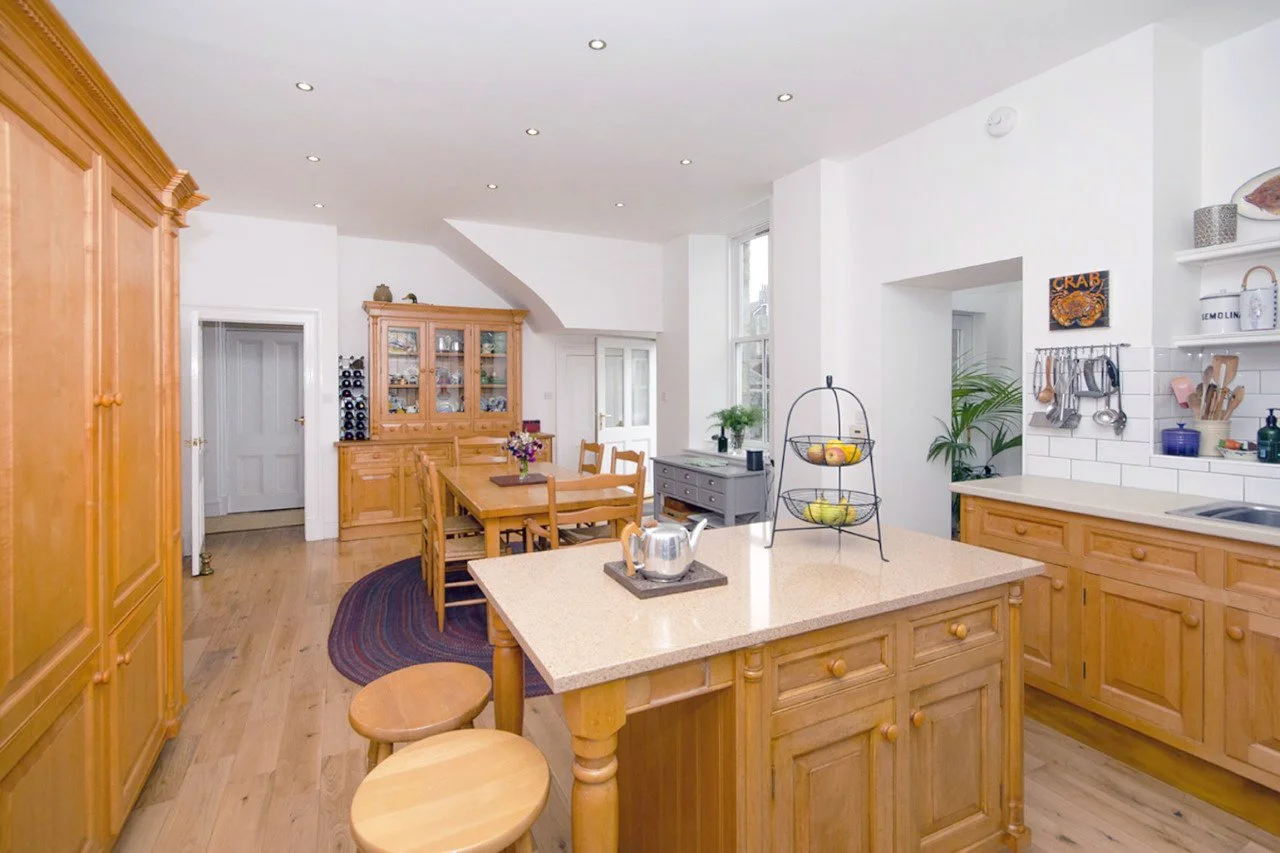
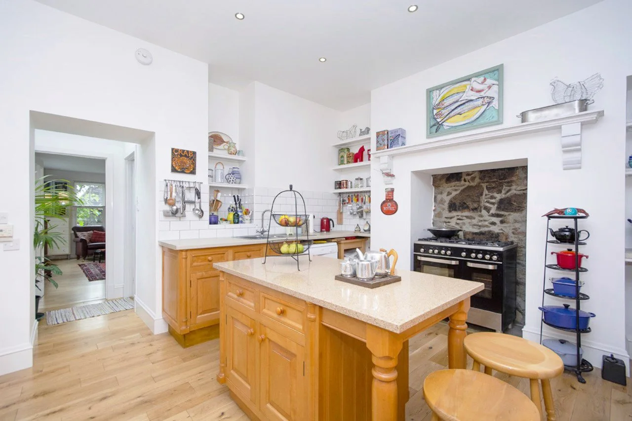
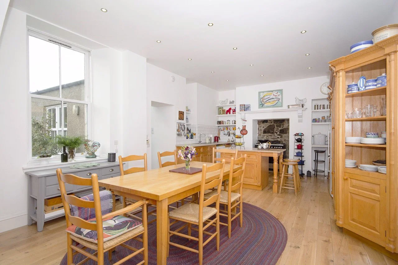
The existing kitchen was a combination of elements from a older American style kitchen and some early 2000s B&Q units. Although some effort had made to rationalise the these two kitchens the overall product was lacking. The solid wood construction doors and detailing was impressive but much it had warped internally and doors were difficult to open. The wood tone was dated and the kitchen appliances were mismatched and some in need of replacing. The range had no proper extraction and the exposed granite rubble to the gave off soot from when it was a fireplace. The sink was insufficient and was positioned at non-standard height. The island lacked any electrical sockets and had a different surface material to the small sink run - the island had a pink granite and the run was a cheap laminate. The kitchen had been a cause for hesitation for the clients when purchasing the property and they imagined that any future house hunters might fear the kind of work required to replace it
Concept
Existing room

Opportunities
Proposal
Proposal
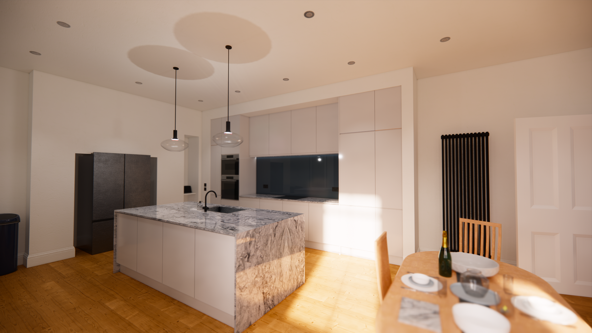
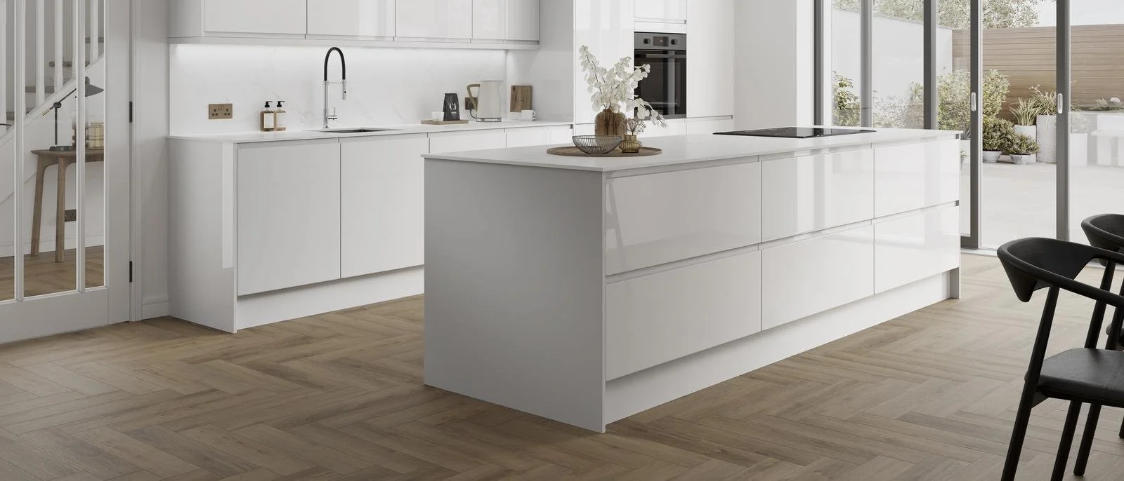
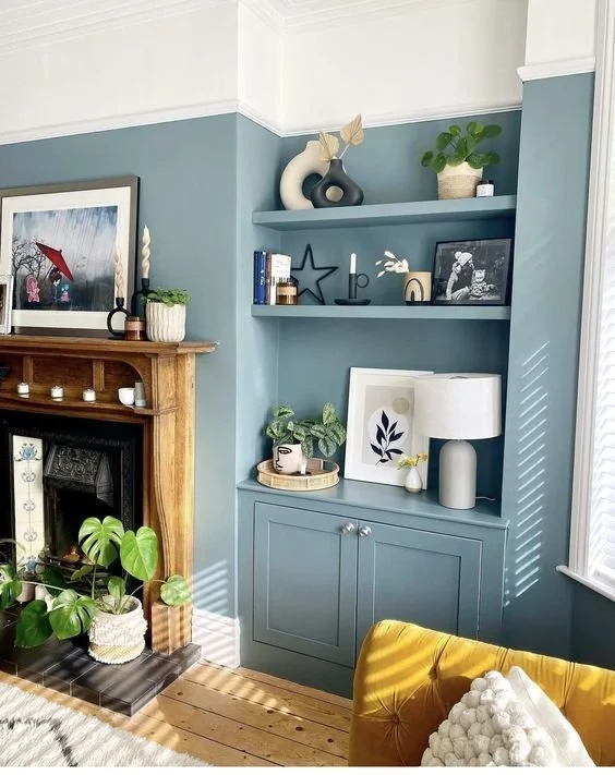
The proposal aimed to simplify the kitchen layout and achieve a custom built-in appearance to elevate the units. The proposal was split into 2 elements, a large island, and a run along the wall.
The island, proposed to be 1.2m x 2.4m, would be significantly larger than the previous one, would host the sink, a boiling water tap, the dishwasher, as well as plenty of storage. One side consisted of large pan drawers with hidden internal drawers for cutlery to reduce visual. The other side provides regular cupboards as well as a dishwasher and the equipment for boiling water tap. The sink was selected carefully to be as big as possible as the unit could handle while maintaining a functional, drawer. To provide power a small diameter pop-up socket was selected that allowed its body to fit within the service space between units and maintain cupboard integrity.
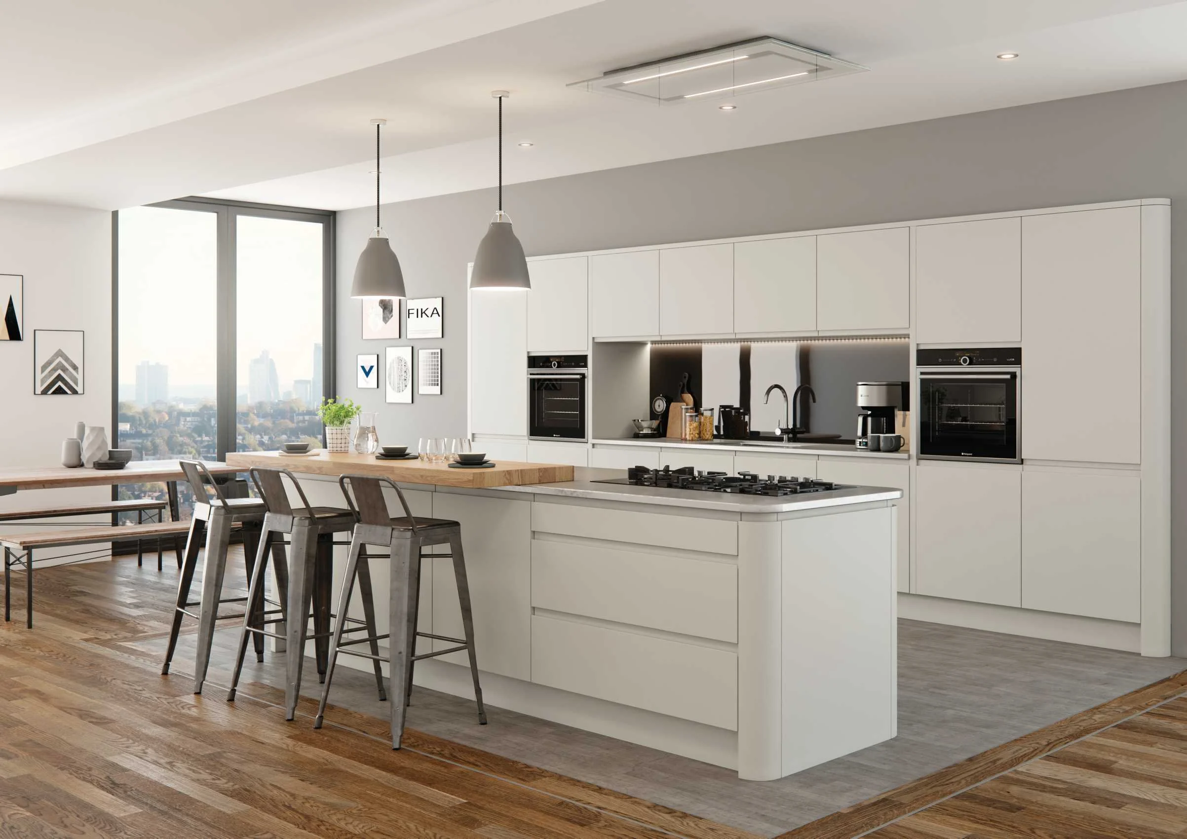
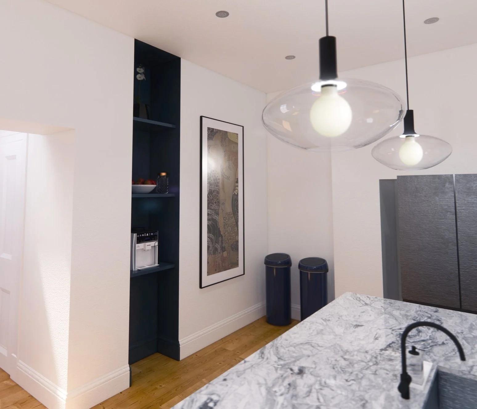
The run was proposed to host an induction hob, oven, and combi microwave as well as 3 larger larders, regular cupboards, and high-level storage for less frequently used items. The higher ceiling provided the opportunity to go tall which I felt would solve various concerns of the clients while providing a higher-end appearance. I proposed reduced heights units would be flipped upside down to provide the upper storage on top of existing larders. This allowed larger wall units to be selected and positioned higher. The clients had concerns about any part of their kitchen feeling ‘claustrophobic’ and the larger space between the wall and floor units helped eliminate this fear. The space surrounding the run was boxed in and the surrounding alcoves rationalised to appear more intentional. To complete the built-in finish the space now framed by units on the wall would be filled by a blue backsplash.
The final elements started with the creation of a shelving space to help mediate the different wall projections produced by the previous kitchen renovations. This provided a dedicated space for the coffee machine as well as a location for various pieces of decorative glassware. Within another alcove a shelf was created for the toaster, this meant the surface could remain uninterrupted when not in use. The fireplace alcove was reused for a French door fridge. Finally, the fireplace was leaned against the wall in the enlarged dining space.
Renders
Design Stages
Part of the design process was to create an easy set of steps to reduce the time the kitchen was inoperable.
Stage 1
Old range sold
Temporary oven installed
Island & surface sold
Fridge installed in place of the range
Stage 2
Old fridge & radiator sold
Tall units removed
New kitchen units installed
New radiator installed
Surfaces & backsplash installed
Stage 3
Old sink and dishwasher removed
Temporary oven sold
Remaining old storage removed
Stage 4
Lights installed
Boxing out created
Room repainted
This animation was created in AfterEffects to develop my skill and represent this process in my portfolio.
Careful consideration went into creating a looping effect which is popular in high quality social media content.
As mentioned in the brief, an overarching objective was value for money and various decisions about the kitchen reflected this.
The first and largest decision resulting from this was the selection of a ‘DIY’ supplier for kitchen units. The supplier offered the best value for money with superior construction compared to their competition. I planned, selected, and produced a list of all the units required and to ease the process created an excel spreadsheet and accompanying diagrams to make the design clear.
The selection of appliances was also done to achieve high-end features at a reduced cost: the boiling water tap selected was one of the best at a lower price range; the combi-oven was sourced through a returns auction; the remaining appliances were selected to maintain a consistent appearance & brand but through various supplier to save money.
The room’s lighting had been split into two separate circuits with two separate switches. The new room layout made these zones obsolete. To avoid a rewiring that would require access to the space above the ceiling. I worked with the client to select an affordable smart light brand for the spotlights, pendant lights, and the backsplash strip lights. This allowed the client to control the lighting independent of the switches and in conjunction with the strip lighting. The result was cheaper than hiring an electrician for the rewire but added full RGB colour options as well as dynamic colour changing selections.
Other cost-cutting included the creation of the shelf space instead of going for full custom storage, the reuse of the current floor with a refinishing to it at later date and finding buyers for some of the old kitchen’s appliances and its island.
Decisions like these, as others allowed the proposed design to go ahead with only one major change, the dropping of the waterfall stone worktop edges. This change helped half the worktop cost and clients felt this was a worthwhile compromise.
Cost and Sourcing
Documentation
Various documents and diagrams were produced to create a smooth process. Shown here, are some of the documents I produced to aid in the purchase and tracking of units. It ensured we purchased all the right units and helped when the supplier delivered incorrect items and we had to respond quickly to ensure the kitchen delivery was not delayed.
Brief
The clients have recently made a house purchase and have managed to get it below asking due to the condition of the property. Generally, the clients wanted were anxious about the number of decisions needing to be made, the number of options to sort through, and what kind of things would offer the best visual improvement.
The main goals were:
The confidence to make bold colour choices and their combination – the clients were cautious to avoid a mostly white/grey house (greige).
Room Usage, the clients, a couple, had a lot of space to work with and needed to decide which room would be the primary and which of the secondary bedrooms would be their office, spare bedroom, and craft space.
Furniture & fixture selection. The clients had a range of existing furniture but expected they would need to get new things. Their current selection was often born out of practicality so were not always their exact taste. They wanted to know how to use these items as what new furniture to get.
More premium appearance at a reduced cost. What design choices could be made with much cost to make the house feel more premium?
House Renovation
Client Pinterest

Existing House
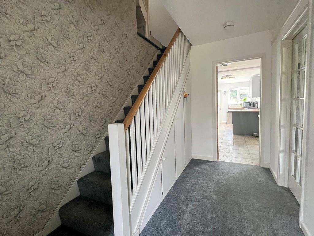
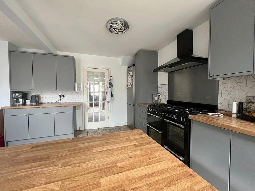
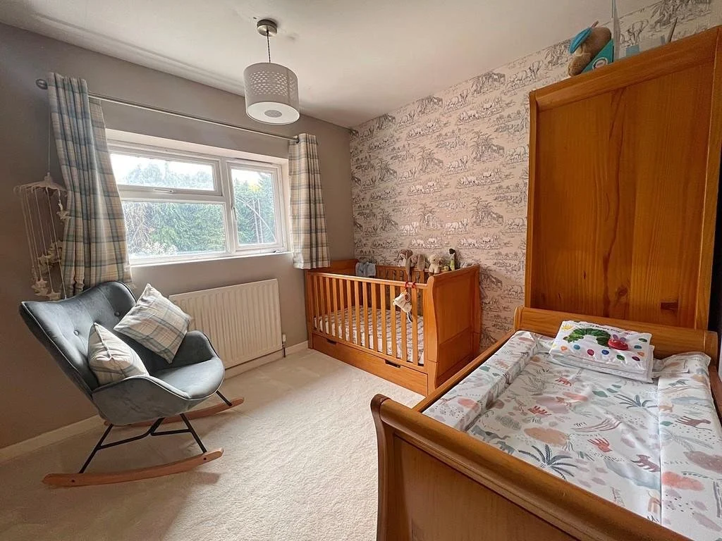
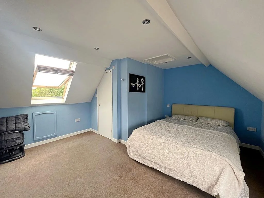
The photos provide the first indication of underlying issues around the house. The curtain rails are poorly attached to the wall, unlevel in every room and often small with dark curtains. Paintwork, particularly on all the wooden elements is worn and damaged. The flooring throughout is mismatched and varied in quality, wear and colour. In the hall, the under-stair storage has noticeable gaps around each door made, even more visible by the white paint. In the living room, the ceiling paint is discoloured from smoke. Positioned over the fireplace, the TV has exposed wires, is too high, and becomes the centrepiece of the room. The light fitting in the living room is also not properly attached and is too small for the room. One bedroom is dominated by a cupboard that is far larger than the room can comfortably accommodate, and the ‘wooden’ floors are just the gap-y and uneven underfloor poorly stained with stain making its way onto the white skirting. The attic bedroom is large, but the light fixtures are rusted, the floor plan is disorganised, and all the walls are discoloured with none being the same colour of blue. The ensuite door for this room is cut in a way that appears like a mistake.
However, the photos hide some other problematic issues with the house. The upstairs doors, not shown in the listing photos, are warped, ill-fitting and too thin. Like the kitchen door visible in the photos, the handles are too high, and the latch used is incorrect. Another bedroom uses the subfloor, this time with worn paint. This same bedroom also contains a poorly constructed wedge storage unit. The stairs have unused white wires aligned along the skirting with the wallpaper being trimmed to the top of the wires instead of going all the way to the skirting. The hallway was cold, not having a radiator of its own, and had a stone step exposed between the foyer addition and the hallway. The living room radiator is rusted and needs replacing but there are also exposed pipes running across the wall to its position half below the window. These are some of the largest issues throughout the house, but each room poses an opportunity to think carefully to deliver design improvements.
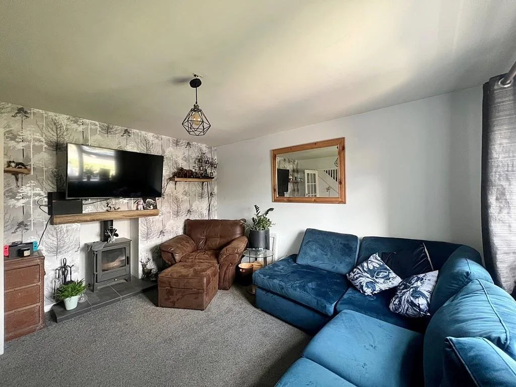
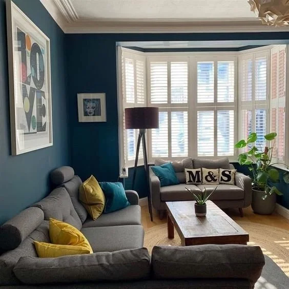
Living Room
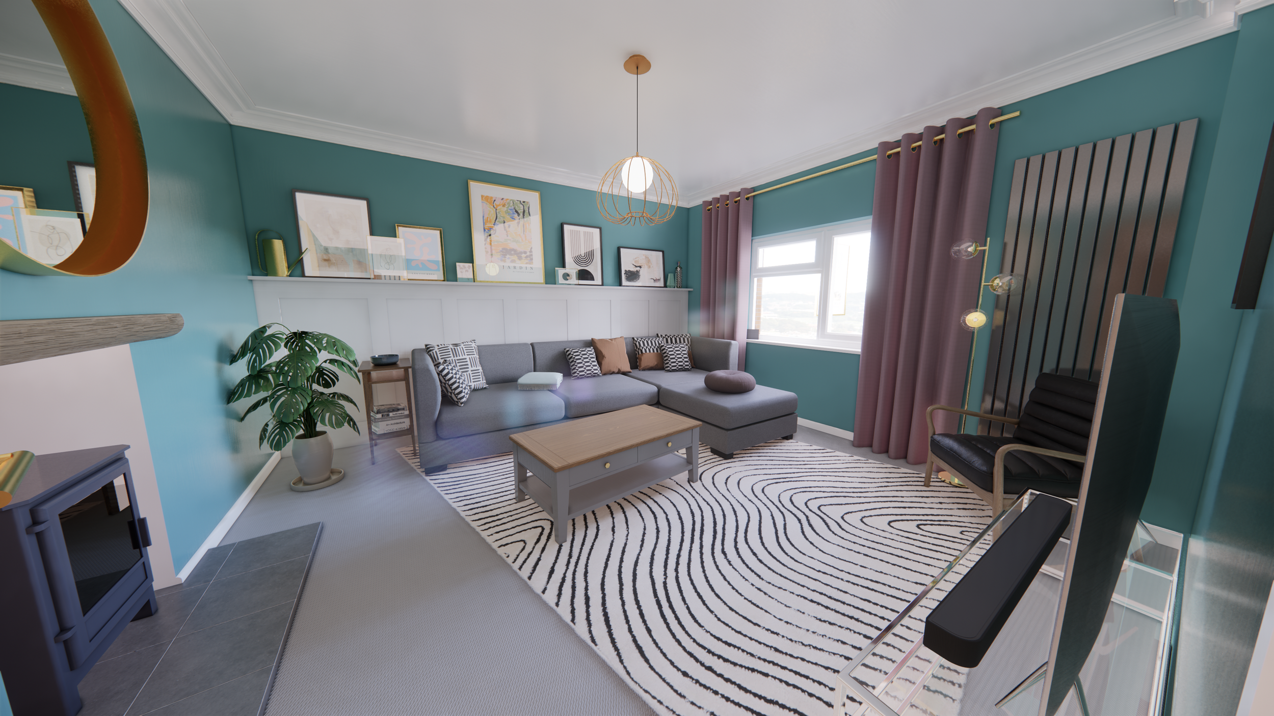
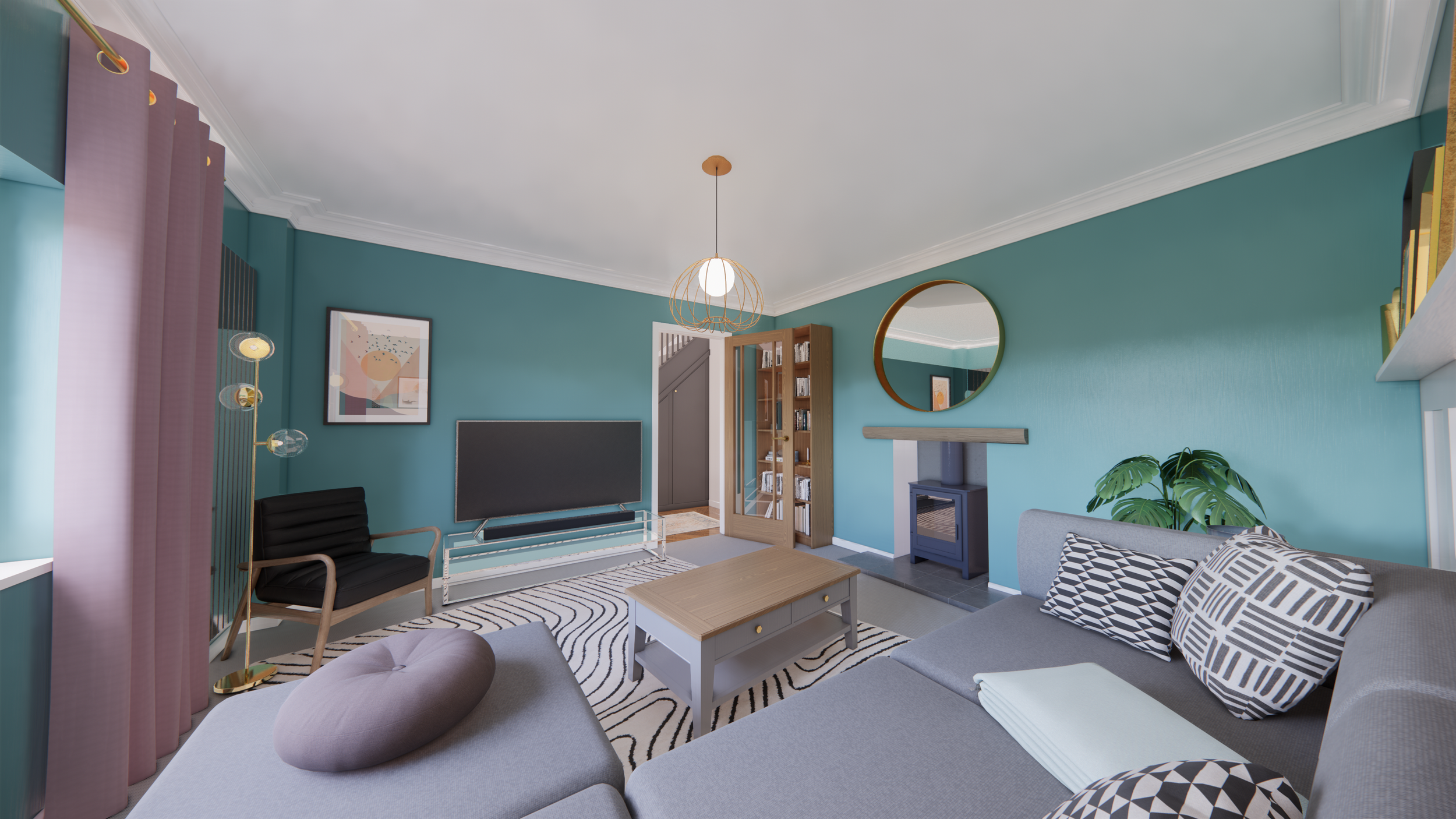
The living room was a good size and had a wood burner within the original fireplace alcove. The previous owners had mounted a television above the fireplace, used small and misaligned curtains above the window, and had the radiator misaligned with only half under the window. I worked with the client to retain much of their existing furniture but introduce new items and arrange them carefully to create a room that avoids too much focus centering on the television. Working with the client, I selected several items, such as the mirror, curtains, curtain rails, radiator, doors, and door hardware.I
Proposal
Concept
The video describes the series of moves made to develop a coherent simple living room design that matched the client’s preferences. It was produced to explore and help develop my after effects skills.
The off-centre radiator below the window is replaced with a vertical designer radiator to mirror curtains without obstructing them.
Curtains are enlarged and placed beyond the opening to make the window appear larger and allow more light in when open.
Paneling with built-in shelf provides detail to large blank wall and is inspired by client Pinterest.
The shelf provides space for artwork and decorative items with visual harmony between elements provided by a consistent base line.
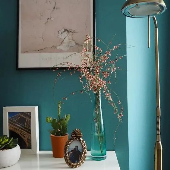
The client’s sofa and coffee table are reused with their grey tones working well with green and pink elsewhere in the room. The coffee table handles are replaced with brass ones to match the other metalwork in the house.
An armchair is introduced to create a conversation area and avoid a singular focus on television within the living space.
The client’s television and stand are positioned opposite the sofa for a good viewing angle but low enough to allow the fireplace to remain the focus of the room.
The rug is used to tie living room furniture together and provide contrast to grey carpeting.
A round brass mirror is placed above the fireplace, having replaced the television as the focal point of the room. Brass metalwork was selected to match elsewhere in the house.
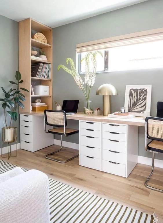
Office
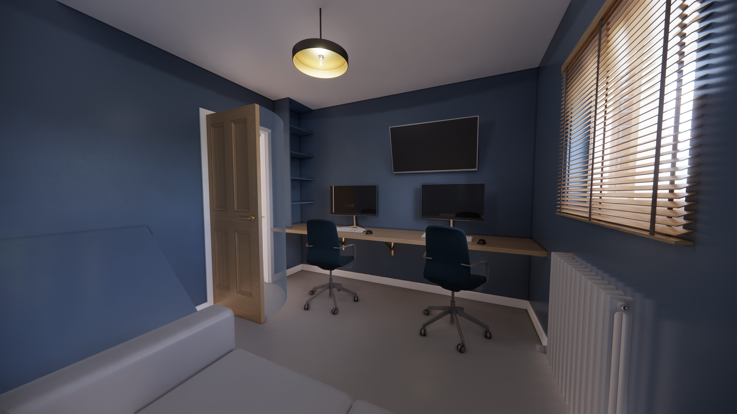
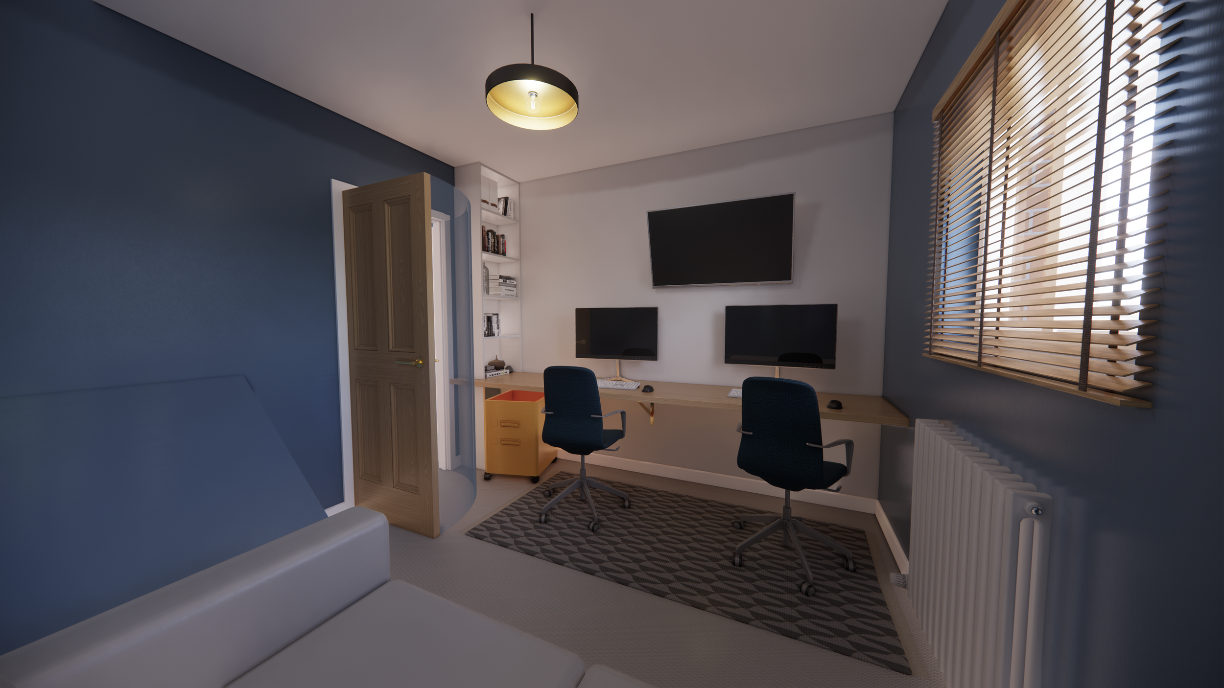
The clients wanted to explore the smallest bedroom as a office space, using the longest wall as a single long desk. I show how the door swing might limit space and how that dead space might be used. It was only once I showed them how the space would look they realised it was too limited to be a shared home office.
Hallway & Built Units
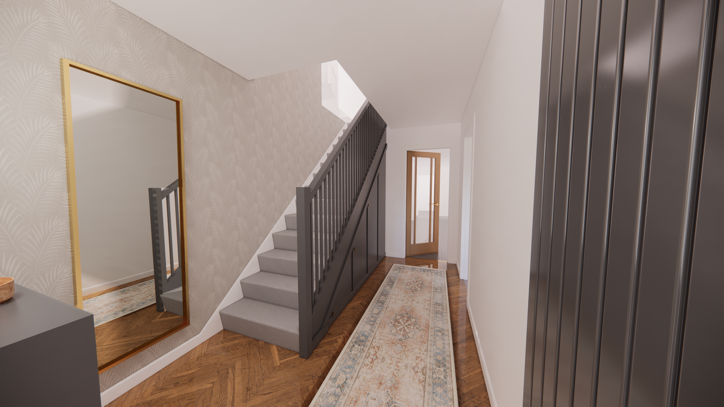
In the hall, to make them more coherent with each other and hide gaps, the staircase and cabinetry are painted dark grey.
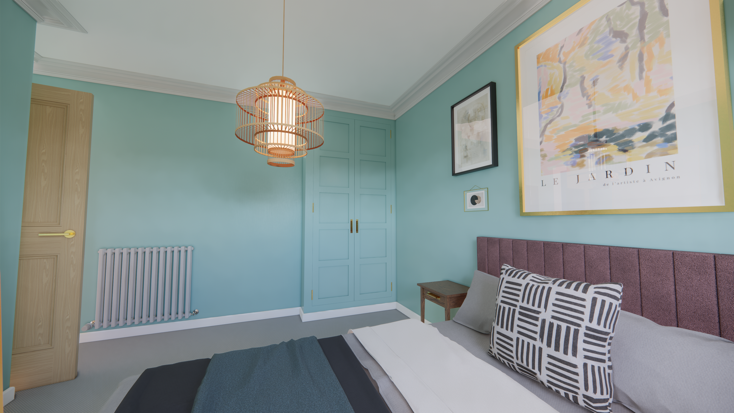
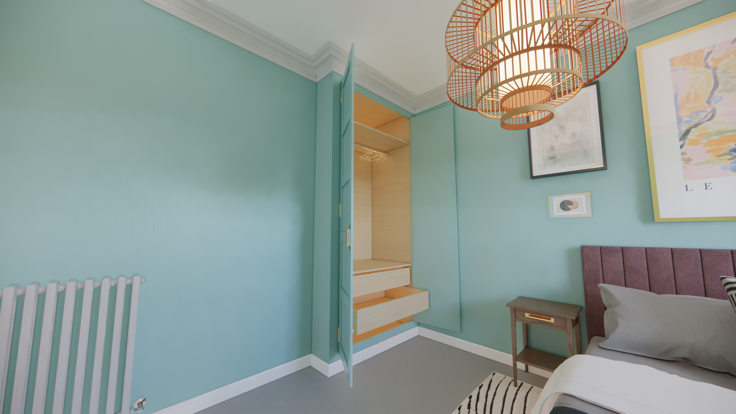
In the secondary bedroom, I showed how an IKEA pax unit could be turned into a premium-looking built-in.
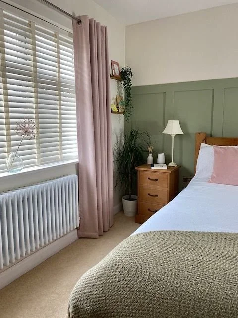
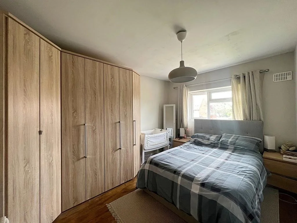
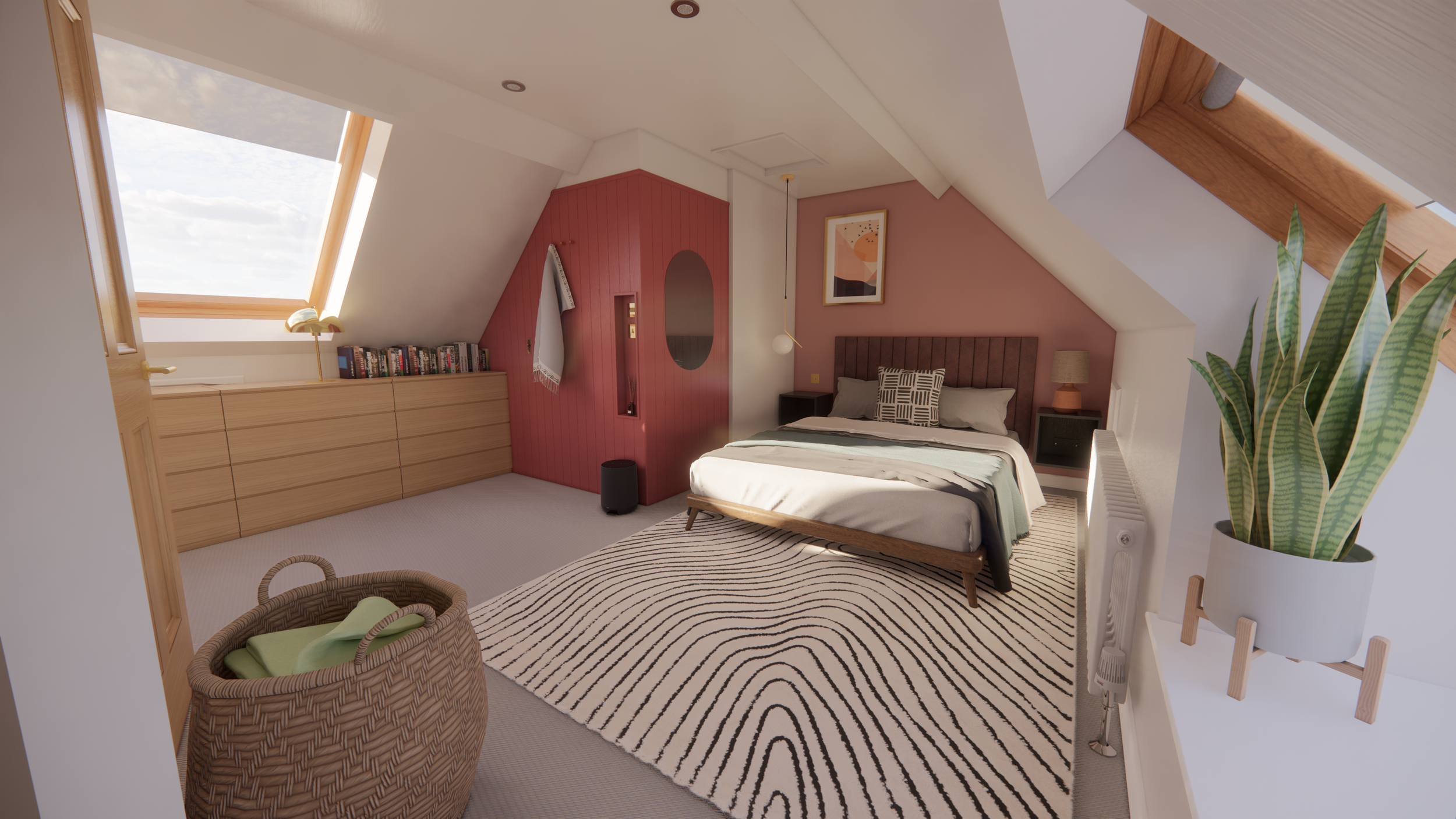
Primary Bedroom

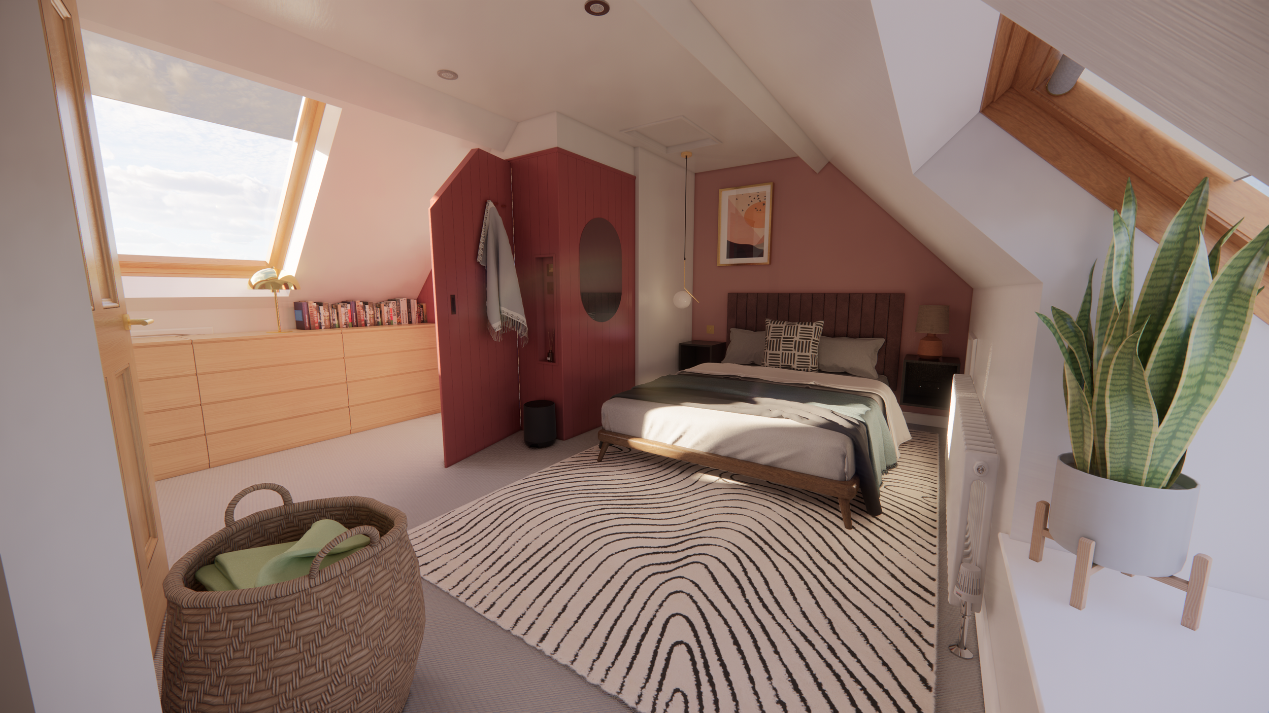
The primary bedroom is located in the loft space and is an odd shaped room. A chimney breast divides the space and the corner behind itis a ensuite bathroom. The door to this ensuite was trimmed to fit the ceiling and looked like an afterthought. I suggested a hidden door within panelling could be created to create a more clean look. I suggested by combining their existing Ikea drawers they could create the appearance of a built-in and use the low ceiling space effectively. I selected a low bed frame and designed custom headboard so they could fit king sized bed within space despite limited headroom.