Website
As well as serving my future professional and personal life by displaying my work, the website also offered an opportunity to learn new skills regarding web design, coding, and digital formatting. All of which will be important as we embraced more non-physical representations in the post-covid world.
I enjoyed making this website and hope you see this, not everything will be perfect but it covers a huge amount of stuff and is always being updated.
Design Principles
The website follows a set of design principles to create a coherent, attractive, and easy-to-follow space with colour, font, sizing and layout all considered carefully. These logics are through the website but these rules occasionally are broken to provide emphasis on an item or certain page. This page will explore some of these principles to give you insight into how I developed the website and how it reflects me personally. The website was created for professional viewing and this was also a important consideration when filtering my personal taste into a cohesive experience.
Colours
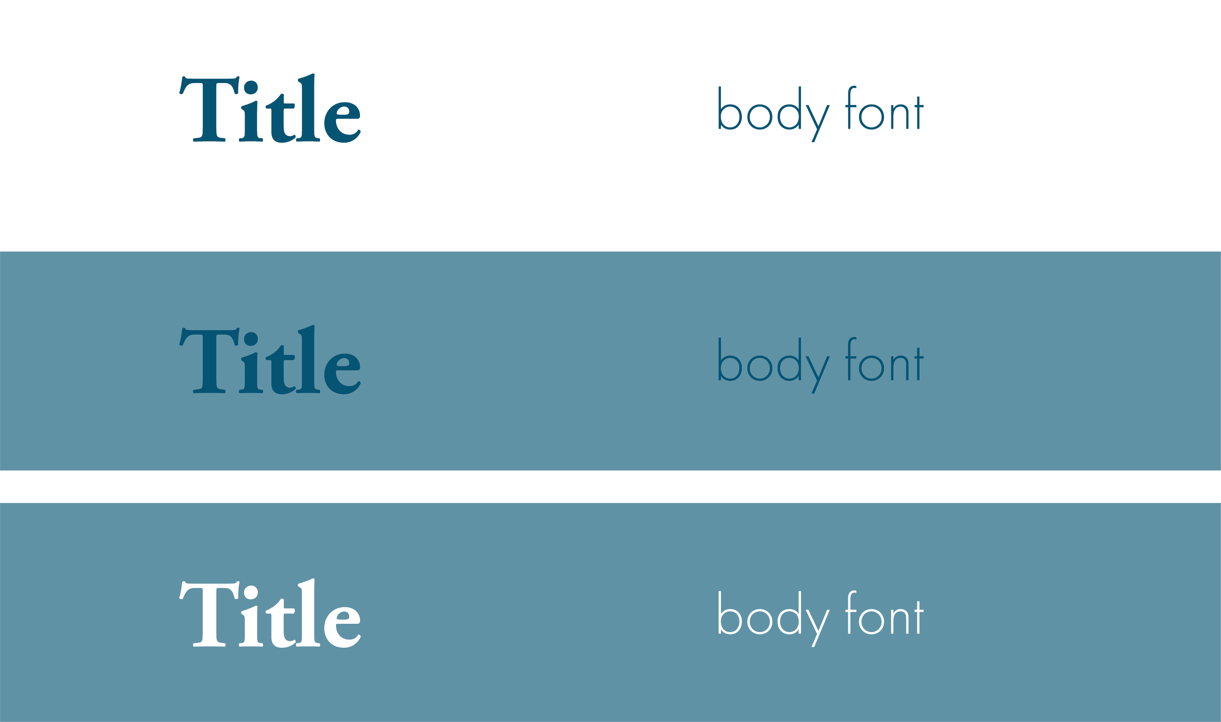
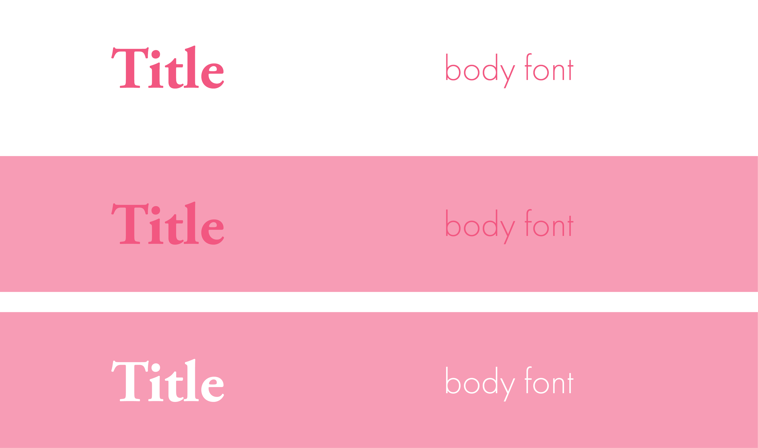
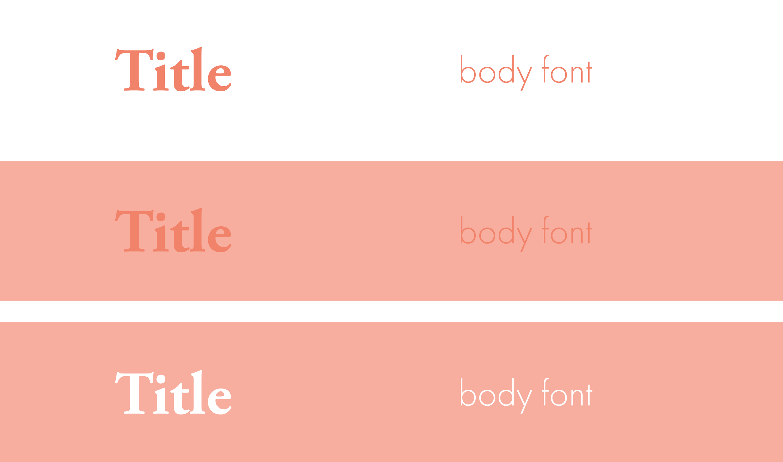
Colour is used quite simply through the website. It indicates which of the three sections the current project is contained. The bright colours used are ones I felt indicated the different sectors of my design work well and highlighted my appreciation of colour. I do not have one taste and love everything from rigid greyscale to gaudy expressive neon. Below explore each colour and why it was used and with a diagram of its use on the website.
Dark Grey
Avoiding black intentionally, this colour is dark but not black, it avoids some of the sheerness you see with black against other colours while still having the readability and neutrality of black. It is used whenever for the main pages of the website and for font broadly when the background colour is white.
Navy Blue
Navy Blue is used for my educational projects and is dark and classic colour that I feel describes the time I had in Edinburgh. The city and the university I studied in are both ones’ famous for their order and history: the university having its deeply developed hierarchy and ceremony; the city with its strict and pleasing palette of yellow sandstone and neoclassical architecture.
However, between the art school and student corners, the very new modern Scottish parliament and tiny lanes of the old town, the old industrial areas of lieth and the people throughout the city, Edinburgh is far brighter and colour city than its stock images imply.
I felt navy blue described all this well. This is entirely a subjective view, and the colour also works well for the more practical needs of this website, but navy blue was chosen careful to represent the mixture of rigid and wild my educational experience contained.
Magenta
Magenta is used for my professional work done at an architecture firm. The colour is punchy and reflects the more bright colour schemes Pollard Thomas Edwards were willing to keen to use.
My time working in London was also a really new, independent and experimental time in my life and brough a lot of life experience that informs my decisions now. I think magenta makes for a strong colour to represent these things as well.
Orange
My personal projects reflect my interests, politics and life. As such the colour I used for this section is my favourite, orange. It helps this particular shade works well with magenta and navy to form a pop-y and contrasting palette with white appearing well against it. The colour works particularly well with my posters and that was the first projects I brought to life on this website and helped cement its use.
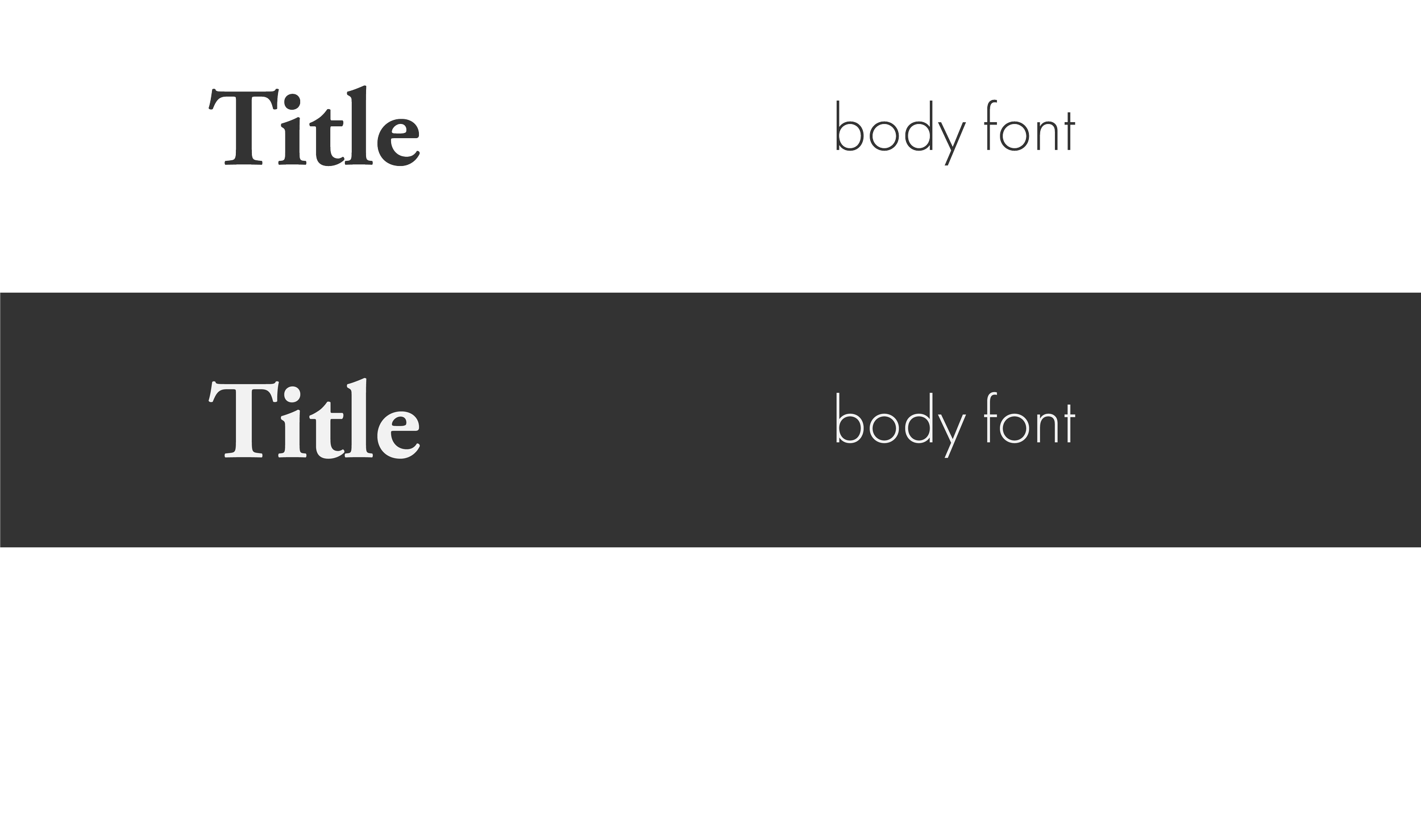
The font combination is designed to be playful and professional. The use of sans serif and serif font together is one I often enjoy. When done carefully the serif font can appear modern and playful, particularly when paired with youthful bright colours. This is best paired with a simple and readable body font to avoid a busyness or dated appearance.
For titles I selected Garamond Pro in a heavier weight. It is a attractive font and avoids excessive augmentation. The weight makes clear the function of the font as titles and almost abstracts them from just a serif font into more of a graphic element.
For the body I choose futura, a simple readable and clean body font that doesn’t take away from the title fonts. It works well in various forms and is occasionally used in italics or bold, the latter mostly for buttons or any important numbers.
Fonts
Garamond Pro
Title
Title
Title
Title
Title
Title
Title
Futura
Body text and captions
Body text and captions
Body text and captions
Body text and captions
Body text and captions
Body text and captions
Body text and captions
Body text and captions
Body text and captions
Body text and captions
Body text and captions
Body text and captions