Posters
Prompted by a desire for art of my own creation focusing on various brutalist buildings, these posters explore, in bright colour, the form of each structure - emphasising their different orthographical planes.
Before I had set out to create these drawings my explorations had already indicated there existed simplified and minimalist representations of brutalist buildings but nothing with the detail and surreal colours I desired. This would fundimental to these prints, the rejection of the existing conception of brutalist buildings in digital art. The abstraction of materiality and rejection of shadows would leave just form with simple backgrounds of cropped gradients to protect the buildings from the page.
This project ended up being a more in-depth exploration than I first intended, making me reflect on my fascination with brutalism which had existed as long as my interest in architecture.
Designs intended to be printed on off-white card stock.
& Bookmarks
At first, my interest in the style was based on a simply visual appeal and a curiosity about why it inspired such disgust in the eyes of many. I saw family members I admire derive it and thought why do I not feel the same way about these buildings.
Then, as I discovered my politics, I appreciated the vision behind brutalism. Emerging at the time of big society and government, with the principals of functionality above form, it was the architecture for the egalitarian, and often socialist, visions for the future. It would be the high quality housing for all and the public space owned by the public. That was at least how I saw the style with my then new political lens for the world. Even then I was aware of the realities of the modern housing market and inequalities of our times so I felt keen to defend the architecture strongly as the designs and politics of a better time.
As I have gotten older, had formal education, and had actual experience within the industry, my views on it have gotten more complicated, understanding the design as prescriptive in nature and often from a western middle class viewpoint. They were not always the socialist and fantastical architecture of the future, plenty of it’s towers poorly made and underfunded, plenty of it’s best designs explicitly not left-wing. I remain captivated with the form and vision of the style, even if I have more nuance views of the style.
My relationship with Brutalism
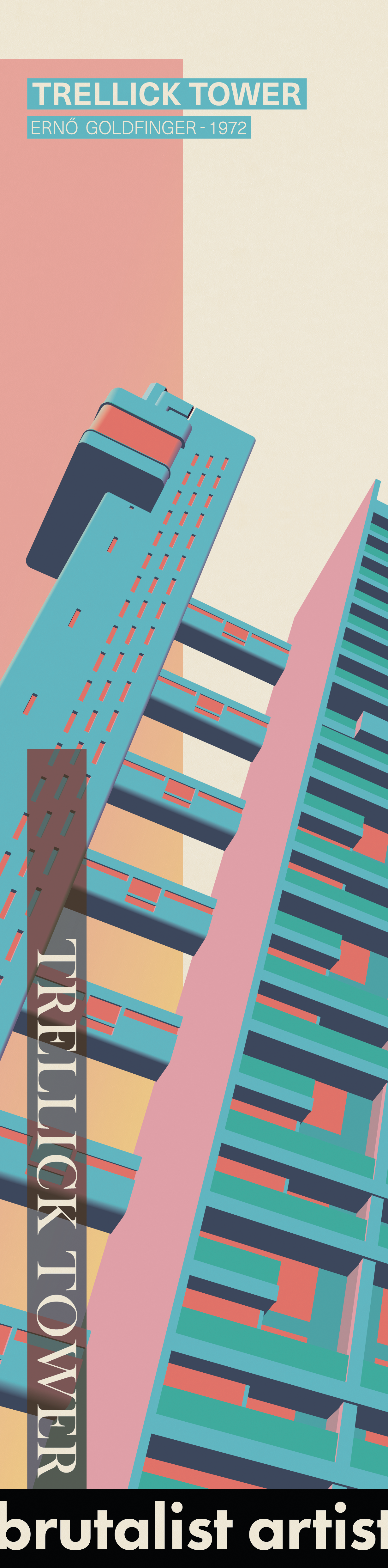
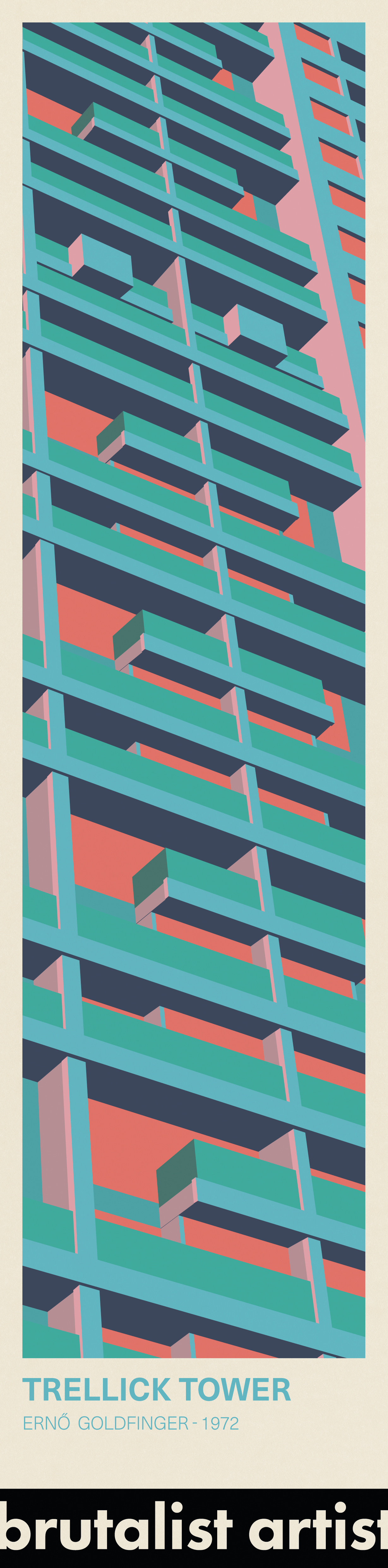
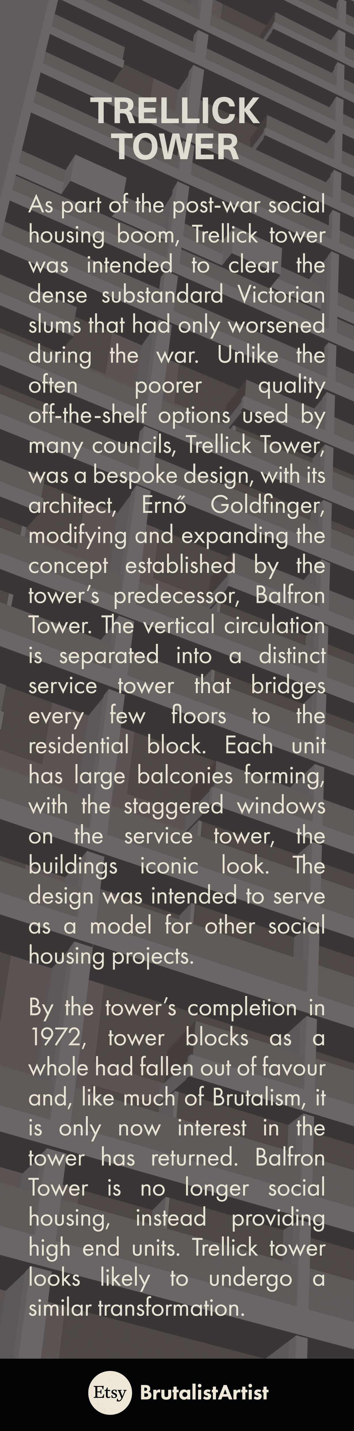
Trellick Tower
Ernö Goldfinger - London, 1972
At first glance the towers design appears like two monolithic objects. However, looking any longer and the complexity of the facade is clear, helping hint, along with the bridges, the unique interior arrangement of the flats. Through the articulation of the different planes and facade elements in different colours, the depth of the facade is revealed - stripping all the materiality typically used to dismiss the structures merit.
As Brutalism finds new popularity half a century since the buildings creation, we see renewed interest in the tower. It’s predecessor, Balfron Tower, similar in design, is no longer social housing, instead providing high end housing. As a similar fate looks likely for Trellick tower, one questions why, when the merit of these towers is seen again, do the social residents have to lose out? Despite Brutalism return to vogue, the ideology that created these towers, one that sought to provide high quality homes to all regardless of class, remains out of power.
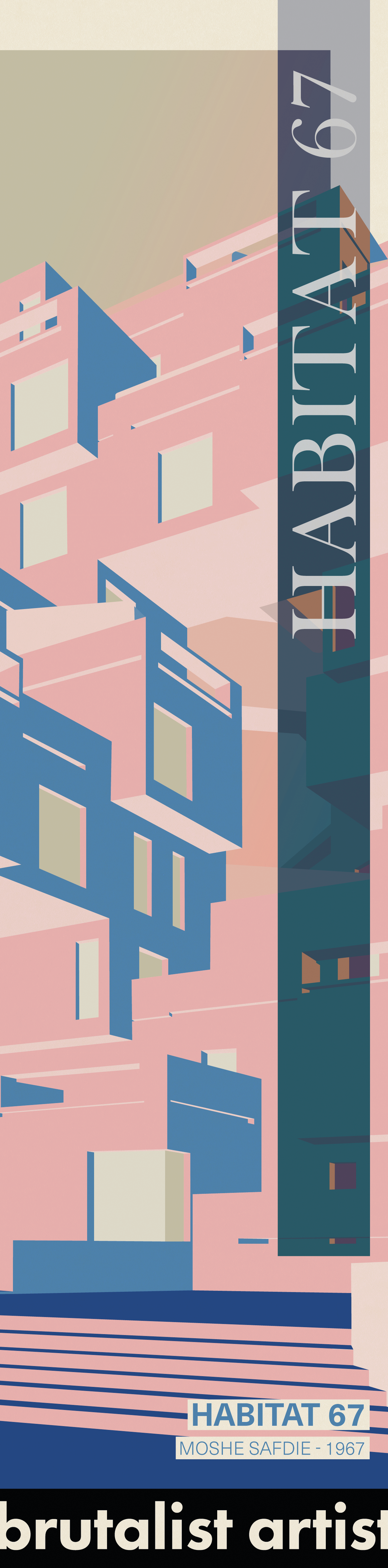
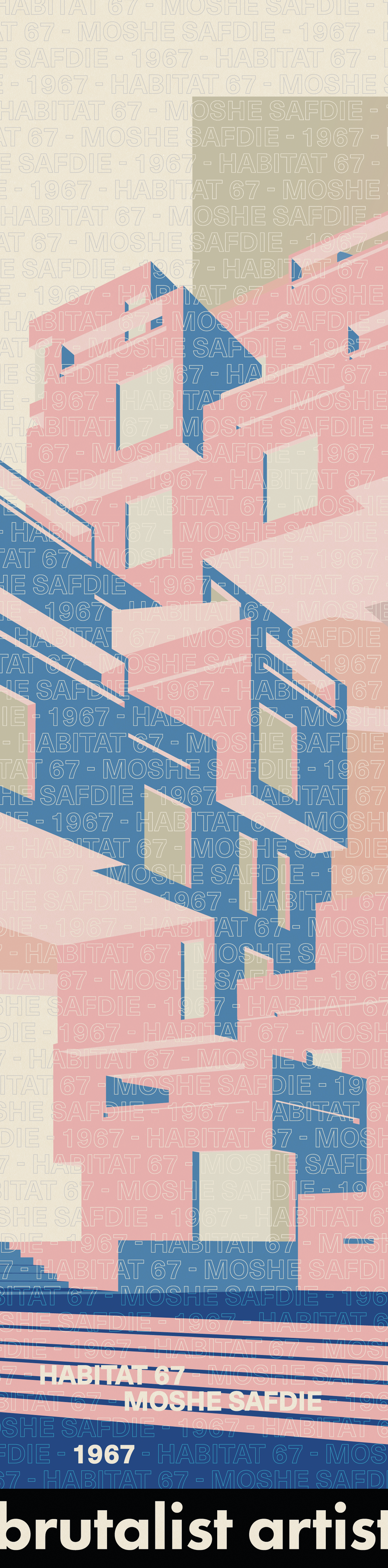
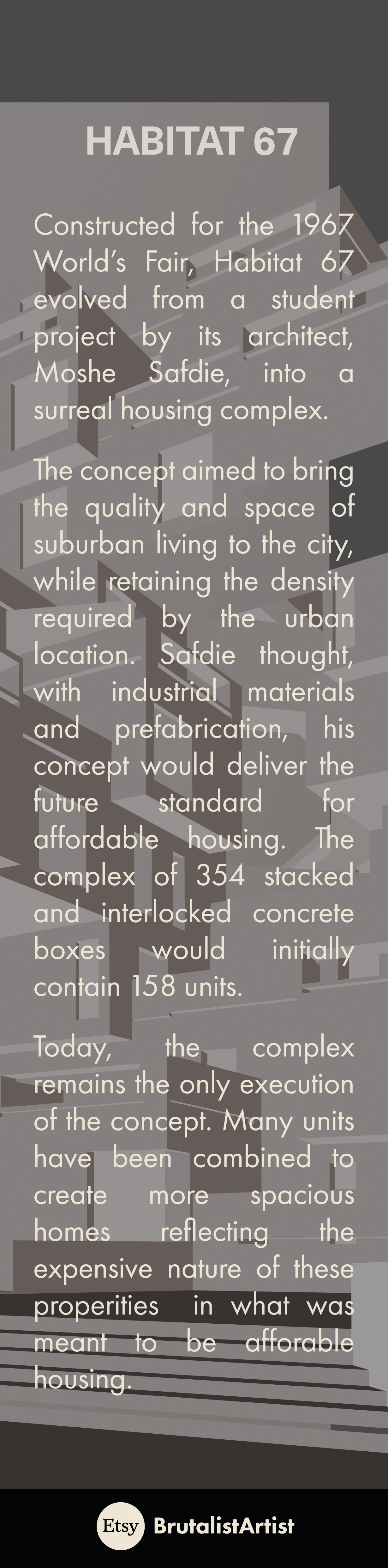
Habitat 67
Mohe Safdie - Montreal, 1967
Although Habitat 67 aims included providing affordable housing, similar to the Trellick tower, it also had the far lofter goal of representing what it’s architect thought would become a popular form housing - stacked suburban style homes with urban density and centrality.
Consisting of stacked, rotated and intersecting blocks cut into for windows and openings, it presenting a exciting opportunity to explore its representation. The reduction of the various materials and planes to colours shows the seemingly random window placement and the, at first appearance, chaotic nature of the stacking. In reality, the actual stacking of units and arrangement of openings were thought out carefully to provide at least one garden to each unit and allow repetition of individual units and large sections within the structure. This is where the beauty of the design lies and what I wanted to represent with this drawing - A view that showed an absurd structure which in reality is anything but.
Its rejection of traditional stacking stands out when even expensive residential developments reduce cost through repeated floors. It showed a method in which repetition could be done differently. The complexity of envelopes, insulation, fire protection, etc. now make such a design far more difficult today and means that the build will likely remain one of few buildings of its type.
Most of the properties are now worth a significant amount and the scheme was never expand, as was intended by the architect, beyond the initial development. The Traditional suburban concept would remain in North America and the building’s premise never took off as the architect imagined.
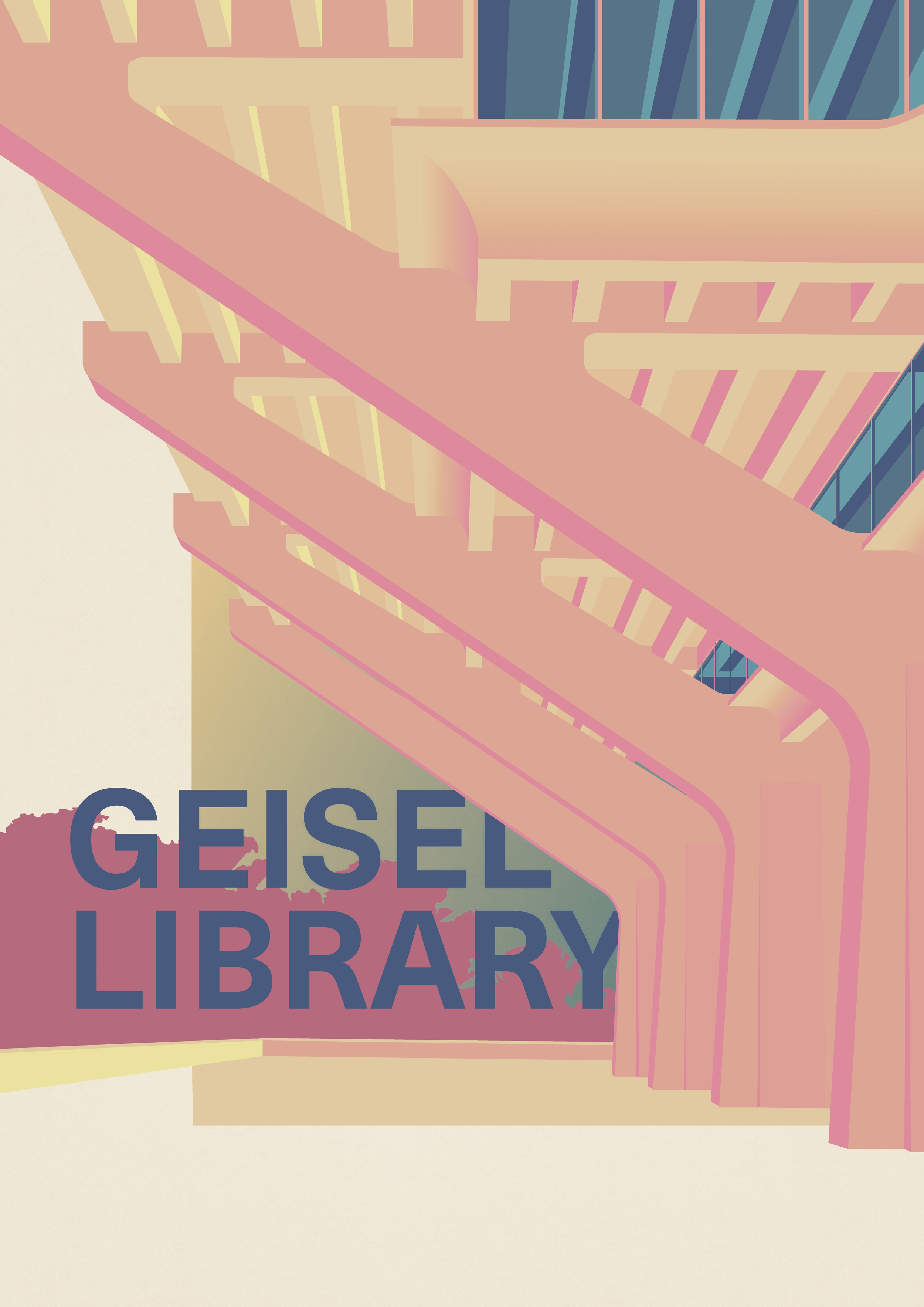
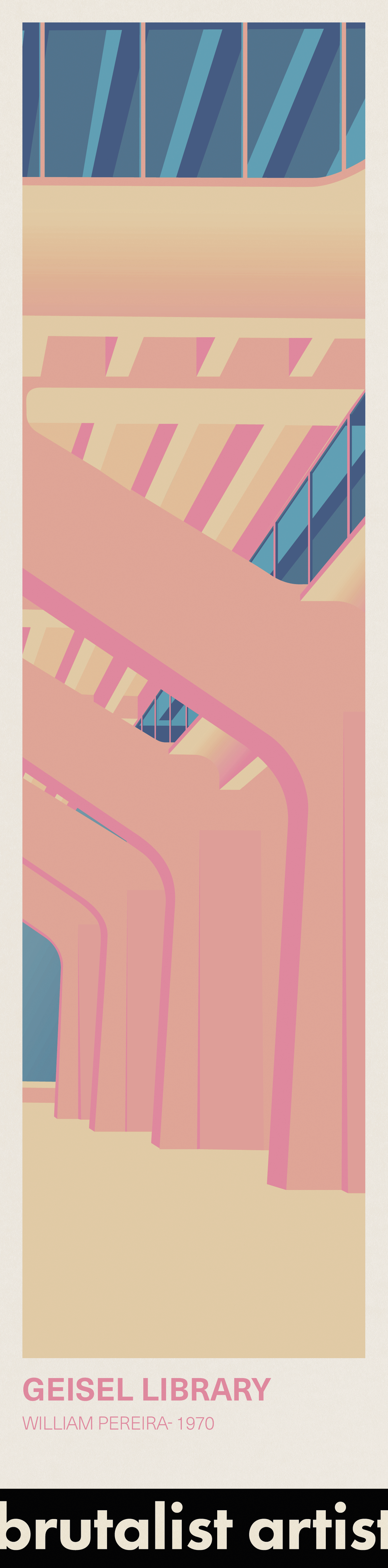
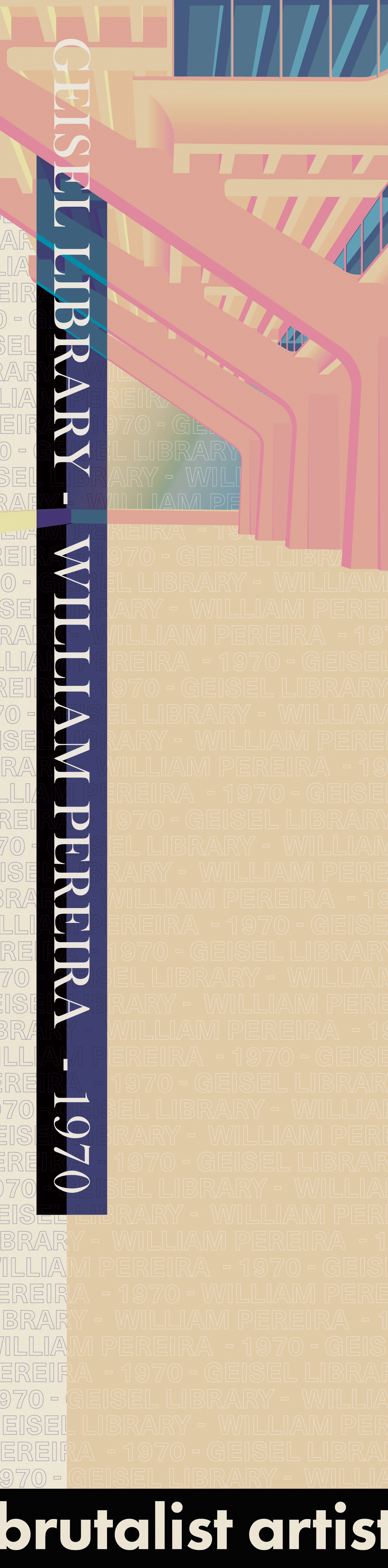
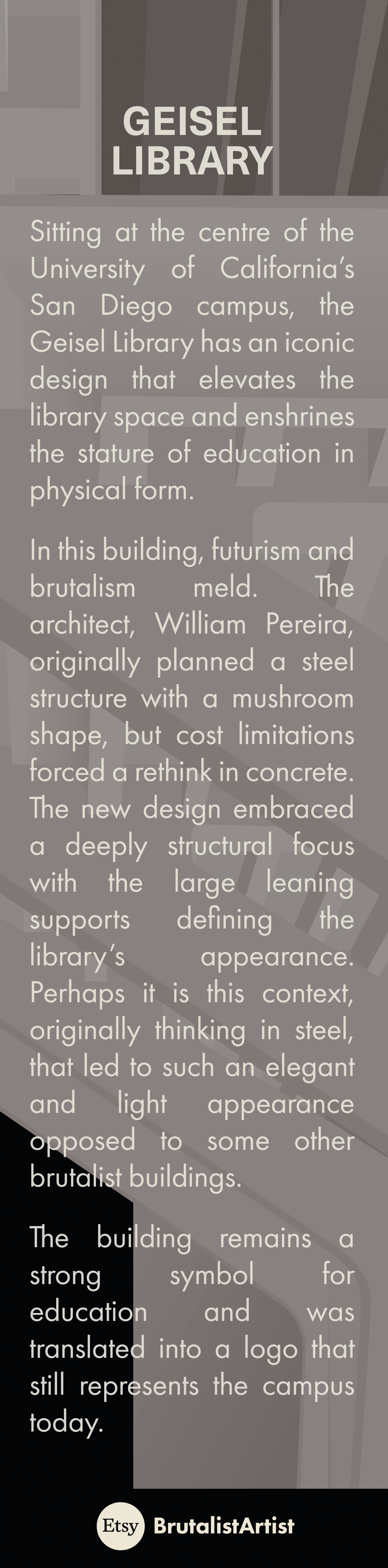
Geisel Library
William Leonard Pereira - University of California San Diego, 1967
Although it shares materiality with the previous two structures, the Geisel Library is not residential and is of the futuristic style. The upper parts of the building are heavily glazed and give a far lighter appearance outwardly. The drawing here, focuses on the base and the various sculptural supports the drawing explores repetition on a small scale.
My like of this building is perhaps the most superficial. This is not to say my politics was not involved, the university campus is infamously not an apolitical place and even the architecture takes on meaning. The building was not housing for the masses but it was atypical - the library is elevated and made the centrepiece of a campus. A space that represents value for all and one used by all students being made the core of a campus feels, to me, like a rejection of the centring of financial that now dominate out city centres.
Despite being what to me seems like a obvious beauty, it still manages to find itself on lists of the ugliest building - a reminder the hold the neoclassical has on the zeitgeist.
Small Business Venture
Excited by these drawings and keen to explore and understand what goes into the sale and delivery of products, I decided to also try selling prints.
As indicated before I already had some awareness of what existed out there and felt my prints offered a twist on an existing concept. Exploring the various marketplaces people were keen to see these products sold in various formats and often they came with small freebies. Bookmarks, a popular one, interested me as I had collected architectural and artistic ones as a child. Every museum gift shop I visited would be properly searched. Bookmarks could be another product as well as a cheap freebie to offer patrons but mostly It was an opportunity for me to explore my art in a new format. I developed a simple, Etsy-friendly, brand - “BrutalistArtist” - to sell these products under.
Bookmarks
Monetisation
Habitat 67
As probably indicated before, much of my excitement about this project was the opportunity to produce bookmarks and explore more of my digital artwork but the money involved in selling these profitable was also interesting. I am always keen to find deals and, as I had done with the kitchen remodel, finding good value money was important to deliver the best outcome.
To give a more premium experience to customers at a small scale is difficult as bulk is key in reducing costs. Although nice, custom tissue paper and packaging would be far too expensive. Instead, printed branded stickers and embracing the functionalism of brutalism with simple cardboard boxes would create a nice bespoke feel to the unboxing experience. To add further to the premium experience and to reflect my own environmental concerns the products I used are all recyclable and many are made of recycled or at least 70% recycled materials. The off-white colour of the card stock and of tissue paper are not just a stylistic choice but reflect the choice of unbleached products. This would be advertising this to customers both when they are buying and when receive the products.
Each building has two bookmarks with individual colour design for each and a share black and white informative section on the rear. The brand name at the bottom is simple and attractive to retain the visual appeal. In total there are six bookmarks options.
The smaller scale, proportion and use of this format encouraged a more radical designs with the some of the small details on the larger prints not being as visible as this scale. To do this the bookmarks embracing the text and colour centric designs of the posters, with various new features that play with these two elements. Although they are not all applied in every bookmark, there is shared logic to their design to create a coherent collection.
Option 1
Option 2
Rear
Trellick Tower
Option 1
Option 2
Rear
Geisel Library
Option 1
Option 2
Rear